Home / Lab

Built with AI. Shipped anyway.

A designer who can build changes what is worth proposing. These are the ones that made it to a URL — with the parts that fought back written down.

3 builds
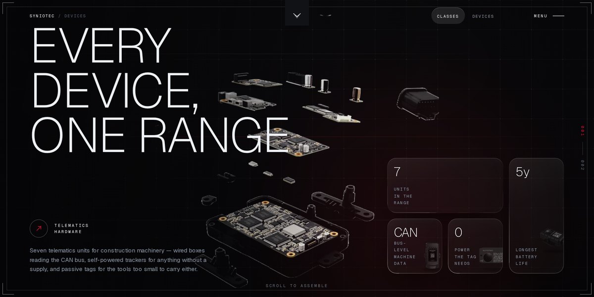
khomeriki.design — screenshot
01

khomeriki.design

Portfolio · 2026

This site. A portfolio with no framework and no page builder — a Python script generates thirty static pages from one shell, and the motion runs on hand-written WebGL and GSAP.

Python generatorVanilla JSWebGLGSAP + LenisCSSClaude
  • The background is a GPU particle field. The reference implementation I started from advected 50,000 particles in a JavaScript loop; moving the whole simulation into a vertex shader dropped it to one draw call and 12KB, instead of the 600KB three.js would have cost.
  • Every page comes from one build script, so the nav, footer and meta can never drift apart. Editing content means editing a Python list.
  • Vibe coding gets you to a running thing fast, then the real work starts: most of the time here went on contrast, layout drift and cache headers — the parts a demo never has to survive.
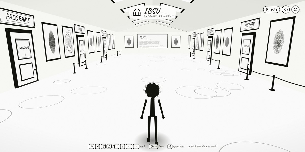
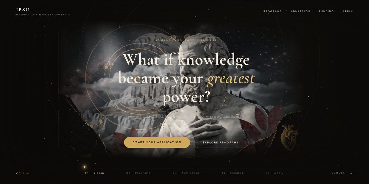
IBSU — Entrant — screenshot
02

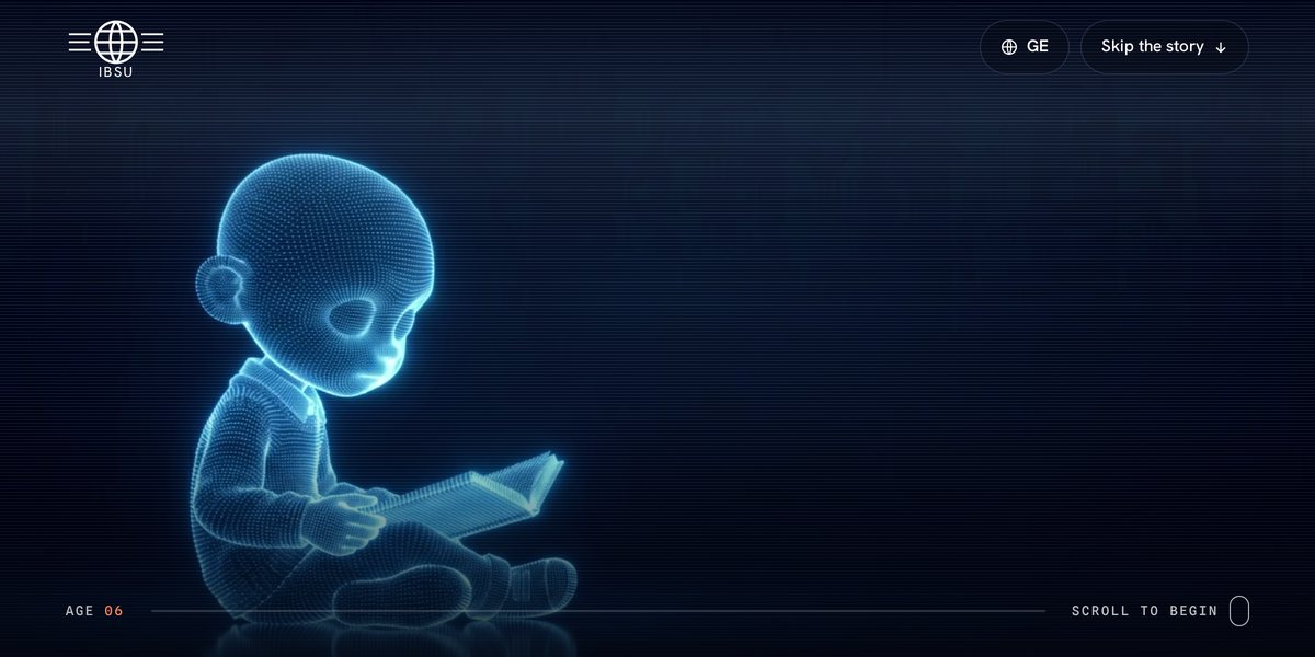
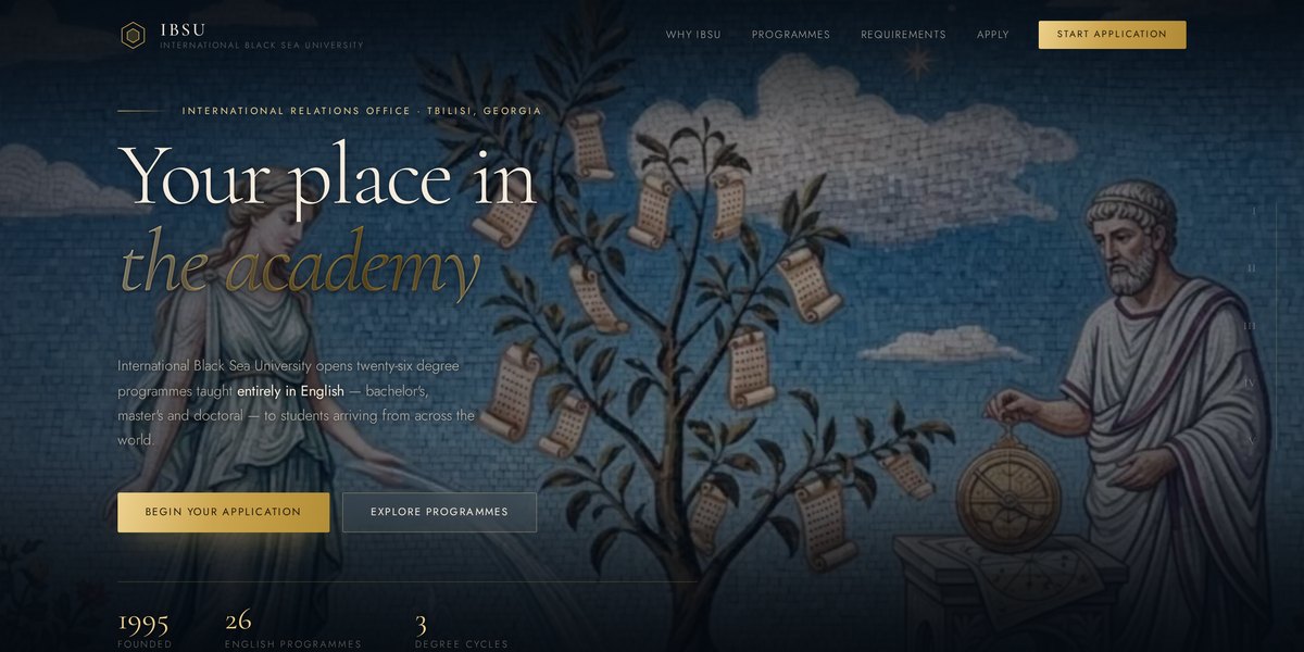
IBSU — Entrant

Concept · 2026

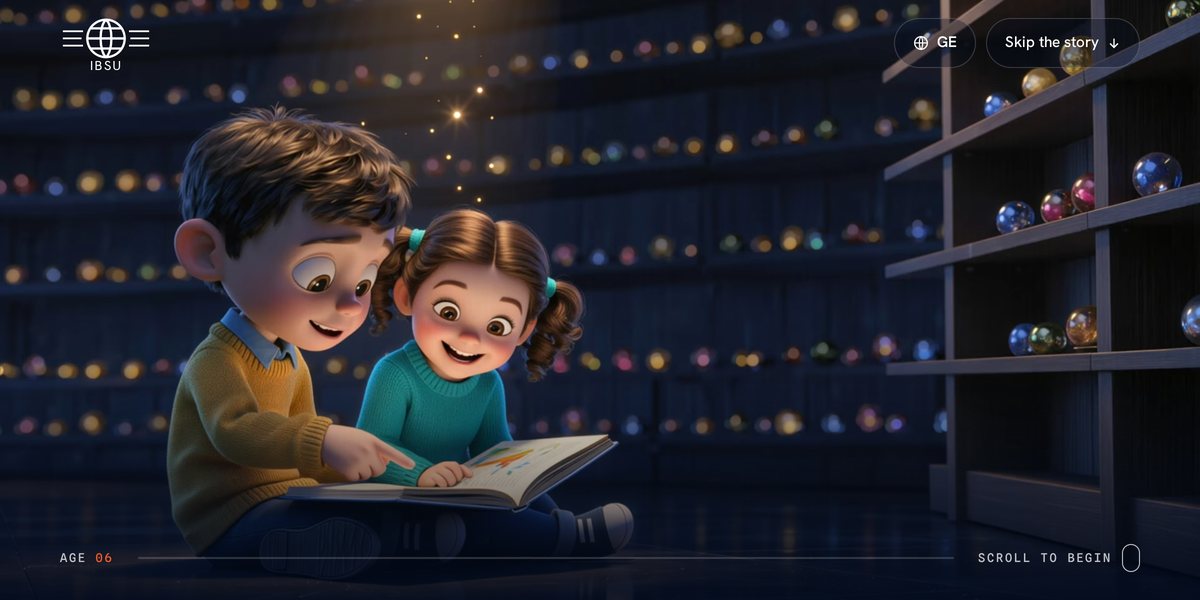
An admissions site aimed squarely at school-leavers rather than at the university. Five scroll chapters — Vision, Programs, Admission, Funding, Apply — that end on the Georgian national-exam steps, because that is the actual decision an applicant has to make.

Scroll narrativeComposite imageryWebClaudeGenerative imagery
  • Universities usually sell themselves to parents. This one addresses the seventeen-year-old: one question in the hero, then the enrolment path in three concrete steps instead of a prospectus.
  • Classical sculpture composited into a dark, gilded field — an attempt at an academic institution that does not look like every other one.
  • The chapter rail doubles as a progress indicator, so the page tells you how much decision is left before you commit to reading it.
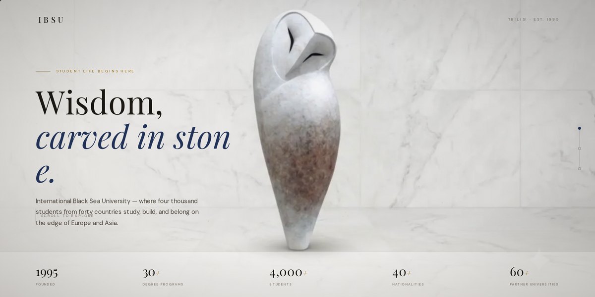
IBSU — Wisdom, carved in stone — screenshot
03

IBSU — Wisdom, carved in stone

Concept · 2026

The same brief taken the opposite way: marble instead of night, a serif voice, and the institution's numbers doing the talking. Built as a counter-proposal so the choice between the two was a decision rather than the first idea.

Editorial layoutSerif type systemWebClaudeGenerative imagery
  • Two directions for one brief is the cheapest thing a designer can do and the one clients value most — it turns 'do you like it' into 'which one'.
  • Stone, owl and quiet gold do the institutional work that a stock photo of smiling students usually fails at.
  • Known issue: at some widths the hero headline breaks mid-word — 'carved in ston / e.' A word-break rule set too aggressively on the display type.