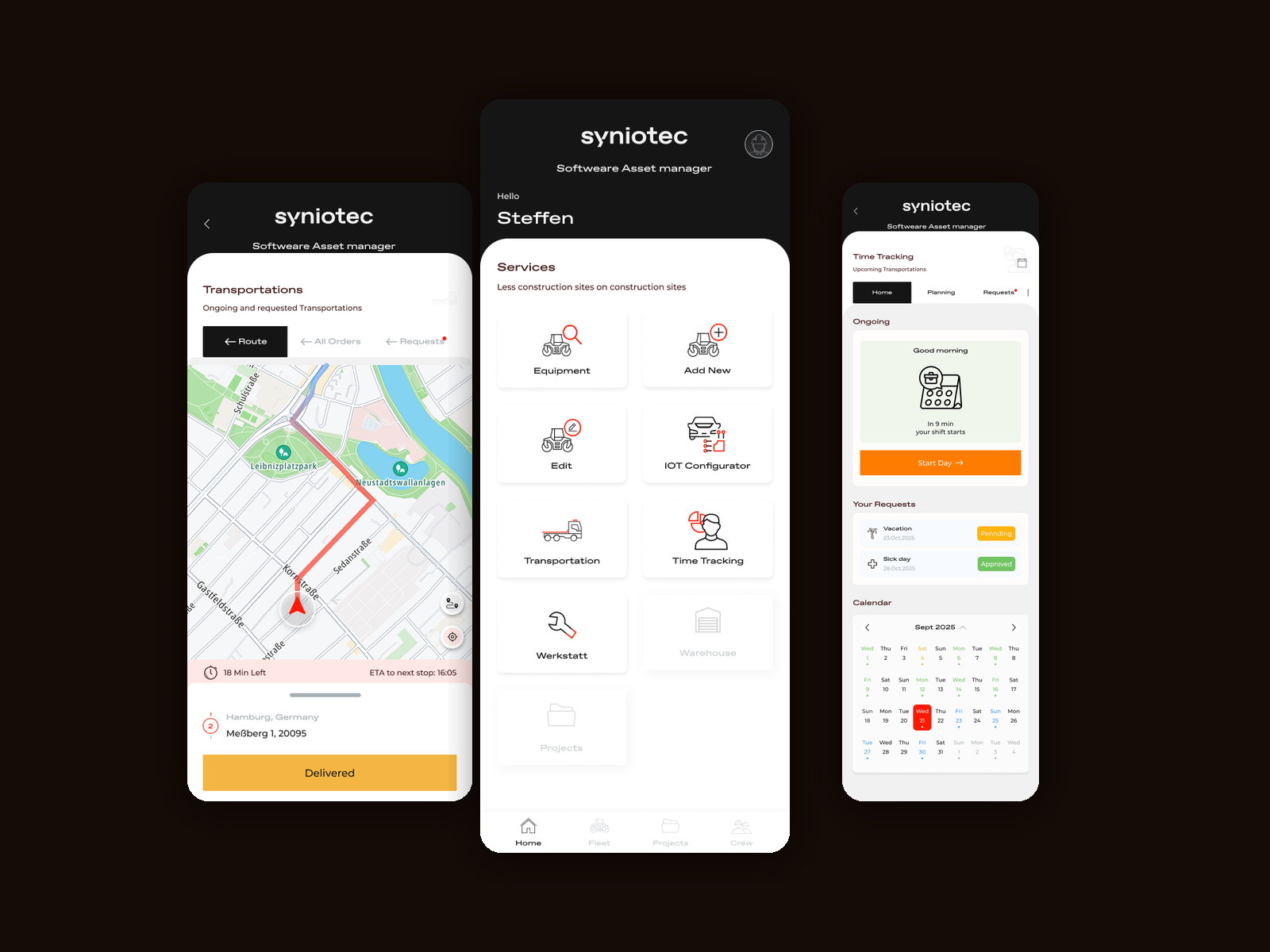
The desktop platform describes a fleet. The phone has to get somebody through a day.
SAM's original research found that field staff routed around the software because a phone call was faster. The desktop rebuild answered that for dispatchers and the office. It did not answer it for the person driving to Hamburg with a machine on the back.
On site, asset management is not a category of software — it is a sequence of small obligations. Clock on. Find the excavator. Take it to a job. Confirm it arrived. Book it in for repair. Ask for Friday off.
Every one of those was either a different system, a phone call, or a form somebody filled in at the end of the week from memory. The client's own line for the product says it best: less construction sites on construction sites.
Mixed literacy, mixed devices, one build
The same app is opened by a mechanic, a driver, a workshop technician and a branch manager — some of them daily, some of them twice a month, on whatever phone they already own.
Nobody opens this app to manage assets. They open it to start their shift, or to prove they delivered something.
That is why the home screen is a launcher rather than a dashboard. A dashboard assumes you came to look; a launcher assumes you came to do one specific thing and want it in two taps.
It also settled what mobile owns. Equipment, transport, time and the workshop live here because they happen away from a desk. Anything that needs a keyboard stays on the platform.
A grid of jobs, not a menu of modules.
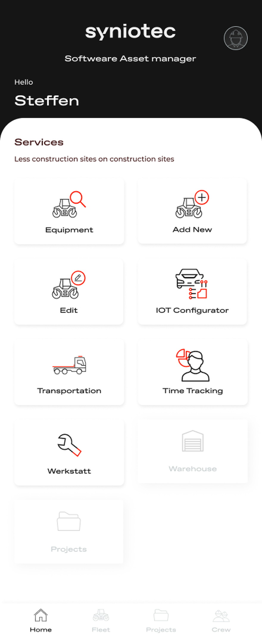
The home screen is a set of large, named actions — look up equipment, add one, edit one, configure its telematics, move it, track time, send it to the Werkstatt — and the ones a given user cannot do are shown greyed rather than hidden.
Underneath, each job is built for the moment it happens: a shift starts with one button, a delivery ends with one button, and a leave request sits beside the calendar it affects.
A launcher, and it shows you the locked doors
Every service as a large tile; unavailable ones greyed, not removed.
Icon-led tiles at that size survive a shared phone, a cracked screen and a user who opens the app twice a month. There is no navigation to learn — the whole product is visible on the first screen.
Warehouse and Projects appear greyed out rather than hidden. Hiding what a role cannot reach makes people ask colleagues what they are missing; showing it disabled answers the question before it is asked and tells them the module exists.
The shift is the first thing the app knows
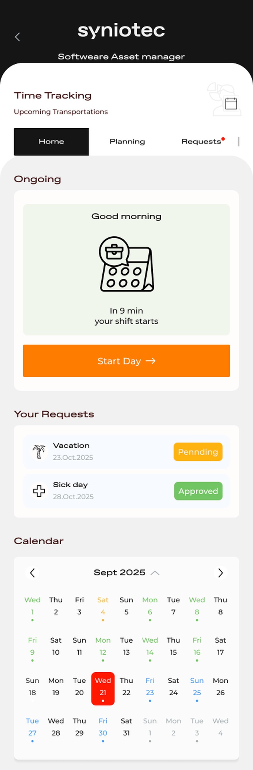
One button to start the day, and leave requests beside the calendar.
Time tracking opens on a single sentence — your shift starts in nine minutes — and one full-width action. Clocking on is the highest-frequency, lowest-thought interaction in the product, so it gets the largest target on the screen and no decisions attached to it.
Vacation and sick days sit directly under it with their status in plain language, pending or approved, because the question a worker actually has is not 'where do I file this' but 'did anyone answer me'.
A delivery ends with a button, not a form
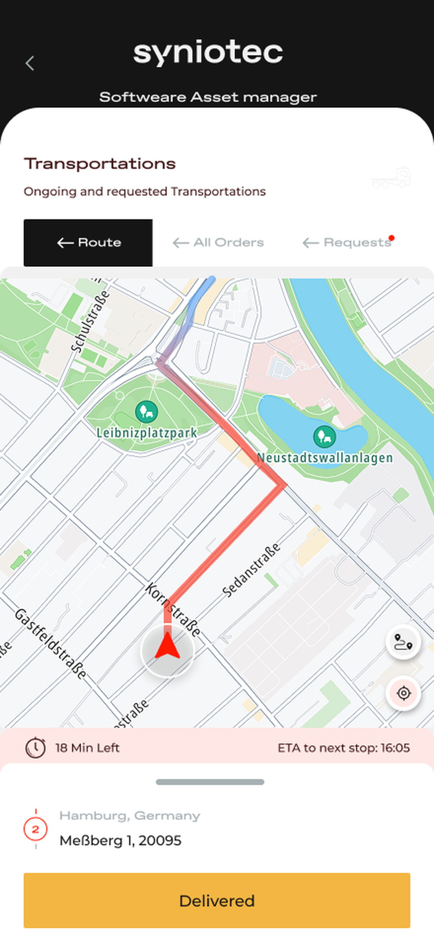
Live route, time remaining, ETA to the next stop, then confirm.
Transport is the part of the job done while moving, so the screen is a map with two facts on it — how long is left and when the next stop happens — and the confirmation is a single action at the bottom, reachable with a thumb.
Confirming arrival where it happens is what makes the platform's timeline true. The alternative, which is what existed, is a driver reconstructing three drops from memory in the evening.
Four tabs, and the workshop in the users' own words
Home, Fleet, Projects, Crew — and Werkstatt stays Werkstatt.
The bottom bar names the four things the business is made of rather than the four biggest features, which keeps the structure stable as modules come and go.
The client is a German operation and the workshop is called the Werkstatt on site, so it is called that in the interface. Translating vocabulary that a crew already shares buys nothing and costs recognition.
The record started being written where the work happens.
Shifts, transports, workshop jobs and equipment changes are now entered on site instead of reconstructed later, which closes the gap the original research found: the platform used to be a few hours out of date exactly when accuracy mattered.
Because the app shares the platform's tokens, states and component behaviour, it reads as the same product rather than a companion — a status in a driver's hand means what it means on a dispatcher's timeline.
What I would keep from this one
A field tool is not a small desktop tool. The temptation with a mature platform is to make it responsive and call that mobile, which produces something technically usable and practically ignored.
The decision I would defend hardest is the greyed-out tiles. Every instinct says hide what the user cannot use; on a crew where people cover each other's roles, showing the whole product and locking part of it turned out to explain the system better than any onboarding would have.