Neither the platform nor the operators on it have a reputation to trade on.
11 Corners aggregates tours from small Georgian operators: wine trips in Kakheti, day trips to Kazbegi, walks in old Tbilisi. Twelve hundred of them, from companies a foreign traveller has no way to evaluate and a brand they have never heard of either.
The traveller is also not where a booking engine assumes they are. Somebody typing a hotel name has decided; somebody looking at Georgia in February has not decided the country, the region or the month, and a form with four empty fields is no help to them.
So the funnel is upside down. The interesting work is above the search box — giving a person a reason to want a place — while the search box still has to be there for the minority who arrived knowing.
And a marketplace cannot vouch for its own inventory. Any ‘recommended’ ordering is a claim about operators the platform has not verified, and if it is wrong once it costs the traveller a day of their holiday.
Borrow the country’s reputation, then lend it back
Sell Georgia editorially at the top of the funnel, and make the ordering of results something a traveller can audit rather than something they have to take on faith.
A tour company nobody has heard of cannot sell itself. It can sell Georgia in February, and let the ratings do the rest.
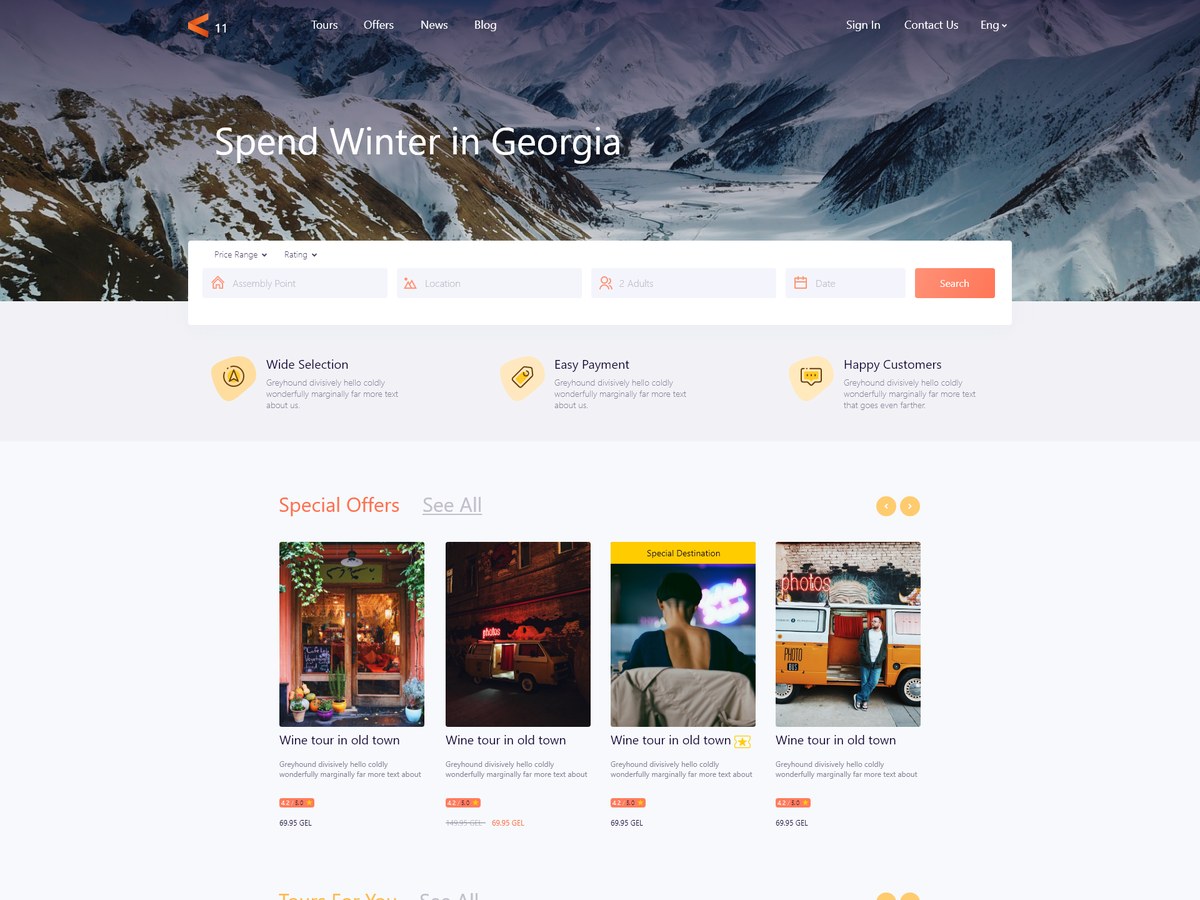
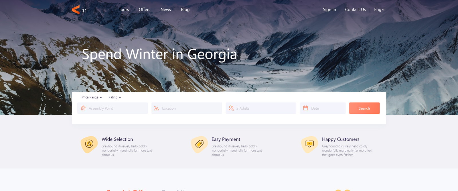
The home page therefore opens on a season rather than a search — Spend Winter in Georgia over a photograph of the mountains, with the search fields laid across the bottom of it for anyone who does not need persuading.
Everything below that is a different way of answering ‘where should I go’: offers, tours picked for you, one destination given the full width, and a blog. The catalogue itself is the last thing a visitor meets, not the first.
Editorial at the top, an auditable catalogue underneath, and one card component throughout.
The home page runs a seasonal hero with a four-field search laid over it, three plain reassurances, two tour carousels, a full-width destination feature and a row of articles. The listing page keeps the same search bar pinned above the results with an advanced-search toggle, because travel search is iterative rather than a single query.
The tour card is one component used everywhere — in the home carousels, in the listing grid, and at the foot of a blog post — so a small team maintains one thing and the traveller learns one object.
Open on a season, not a search box
‘Spend Winter in Georgia’, with the search fields laid across the photograph.
A search form as the hero assumes a decision the visitor has not made. Naming a season instead gives somebody a reason to be here before asking them to specify anything, and it is content the platform can change four times a year without a redesign.
The fields still sit on the hero rather than a screen below, so the person who does know what they want has lost nothing. Underneath, three plain reassurances — wide selection, easy payment, happy customers — answer the first three doubts about an unfamiliar booking site before any tour is shown.
Two carousels that mean different things
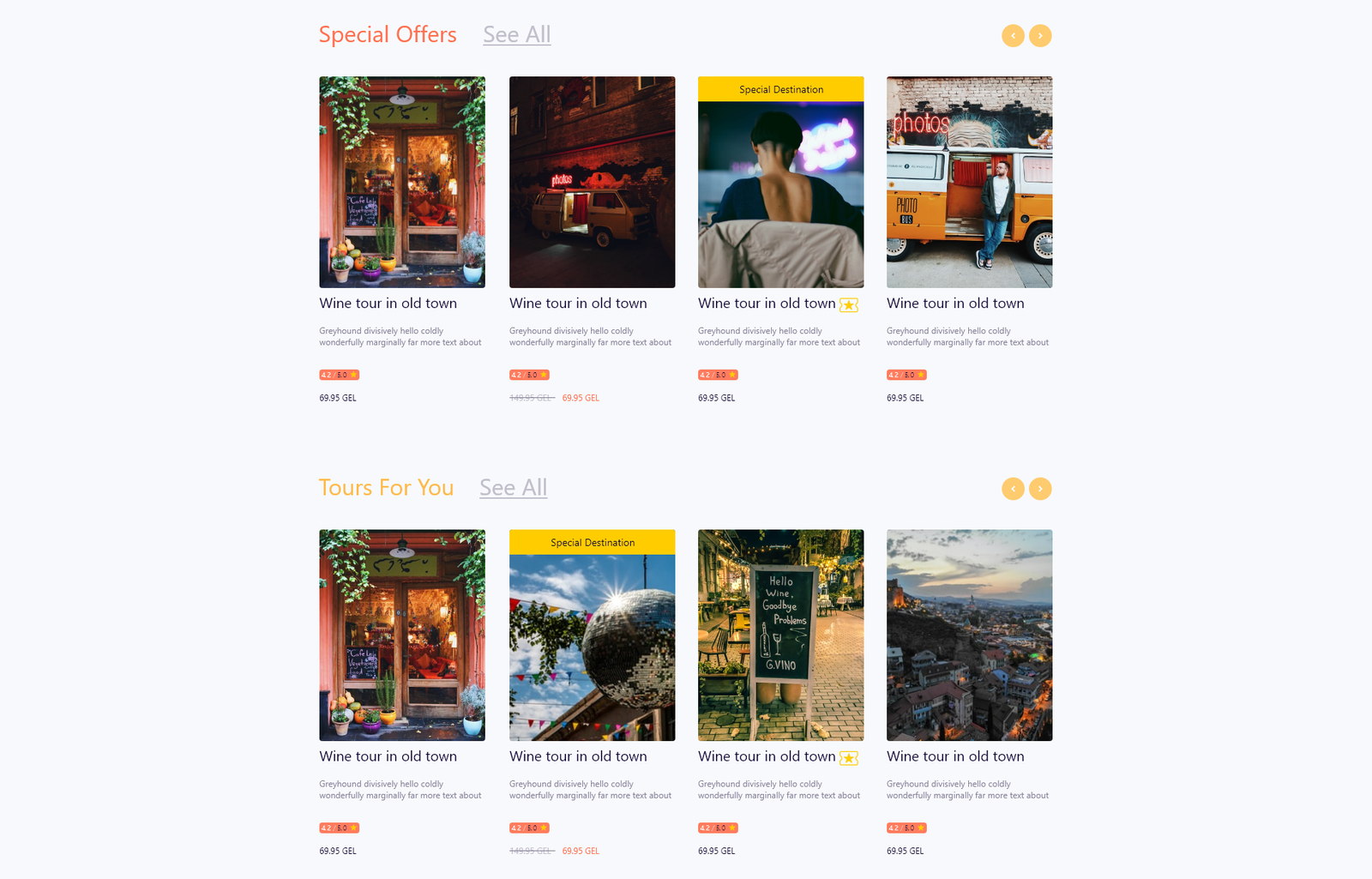
Special Offers, then Tours For You.
One row is priced — discounted trips, with the old figure struck through — and the other is chosen. Merging them into a single ‘featured’ rail would have made both meaningless, because a traveller reads a discount and a recommendation completely differently.
Both are carousels rather than grids so the page stays scannable at full height. On a home page whose job is to give reasons, a visitor should reach the bottom of it.
One destination gets the whole width
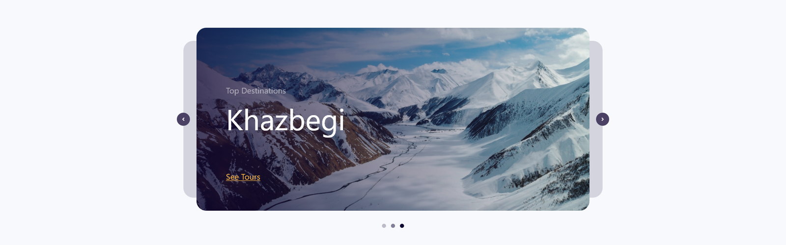
A full-bleed card: Top Destination — Kazbegi — See Tours.
Between two rows of identical cards, one place is given a photograph large enough to actually want. It is the only module on the page that sells a location rather than a product, and it is what turns a browse into a search.
It is a slider, so the featured destination rotates without the layout changing — the same editorial slot works in every season.

Put the articles on the home page
Three posts, in the same rhythm as the tours.
Somebody who has not chosen a country will read before they book. Putting the blog on the home page rather than behind a nav item treats reading as part of the funnel instead of as content marketing filed elsewhere.
The cards use the same proportions as the tour cards, so the page has one rhythm and the articles read as part of the offer rather than as a separate publication.
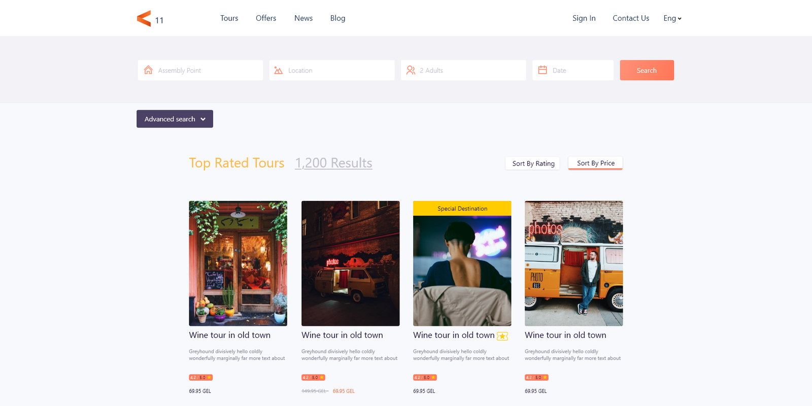
Twelve hundred results, and only two ways to sort
‘Top Rated Tours — 1,200 Results’, sorted by rating or by price.
The count is stated because on a marketplace it is reassurance rather than a warning: twelve hundred trips means the answer is probably in here.
There is deliberately no ‘recommended’ option. A marketplace that has not vetted its operators cannot honestly promote one over another, and rating and price are the two orderings a traveller can check for themselves. Removing the third one removes the only sort that could quietly be sold.
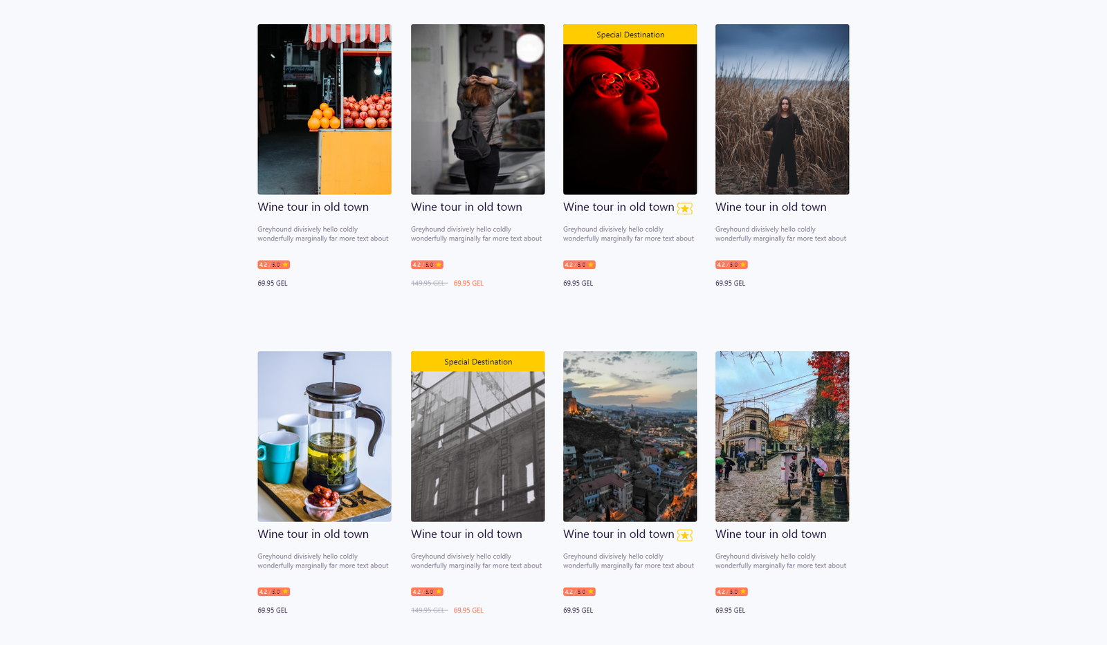
One card, and a ribbon when the client needs one
The same tour card everywhere, with a ‘Special Destination’ flag on some.
Photograph, title, one line of description, a price chip. The identical component appears in the home carousels, the listing grid and under a blog post, which keeps the build small and means a traveller learns the object once.
Merchandising is handled by a corner ribbon rather than by a different card. It gives the client somewhere to promote without letting promotion distort the grid — the flagged tour is still directly comparable with the ones beside it.
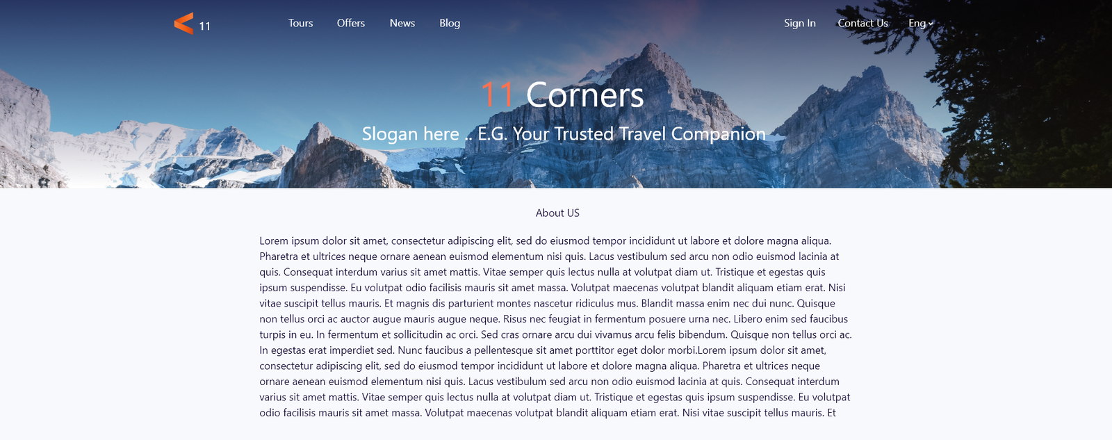
The About page is built from the home page
The same reassurances, offers, tours and articles, under a paragraph.
A traveller reaches About because they are unsure, and the honest answer to that is not more prose — it is the reassurances again and then the actual inventory. The page states who the company is and immediately resumes selling.
It is also the maintenance argument. Composing it from modules that already exist means a two-person team never has a page that quietly goes stale, and there is no second layout to keep in step.
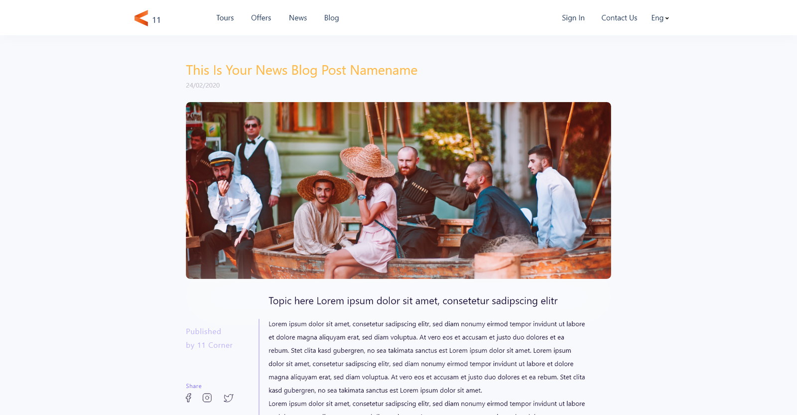
An article is a page, not a post
A wide single column, inline photographs with captions, and sharing in the margin.
The reading experience is given the full treatment — generous measure, images that break the text at their own scale, captions in their own voice. If reading is part of the funnel then a cramped blog template is a leak in it.
Author and date sit at the top with the share controls beside them rather than at the end, because on travel content the decision to send an article to whoever you are travelling with happens while reading it.
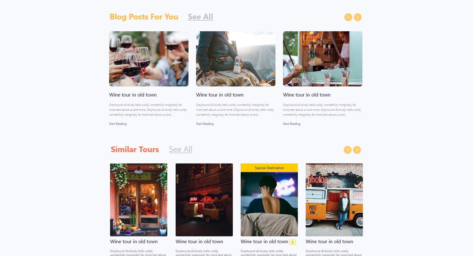
The article ends in tours
More reading, and then Similar Tours.
Every post closes with two rows: other articles for somebody still exploring, and bookable trips for somebody who has just been convinced. The second row is the whole reason the blog exists.
They are in that order on purpose. Leading with tours would make the article read as an advert, which is exactly what stops it working.
A marketplace that argues before it asks.
The platform sells a season, then a destination, then an article, and only then a catalogue — with twelve hundred tours ordered by two things a traveller can verify.
One card component carries the inventory across every surface, and the About page is assembled from the same modules, which is what makes a catalogue this size maintainable by a small team.
What I would keep from this one
Refusing to build a ‘recommended’ sort is the decision I would defend hardest. It is the one every marketplace adds and the one that quietly turns a ranking into inventory to be sold — and on a product where a bad result costs somebody a day of their holiday, that trade is not worth making.
Leading with a season rather than a search box is the other. It dates the home page on purpose, which sounds like a liability and is actually the thing that makes it worth returning to.