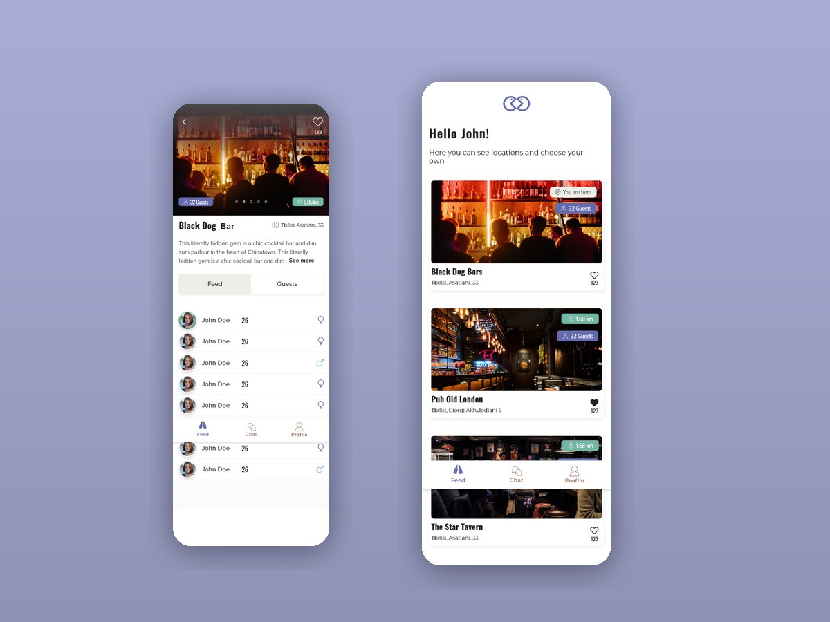
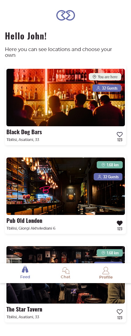
Meeting people nearby is a safety problem long before it is a matching problem.
The obvious version of this app is a map of people around you. That version is also the one nobody sensible installs — broadcasting your live position to strangers is a cost no amount of social upside pays for.
The second problem is the opening move. Talking to somebody in a bar is hard because there is nothing to talk about yet; an app that drops two strangers into an empty message thread has reproduced exactly that difficulty on a smaller screen.
And the whole thing only works in the moment. A person is in that bar for two hours. Anything that takes a profile, a questionnaire and a matching algorithm has missed the evening it was supposed to be part of.
Put a place between the two people
A venue is public, chosen, temporary and shared. It solves the privacy problem and supplies the first thing to talk about at the same time.
Nobody wants to announce where they are. Plenty of people are happy to announce which bar they are in.
Those sound like the same statement and are not. A live location is continuous, precise and involuntary-feeling; a check-in is a single, deliberate act attached to a public place you already walked into.
Building the product around the venue rather than the person changed what the interface had to show. There is no map of people anywhere in it — only a list of places, and inside a place, a list of the people who chose to say they were there.
Places first, people second, and nothing visible until someone opts in.
Three tabs carry the entire product: Feed is the list of venues near you, Chat is the conversations that came out of them, and Profile is four facts about you. Nothing else was added, because the app is used standing up, in a loud room, for a couple of hours.
Everything below that is one level deep. There is no discovery layer, no feed of people and no map — the venue does that work, and the rest of the app exists to get you into one and then out of the way.
The list is of places, not people
Photograph, name, address, distance, guest count — and ‘You are here’ on the one you checked into.
Leading with venues means the app never has to show a person on a map. The nearest thing to a location it reveals is one a user typed themselves by choosing to check in, and that state is marked plainly on the card as You are here.
Each venue carries how many people are currently checked in and how far away it is, to two decimals. Both are decision information rather than decoration: thirty-two guests and 0.05 km is a different evening from four guests and 1.68 km, and nothing else on the card distinguishes them.
Guests are behind the check-in
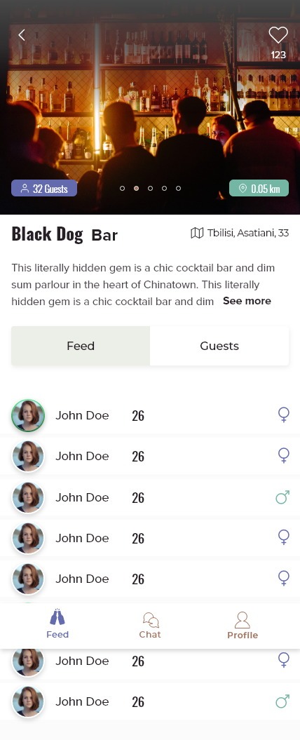
Feed and Guests as two tabs inside a venue, with a photo carousel above them.
Reciprocity is the rule that makes this safe to use: you can see who is here because you have said you are here too. It removes the lurker, and it removes the need to explain a privacy model in a paragraph.
A guest row is a photo, a first name, an age and a gender mark — nothing else, and no message button on the row. Anything richer turns a bar into a dating profile, which is a different product with a different tone. The venue keeps its own like count, so popularity attaches to the place rather than the people in it.
Chat is ordinary on purpose
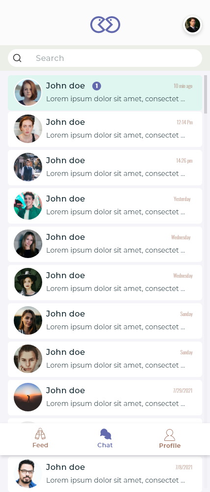
A search box, unread counts and timestamps. Nothing invented.
The conversation is the payoff, not the place to be clever. Anything unfamiliar here — disappearing messages, gimmicked composers, a novel list — would make people hesitate at exactly the moment the product is supposed to be working.
So it looks like every messaging app anyone already uses, which is the highest compliment a chat screen can be paid. The only thing worth designing is how you got into the thread, and that happened two screens earlier.
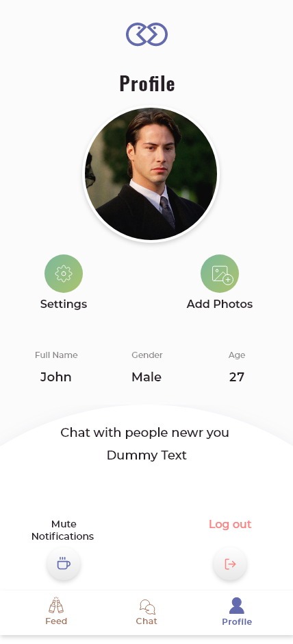
A profile with four fields
Photo, name, gender, age — and a mute switch.
No bio, no interests, no prompts. Every field a profile gains is a field somebody is judged on before they have spoken, and the venue was supposed to do that work instead.
Mute notifications sits on the profile rather than in a settings tree, because a social app that pings you in a bar you are already sitting in is a social app you delete.

A mark that means two people
Two interlocking rings, and a welcome screen that says nothing else.
The identity had to work at the size of an app icon and stay legible on a photograph of a dim room, so it is one shape with no wordmark inside it. Two rings overlapping, each with an eye, is the shortest possible statement of what the app is for.
The opening screen carries only that mark. A product about meeting people in the next twenty minutes should not begin with a value proposition.
A social app that never shows you a person on a map.
The venue model resolved the two hardest problems at once: it gave the product a privacy rule a user can hold in their head, and it gave every conversation a subject before the first message.
It also kept the interface to three tabs and a profile with four fields, which is the right size for something opened between two drinks rather than studied at home.
What I would keep from this one
The instinct with a proximity product is to make proximity the feature. Making it a consequence instead — of choosing a place — is what made it usable by people who would never switch on a live location.
If I revisited it, the check-in would need an expiry that is visible in the interface. A guest list that quietly includes people who left an hour ago is the failure mode that would erode trust fastest, and thirty-two guests is only reassuring if the number is true.