The courier is the only person in the delivery chain who is standing up.
Everybody else in the system — dispatcher, warehouse, support — is at a desk with two hands free. The courier is outdoors between two drops, holding a parcel, glancing at a phone for a few seconds at a time.
There is no session in the usual sense. There are twenty ten-second sessions across a shift, each with exactly one thing to do, and the interface has to be re-enterable at any point without losing where you were.
The information itself is also more awkward than it looks. A Georgian address is rarely enough to find a door — the useful part is ‘intercom 36B, left door from the lift’, which no address field has a place for.
And the app holds something personal: how the courier is ranked against their colleagues, and how much they have earned today. Putting pay inside a work tool changes how often it is opened and how much it is trusted.
Every interaction happens between two stops
One screen, one glance, one action — and the ability to pick up exactly where the last glance ended.
A courier does not have orders. They have a pile to pick up and a pile to drop off, and the day ends when both are empty.
That sentence became the navigation. Three tabs — to collect, to deliver, history — rather than the usual orders / map / profile, because those are the two piles and the record of the ones already cleared.
It also fixed the density question. Somebody working through a pile wants to see the pile, so the list is a table rather than a stack of cards: twenty jobs on one screen instead of four.
A table you can scan, a row that opens where it sits, and one orange action per screen.
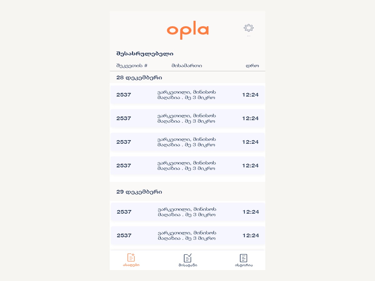
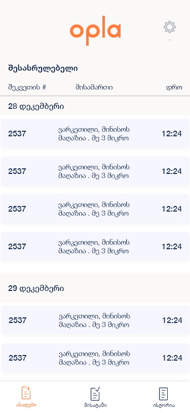
Each tab is a dated table with three columns — order number, address, time — grouped under day headings with alternating row shading, so a shift reads as a list rather than a feed. Tapping a row expands it in place.
The delivery tab can flip between the list and a map with numbered pins showing the sequence. Ratings and earnings sit behind the same shell as a three-section accordion.
The list is a table, not a stack of cards
Order number, address, time — under a date heading.
Cards are the default for mobile lists and they are wrong here. A courier is working through a pile and needs to see the size of it; a card layout would show four jobs where a table shows twenty.
Three columns is the whole record at a glance. Alternating row shading does the separating rather than borders or gaps, which keeps the density readable without costing vertical space.
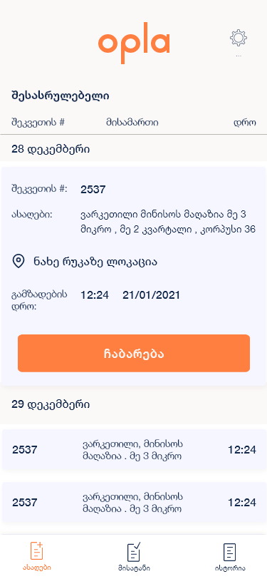
A row opens where it sits
Full address, a map link, the call time, and the action — inline.
Navigating to a detail screen and back loses the courier’s place in a list of twenty. Expanding in place means the surrounding rows stay put, which matters far more when the screen is being read in three-second bursts.
The expanded row carries only what is needed to act: where it is, when it was called in, a link to the map, and the button. Everything else waits for the detail view.

Two tabs, because it is two piles
To collect, and to deliver.
A single ‘orders’ list mixes two different physical states — a parcel that is still at a shop and a parcel already in the bag. Splitting them means each tab empties over the course of the shift, and an empty tab is the clearest possible progress indicator.
The delivery rows carry a van mark and an assignment time that the collection rows do not, because those are the two facts that only matter once something is in your hands.
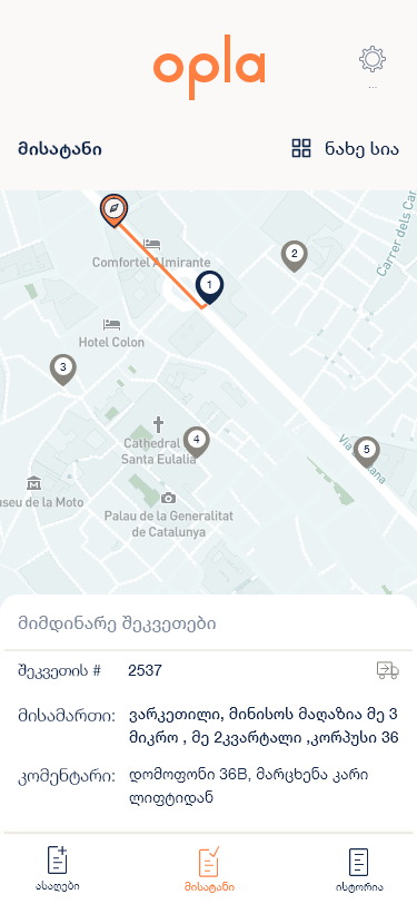
The map is a view, not a tab
A list/map toggle on the same set, with numbered pins.
Making the map its own tab would split one job across two places. Toggling keeps it as a second reading of the same orders — and the pins are numbered rather than identical, so the map answers what order do I do these in rather than just where are they.
Under the map sits the current order with a comment field carrying what an address cannot: intercom 36B, left door from the lift. That line is the single most valuable field in courier software and it is given its own label rather than being appended to the address.
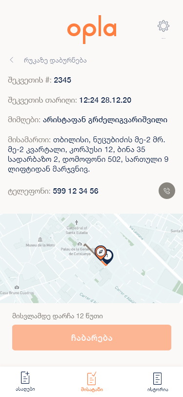
You cannot mark it delivered from the sofa
‘12 minutes until arrival’, and the button greyed out until then.
Proof of delivery is worth nothing if it can be tapped early. The button is disabled with the reason written directly underneath it, so a courier who reaches for it sees why rather than assuming the app is broken.
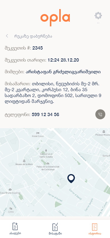
The detail screen puts the recipient’s name, the full address and a phone number with its own call button in reach. Calling ahead is the most common recovery action in delivery, and it should never be more than one tap from the address that failed.
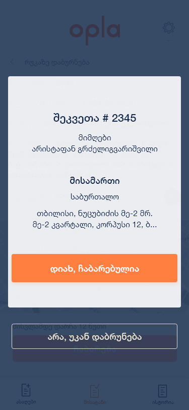
Two named outcomes, not a swipe
‘Yes, delivered’ or ‘No, return it’.
Handing over a parcel is a financial and legal event, so it gets a modal that restates the order number, the recipient and the address before anything is confirmed. A swipe or a checkmark is too easy to do by accident with a parcel in the other hand.
The failure path is offered in the same breath and written as a sentence rather than as Cancel. A courier who cannot complete a drop needs a route through the app, not a dead end that leaves the job open.
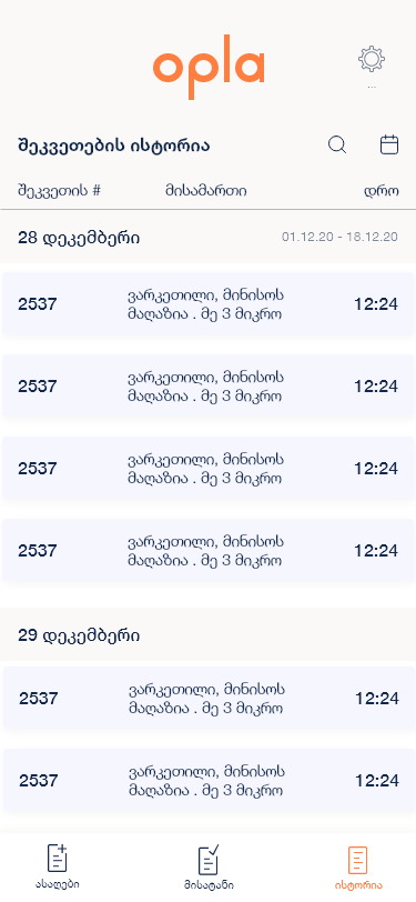
History is searched by date, because that is how disputes arrive
A date range, a search field, and the same table.
‘Where was my parcel on the twelfth’ is the question this tab exists to answer, so the calendar is at the top rather than in a filter sheet. The range shows as plain text — 01.12.20–18.12.20 — and stays visible.
The rows are the identical component from the other two tabs. Once a courier has learned the table, they have learned the whole product.
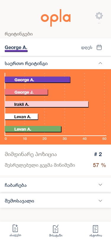
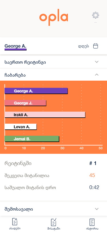
The leaderboard has real names on it
A ranked bar chart of couriers, with your own position stated.
This is the decision in the project that I would still argue about. A named ranking is genuinely motivating near the top and quietly punishing near the bottom, and it is the client’s call rather than the designer’s.
What design could do was give the courier their own numbers alongside it — current position, deliveries completed, average delivery time, percentage of target — so the chart is context for a personal figure rather than the only thing being shown.
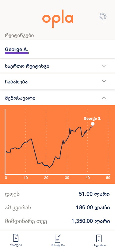
Pay sits in the same accordion as performance
Today, this week, this month — under a rising line.
Earnings are the reason this section gets opened, and separating them from the ranking would have implied the two are unrelated when the whole point of the ranking is that they are.
Three totals and one line is deliberately all of it. A courier checking pay between drops wants a number, not a breakdown — and a rising line is legible in the second and a half this screen actually gets.

A login with nothing on it
A wordmark, two fields, one button.
No marketing, no social sign-in, no ‘create an account’ — couriers are issued credentials, so every one of those would be a dead end dressed as an option.
The single instruction above the fields says what to enter. On a tool people use at six in the morning, the correct amount of onboarding is one sentence.
A work tool that empties as the day goes.
Two piles that shrink, a history that answers the questions support actually asks, and a ratings section where the courier’s ranking and pay sit in the same place.
One table component carries every list in the product, so the whole app is learned once and the build stays small.
What I would keep, and what I would push back on
Shaping the navigation around the physical state of the parcels rather than around a database entity is the decision I would repeat. ‘To collect’ and ‘to deliver’ are the same records with a different status flag, and treating them as one list would have been technically tidier and much worse to work with.
The named leaderboard is the part I would question harder now. It is effective and it is not neutral — being visibly last among your colleagues every day is a real cost to somebody, and if I revisited it I would want the ranking anonymised below the top few, with the personal figures kept exactly as they are.