Picking groceries for somebody else is a job where being fast and being right pull in opposite directions.
An order arrives as a list of quantities — seventeen of one bread, two kilos of apples — and a picker walks a shop floor assembling it against a clock. Every second spent checking is a second lost, and every check skipped is a wrong item in somebody’s bag.
Groceries make the verification harder than parcels. Four breads from the same bakery differ by a word on the label, and the picker is holding a basket while reading a phone.
Shortages are constant and unavoidable. Half the orders cannot be filled completely, so ‘what happens when the shelf is empty’ is not an edge case — it is a core flow, and it ends in somebody’s money.
And it is the same company as the courier app, so the two tools had to feel like one system operated by two different jobs.
One hand, a basket in the other, and a clock running
Every screen has to be readable at arm’s length and actionable with a thumb.
A picker does not want to know what is in the order. They want to know how much of it is left.
A list of everything you must collect is demoralising at the start and useless in the middle. The same list phrased as a remainder tells you where you are in the job every time you look at it.
So the counting runs everywhere: how many kinds of product an order contains before it is opened, how many units of the current line are still needed, and how many lines are left on the button that finishes the job.
A worksheet that shrinks, a scan that verifies rather than enters, and a receipt that admits what is missing.
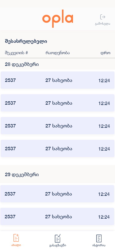
Three tabs carry the shift — new orders, ready to send, history — in the same table component as the courier app, so the two roles share one product. Opening an order gives a line-by-line worksheet where each row states what to find, how many, and how many remain.
Picking a line opens a full-screen scan with the required quantity already on it. Everything that can go wrong — the wrong code, an unreadable label, an empty shelf — has a named state rather than an error toast.
Count kinds, not items
The order list shows ‘27 kinds’ rather than a total quantity.
The number that predicts how long a pick takes is how many different products it contains, not how many units. Seventeen of one bread is one stop; seventeen different things is seventeen.
It is the only figure on the row besides the number and the time, because a picker choosing what to start is making exactly one judgement: how big is this.
The page counts down, not up
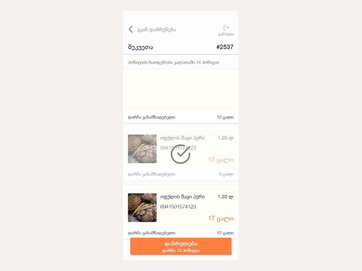
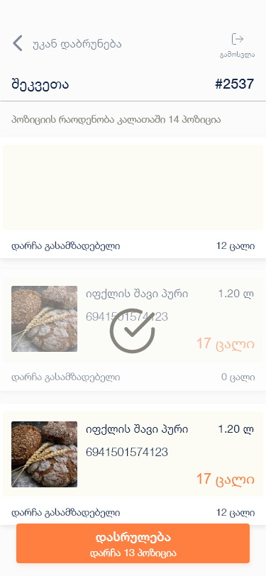
‘12 left to prepare’ on the line, ‘13 positions remaining’ on the button.
Progress bars are for people watching; remainders are for people working. Every number on this screen is phrased as what is still owed, so a glance answers ‘am I nearly done’ without any arithmetic.
A finished line greys out and takes a tick rather than disappearing. The list stays the same length all the way through, which is what lets a picker keep their place in it while walking.
The quantity is on screen before the scan
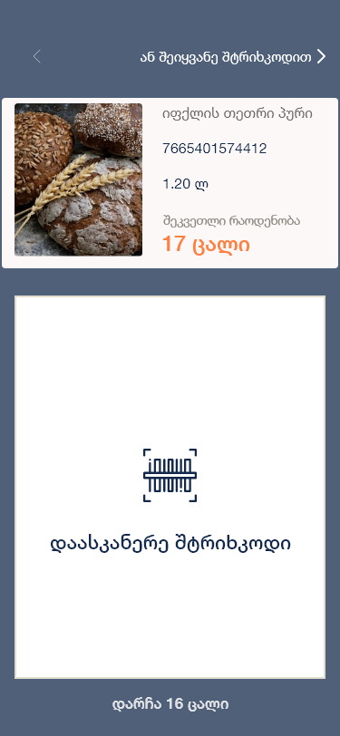
The product card sits above the scan target, with the number in orange.
Scanning is verification, not data entry — the picker already knows what they are looking for. Putting the photograph, the name, the barcode and the required count above the camera means the scan confirms a decision rather than announcing one.
The count repeats under the frame as the remainder, so the same number is visible whether the picker is looking at the top or the bottom of the screen.
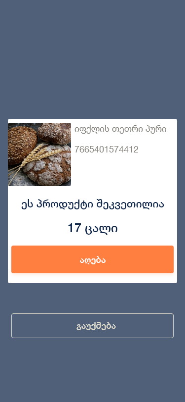
A scan is confirmed, not assumed
‘This product is ordered — 17 units’, then Add, with Cancel underneath.
A barcode reader that commits on read will eventually add something twice, and in a shop that means a wrong basket and a refund. One tap between the read and the record costs a second and removes an entire class of error.
Cancel is offered in the same panel and written plainly, because the most common reason to abandon a scan is realising you picked up the wrong size.
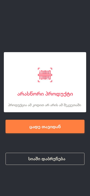
The wrong product gets its own screen
Red on dark: ‘the product with this code is not in this order’.
This is the error the whole app exists to prevent, so it is not a toast that slides away while the picker is looking at a shelf. It takes the screen, states the problem in one sentence and offers two exits: try again, or back to the list.
Inverting to dark with a red mark makes it unmistakable at arm’s length in a bright shop — the only red in the entire product, spent on the only thing that must never be missed.
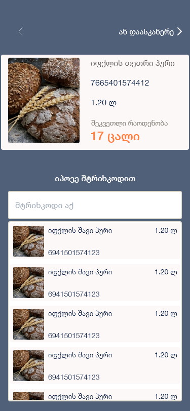
Typing the barcode is a first-class route
‘Or find by barcode’, with a filtered list underneath.
Labels get torn, frozen, wet and creased, and a scanner that fails on the seventh item stops the shift. Manual entry sits one tap from the scanner rather than three levels down in a settings menu.
It filters the order’s own products as you type rather than searching the whole catalogue, so the shortcut cannot become a way to add something that was never ordered.
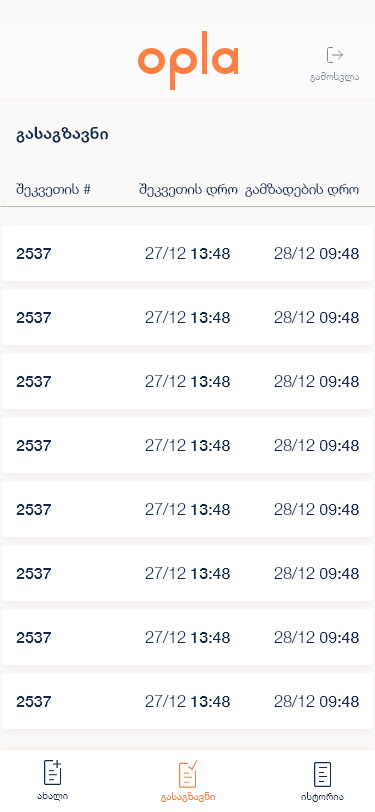
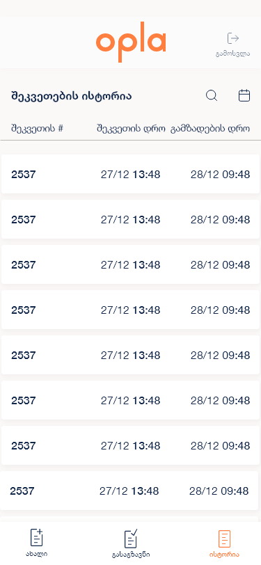
Two timestamps are the whole service level
Ordered at, prepared at — as two columns.
The ready-to-send tab exists so somebody can see how long orders are sitting. Putting the two times side by side makes the gap between them readable without a calculation, which is the only number a shift supervisor actually wants.
It is the same table as every other list in both apps. One component, learned once, used by two jobs.
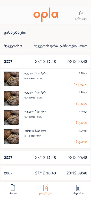
The row opens to what was actually picked
Line items with photographs, inside the row.
A packed order is checked far more often than it is read, so expanding shows the assembled contents rather than a summary. Photographs make that check possible at a glance instead of by reading barcodes.
It expands in place for the same reason as the courier app — a supervisor working down a list should not lose their position to look at one order.
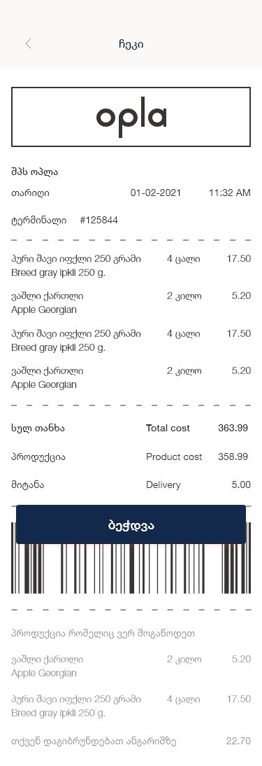
The receipt says what it could not supply
Totals, then the shortfall, then the refund amount.
This is the decision I am proudest of in the project. A grocery order that arrives short is the moment a customer decides whether to order again, and most systems handle it by quietly charging less and hoping nobody notices.
Here the receipt lists the missing items by name and quantity and states the amount going back to the account. Naming a failure and pricing it is more reassuring than a total that silently does not match — and it turns the delivery driver from somebody with bad news into somebody handing over a document that already explains itself.
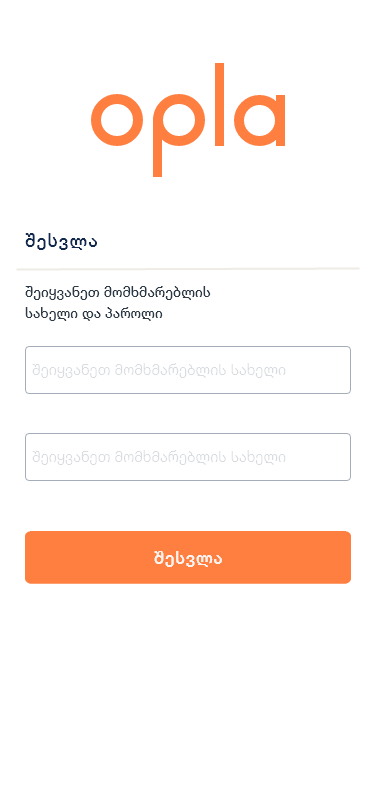
A login with nothing on it
A wordmark, two fields, one button.
Staff are issued credentials, so social sign-in and ‘create an account’ would be dead ends dressed as options. One sentence of instruction is the right amount of onboarding for a tool used at six in the morning.
It is identical to the courier app’s login. Two different jobs, one company, and the first screen of both says so.
A worksheet that empties, and an order that is honest about itself.
Pickers work down a counting-down list with scan verification at every line and a named state for each way it can fail; supervisors read two timestamps to see what is sitting.
The receipt closes the loop by naming shortfalls and refunds rather than hiding them, and the whole product shares its shell, table and login with the courier app — one system, two jobs.
What I would keep from this one
Phrasing every number as a remainder rather than a total is a small change with a disproportionate effect on a repetitive task. It is the difference between a list you are facing and a list you are finishing.
Designing the shortfall properly is the other. Teams spend their effort on the path where everything is available, and then the flow that decides whether somebody orders again gets built in an afternoon. On a grocery product it deserves the opposite ratio.