
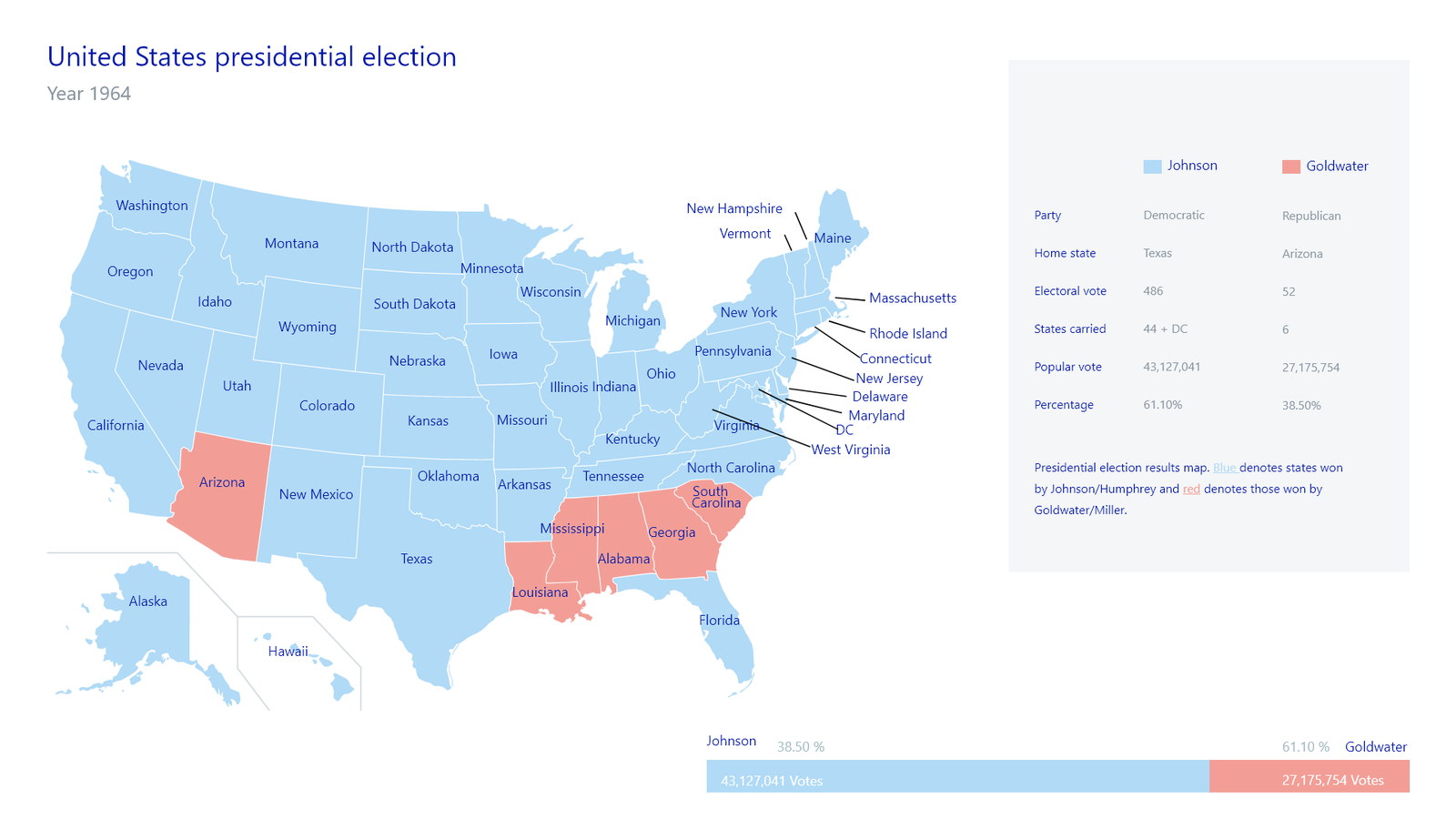
An analyst does not look at a chart. They look at forty, and only two of them matter.
Financial data arrives from several sources in several shapes, and the job is to get it into one consolidated view fast enough that the analysis happens the same day the question was asked.
At that volume, every decorative decision becomes a tax. A gradient, a drop shadow or a needless legend costs nothing on one chart and costs real time across a screen of twenty.
And the output is rarely for the person who made it. A chart is built to be sent — into a meeting, a report, a decision — so it has to carry its meaning without the analyst standing next to it.
Design the set, not the chart
Consistency across the whole family is worth more than the quality of any single visualisation, because the reader is comparing rather than admiring.
The value is not in what the chart shows. It is in how quickly you can rule it out.
Most charts an analyst opens are not the answer. The job of the visual language is to make that judgement in a second, so attention lands on the two that matter.
That points everything at legibility and consistency: same axis treatment, same density, same colour meaning, so nothing has to be re-learned chart to chart.
One visual grammar across every chart type.
Bar, line, scatter and their relatives share axis behaviour, label density, grid weight and a palette in which colour always means the same thing. Data comes in from CSV, Excel, JSON or a live source; the platform cleans and organises it so the analyst is choosing a view rather than preparing a file.
Customisation is deliberately narrow — palette, type, data labels — and annotations sit on the chart itself, so the interpretation travels with the data into whatever meeting it ends up in.
Colour means one thing everywhere
A fixed palette with fixed semantics across the whole family.
When colour is chosen per chart, the reader has to check the legend every time. Fixing it across the set turns colour into something you read rather than decode.
It also survives the real destination of these images — a slide, a printout, a screenshot in a message — where the legend often does not travel with them.
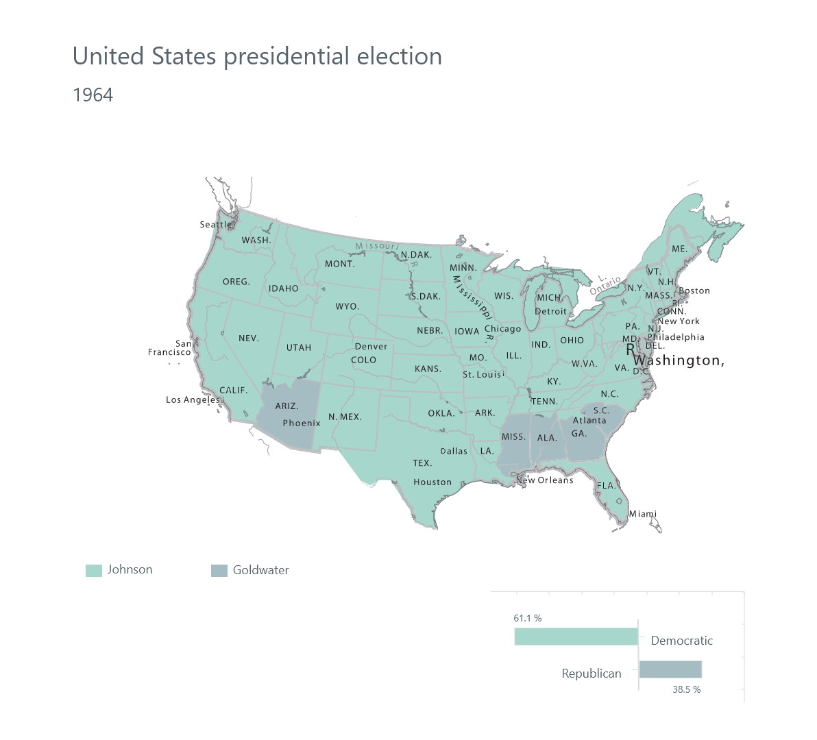
Density tuned for a screen of charts
Grid weight, label frequency and margins set for twenty at once.
Every chart was reviewed at the size it appears in a dashboard rather than at full width, because that is where the analyst actually meets it.
Gridlines and labels are the first things to thin out at small sizes; getting that threshold right is most of the difference between a readable dashboard and a wall of ink.
Annotation is part of the chart
Notes and comments attached to the data, not written around it.
A chart sent without its interpretation gets interpreted anyway, usually wrongly. Letting the analyst attach the reasoning to the point it refers to is what turns a visualisation into an argument.
Real-time sources mean the chart stays current after it is shared, so the annotation and the data do not drift apart.
A set of charts that behave like one system.
Analysts assemble consolidated views from multiple sources, read them at dashboard density, and share them with the interpretation attached.
The gain is cumulative rather than dramatic: nothing has to be re-read, because everything behaves the same way.
What I would keep from this one
Data visualisation work is judged on the showpiece chart and lived through the boring ones. Designing the axis and the label rules properly was worth more than any individual view.
The other lesson is that restraint here is not taste, it is throughput. Every removed ornament is time returned to somebody reading their fortieth chart of the day.