A listed group publishes the same figure a dozen times, and it is redrawn every time.
VEON operates across Russia, Pakistan, Algeria, Bangladesh, Ukraine, Uzbekistan and Kazakhstan. A metric like 4G network coverage is therefore never one number — it is seven series, quarter by quarter, and it appears in results announcements, investor decks, the annual report and the corporate site.
Each of those surfaces has a different background. The report page is white, the deck is dark, the campaign layout is brand yellow, the web section is light grey. A chart designed for one of them fails on the other three, so in practice somebody rebuilds it.
Rebuilding is where the inconsistency comes from — different colours per market, different quarter labels, gridlines that survive on screen and vanish on a projector, and a source line that is sometimes there and sometimes not.
For a company on two stock exchanges, that last one is not a cosmetic problem. A figure without a source and a date is a compliance question, not a design preference.
Fix the geometry, vary only the surface
If the structure, colour assignments and label rules are decided once, every context becomes a theme rather than a redraw.
The design problem was not the chart. It was that the chart had to be recognisable four times.
Consistency across surfaces is what makes a series of quarterly figures readable as a trend rather than as unrelated pictures. Somebody who saw the coverage chart in the deck should recognise it in the report without re-reading the legend.
So the work was a single geometry — the same order of markets, the same colour per market, the same axis and label treatment — with four surface treatments applied over it, rather than four charts that happen to show the same data.
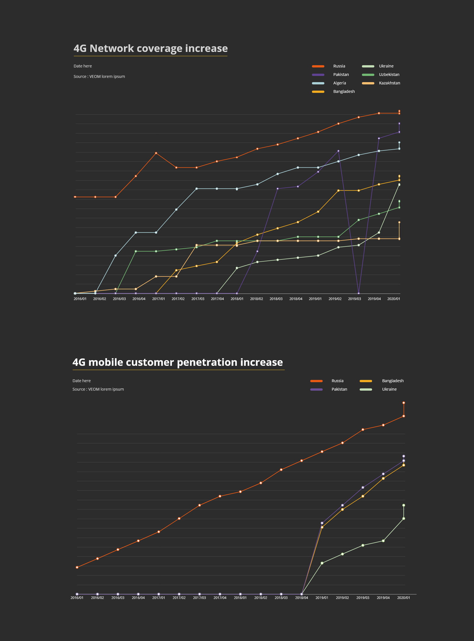
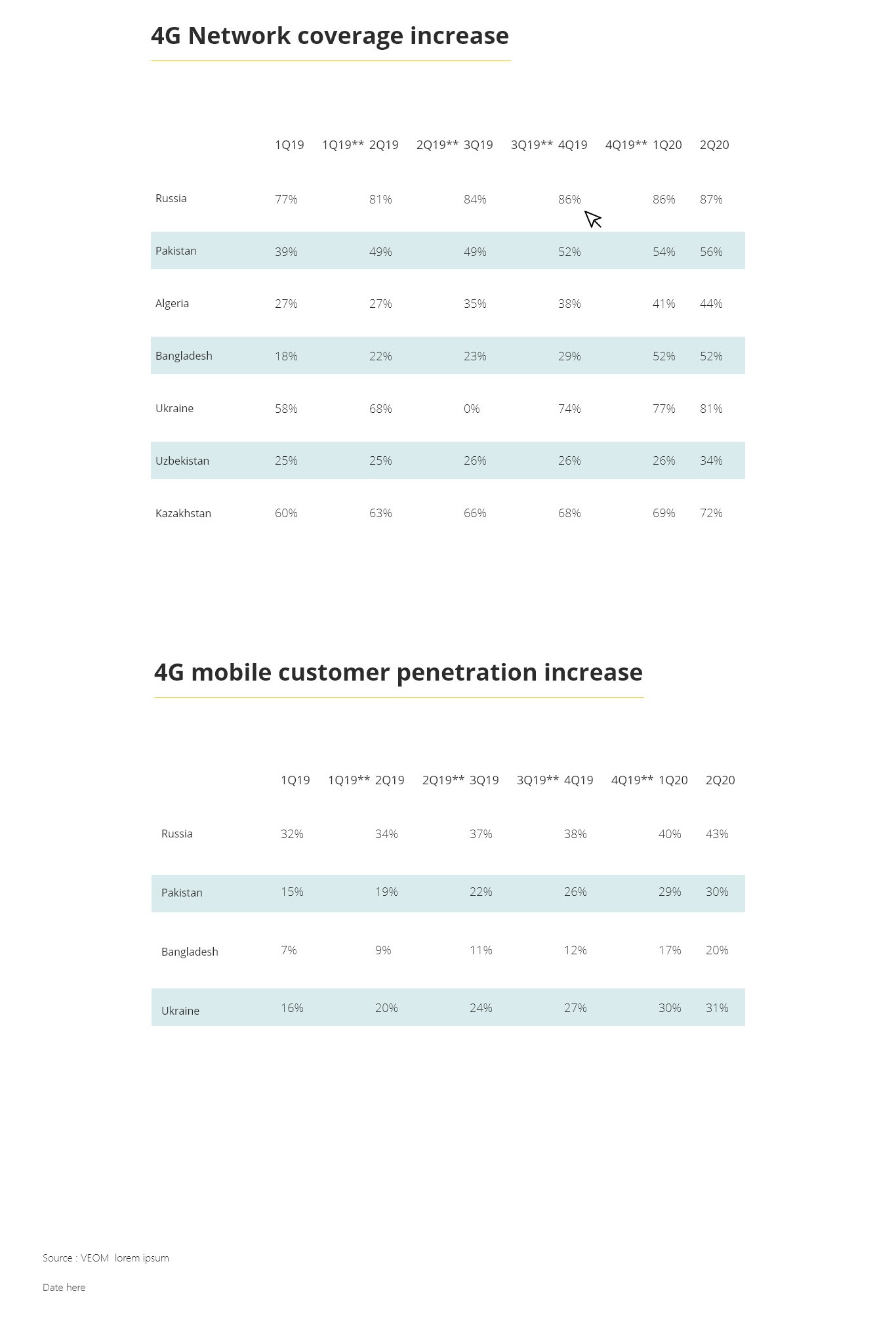
One table and one chart, each in four themes, sharing a colour key.
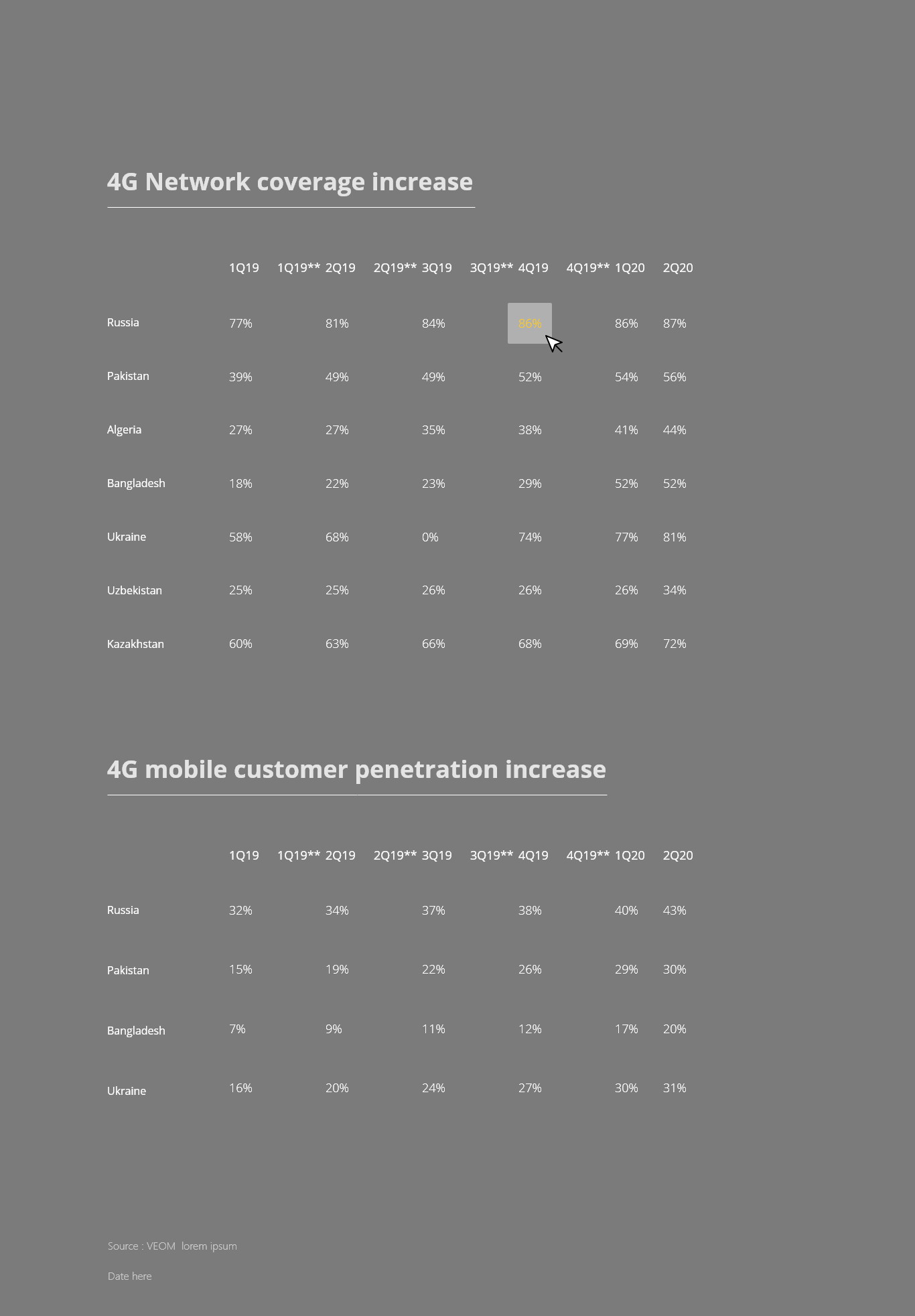
The table lists markets as rows and quarters as columns, with percentages right-aligned and a flag carrying the row. The chart plots the same markets as lines against the same quarters, with a legend that repeats the table’s order and colours.
Both exist as light, grey, dark and brand-yellow variants. Nothing moves between them except the surface: the same rows in the same order, the same series in the same colours.
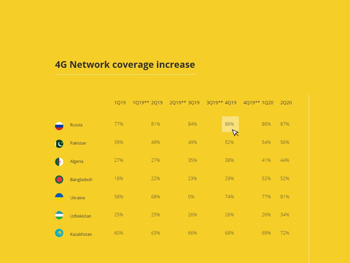
The flag carries the row
A country mark instead of a repeated name column.
In a seven-market table read across eight quarters, the eye returns to the row label constantly. A flag is recognised faster than a word and does not change length between languages, which matters on a document published in more than one.
The name stays beside it rather than being replaced by it. A flag alone is a quiz for anybody outside the region, and this is a document for investors as much as for staff.
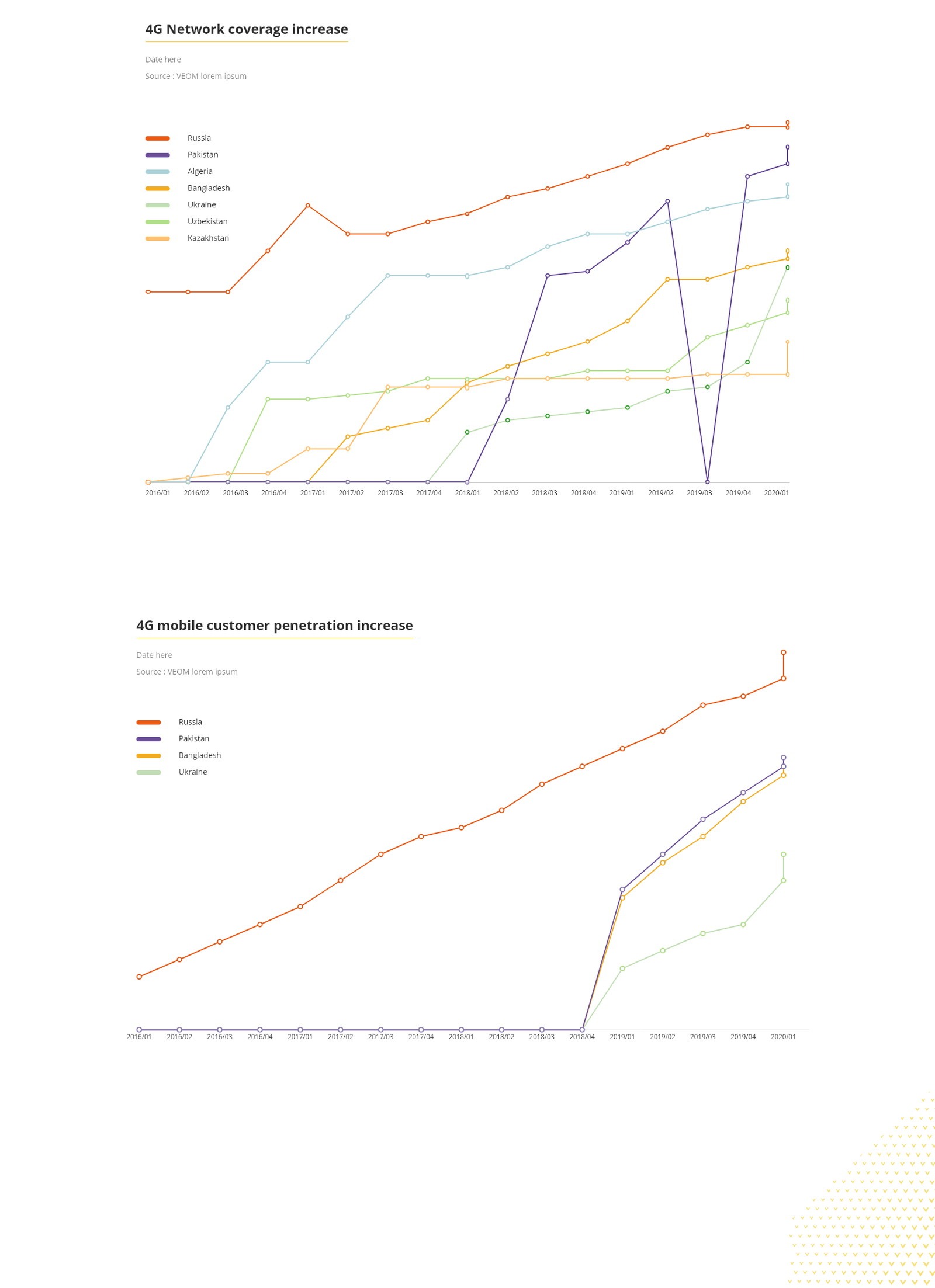
One line per market, and the legend is the key to everything
Fixed colours, fixed order, dots at every quarter.
The colour assigned to a market is the same in the chart, the legend and the table, so a reader learns the key once and carries it through a whole report. Assigning colours per chart is the single most common way this goes wrong.
Every quarter gets a visible dot rather than a smooth line. These are eight discrete measurements, not a continuous signal, and drawing them as points connected by lines is the honest representation of that.
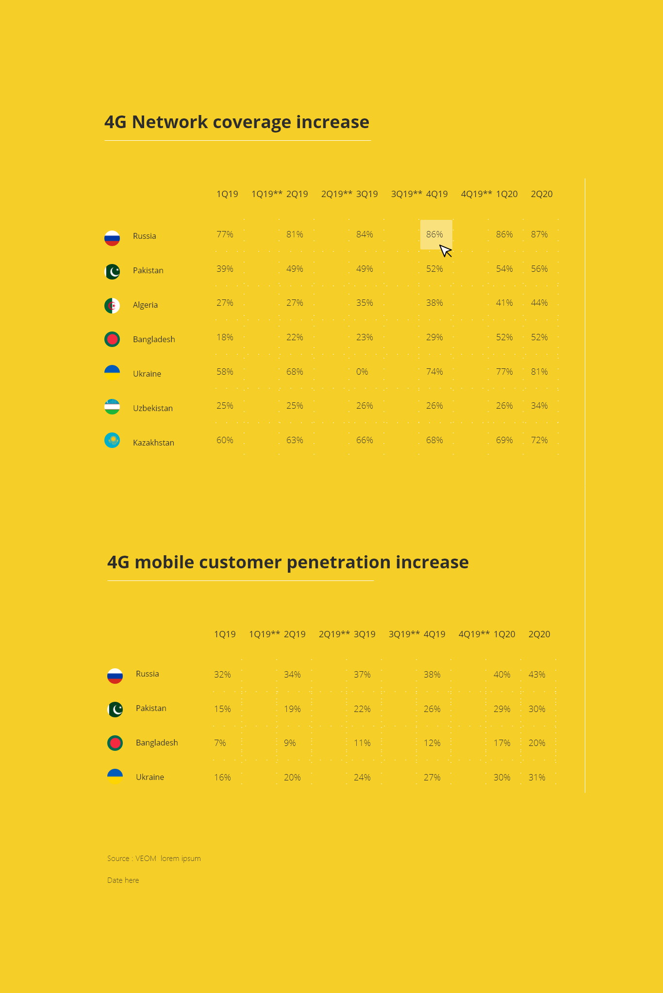
Four themes, one geometry
Light, grey, dark and brand yellow — nothing else changes.
Column widths, row heights, type sizes, axis spacing and label positions are identical across all four. Only the surface, the rule colour and the text contrast move, which is what makes the same chart recognisable on a slide and on a page.
The brand-yellow variant is the constrained one and was designed first. If the component survives being set on a saturated ground, the white and grey versions are free.
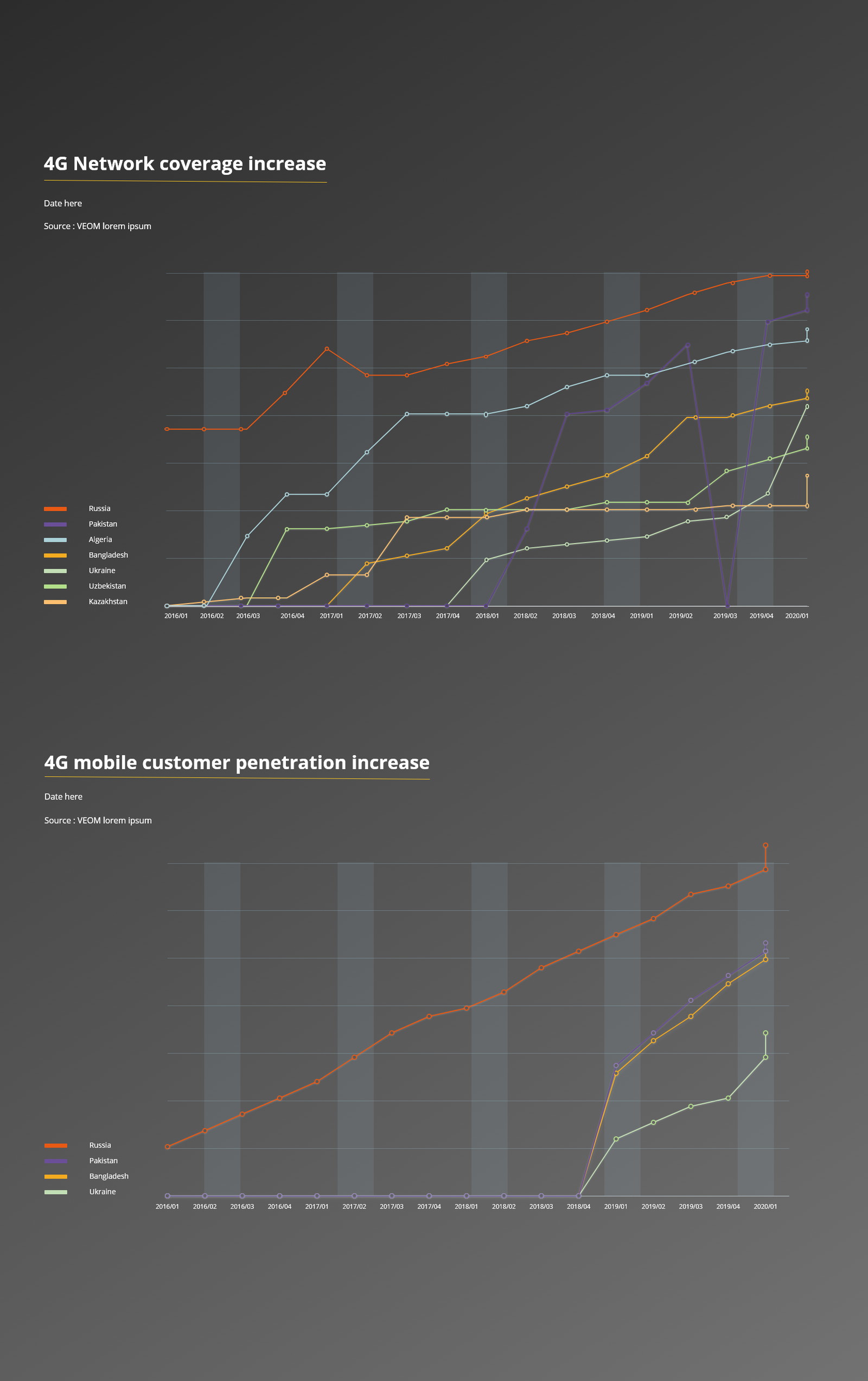
Bands instead of gridlines for the projected version
Alternating vertical column bands on the dark theme.
Fine horizontal gridlines are the first thing a projector loses, and a chart with no reference marks is a picture of a slope. Wide alternating bands behind the quarters survive projection and low contrast, and they band the axis a reader is actually tracking along.
It is the one place where the geometry is allowed to differ, because the failure mode it fixes only exists in that context.
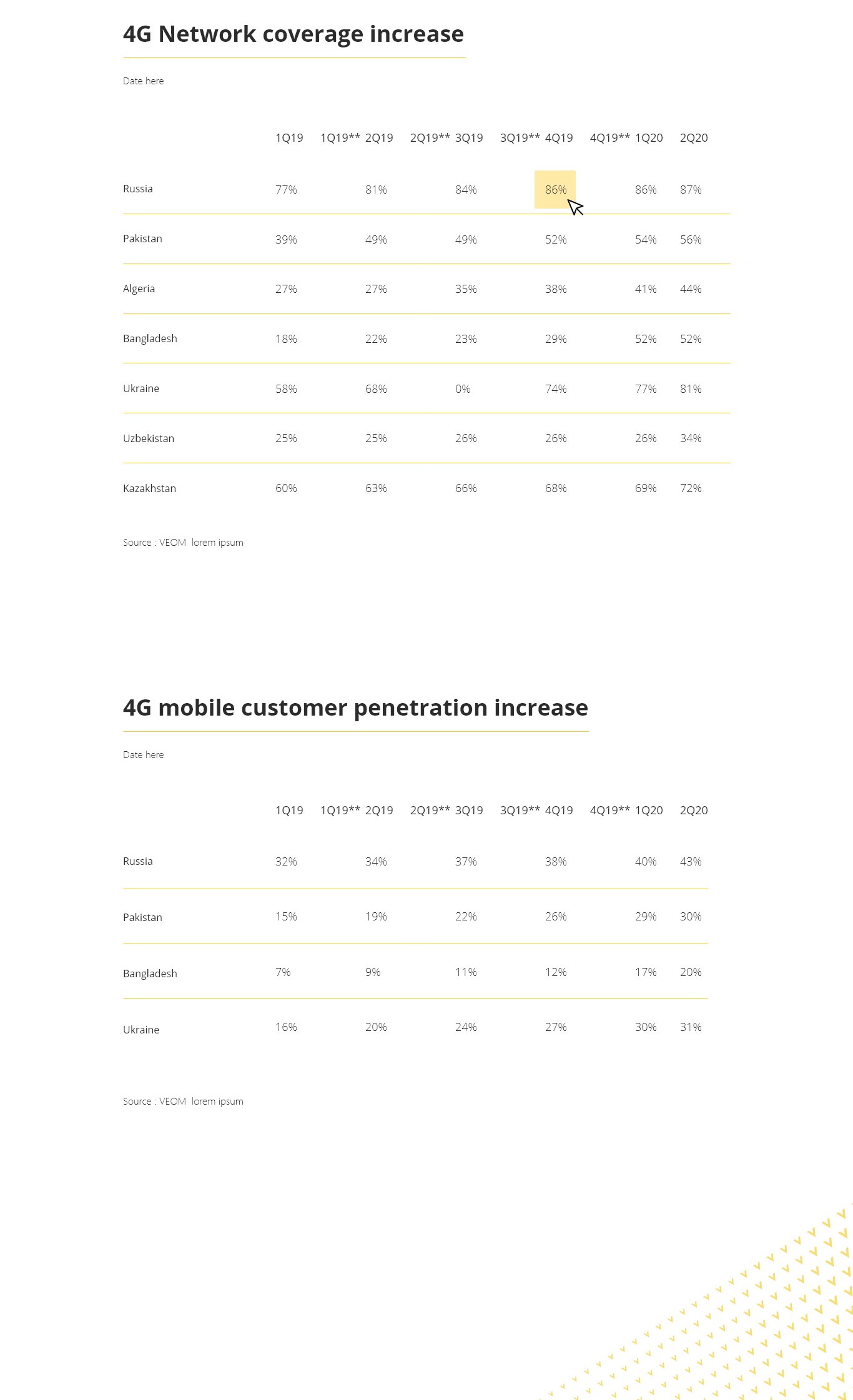
A table of fifty numbers needs a way to point
One cell highlighted, in the theme’s accent.
Seven rows by eight columns is more than anybody reads. The highlight exists so a presenter or a caption can say this one — without bolding, colouring or otherwise reformatting the surrounding data to make it stand out.
It is a single cell state rather than a row or column, because the claim being made is almost always about one market in one quarter.
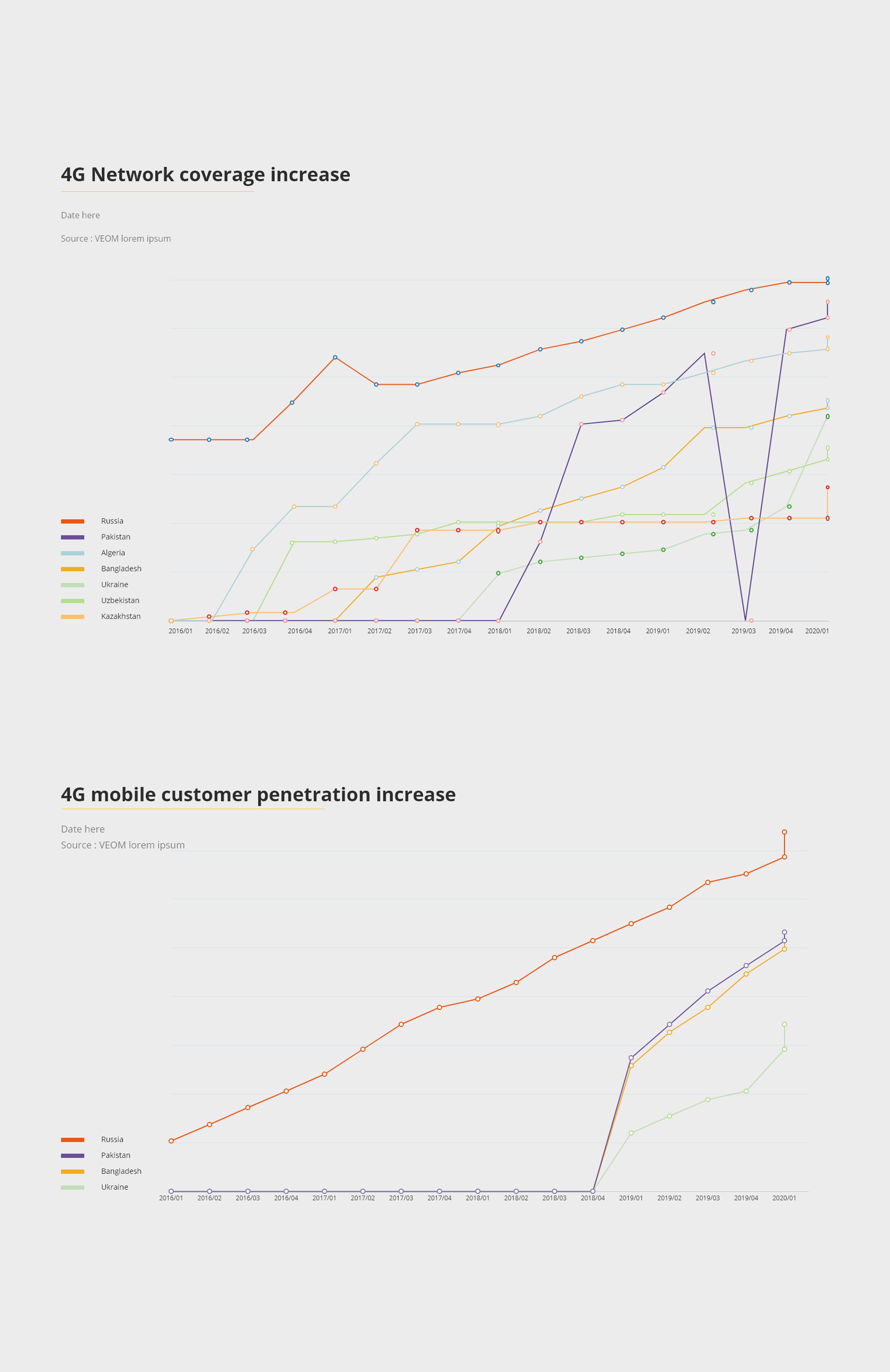
The source line is part of the component
Source and date sit under every chart and every table, always.
On a listed company an unsourced figure is a problem rather than an untidiness, so the attribution is built into the component instead of being left to whoever assembles the page.
It is set small and low-contrast so it never competes with the data, but it cannot be omitted — the component simply does not have a version without it. That is the most reliable way to make a rule hold across a large organisation.
A figure that stays the same figure wherever it is published.
Two metrics across seven markets and eight quarters, rendered as a table and a chart, each available in four surface treatments that share one geometry and one colour key.
Because the variants differ only in surface, anybody assembling a deck or a page picks a theme rather than redrawing a chart — and the source line comes with it.
What I would keep from this one
Designing the hardest-constrained variant first is a habit worth keeping. The yellow version had the least contrast to work with, and solving it made the other three fall out almost for free — the reverse order would have produced three good charts and one compromise.
Building the source line into the component rather than documenting it as a rule is the other. Guidelines get skipped under deadline; a component that has no version without an attribution line does not.