Onboarding a bank customer in Georgia means asking two databases about them, and neither one answers yes or no.
Three fields — personal number, date of birth, phone — and the app already knows more about you than you have typed. The national personal number reaches the Entrepreneurs’ Registry; the phone reaches the bank’s own customer records.
Between them they produce a branch for every kind of person who might be standing there: a genuinely new customer, somebody already in the bank’s database without an active account, somebody who already has internet banking, a business whose registry entry stops the process, and several ways for the lookup to simply fail.
There is also a compliance layer that cannot be softened away. Legal form, tax residency, whether the applicant is a US taxpayer under FATCA, and a consent text that has to be shown in full — all of it before an account exists.
The happy path is the rare one
Most onboarding is designed for the person who sails through. Here the branches were the majority of the screens, and the majority of the work.
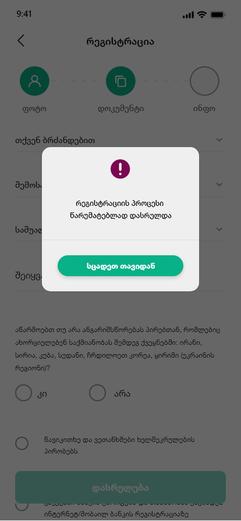
Every one of these outcomes is a person standing there with a phone. ‘Registration failed’ tells them nothing about what to do next.
An error state that only reports the system’s condition puts the burden back on the customer, who then phones the branch — which is the exact cost the app existed to remove.
So each branch was written as a situation rather than a status: what we found, what that means for you, and the one thing to do about it. That is why there are seven end screens instead of one.
Ask for almost nothing, then be honest about what came back.
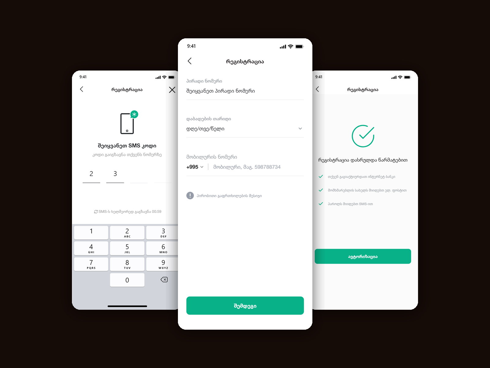
The form is three fields, and the phone number carries the country code because a Georgian bank knows where its customers are. A six-digit SMS code follows, with the number it was sent to shown on screen and a visible resend countdown — so waiting is a state rather than a silence.
The regulatory questions sit behind segmented tabs that split an individual from a sole trader from a company, so nobody reads questions that do not apply to them. Then the lookups run, and whichever of the seven outcomes comes back gets its own screen with its own next step.
Three fields, and one of them does the work
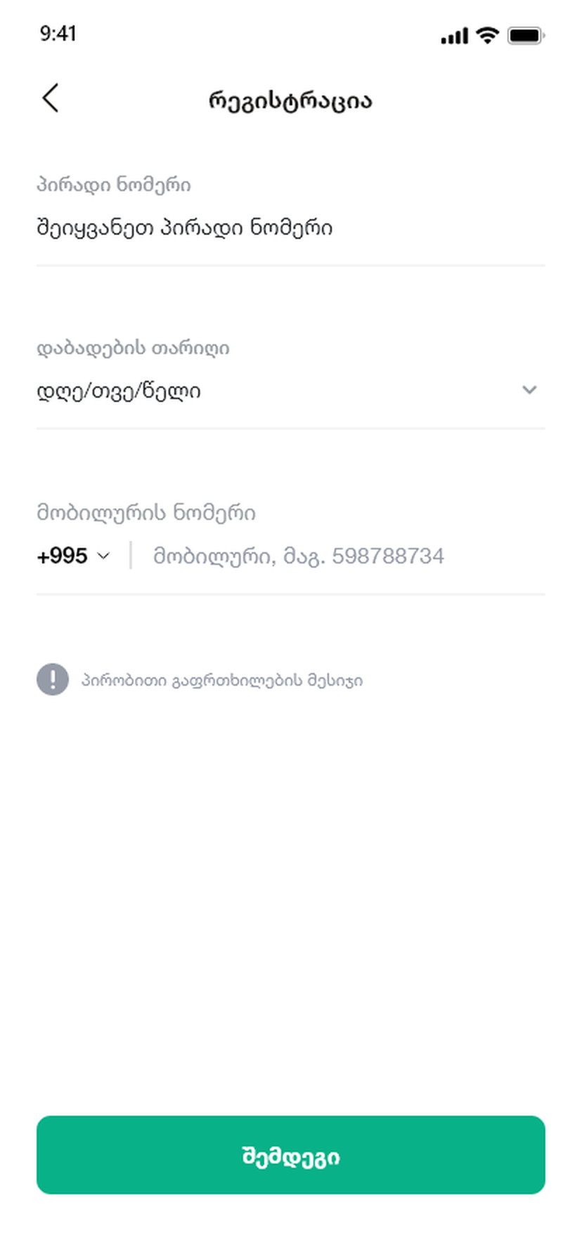
Personal number, date of birth, phone — nothing else.
The national personal number is the key to everything the state already knows, so asking for a name, an address or a company would be asking somebody to type what the registry is about to return.
The phone field carries +995 rather than a country picker. A dropdown of two hundred countries on a domestic bank’s registration form is a decision nobody needs to make.
Waiting is a state, not a silence
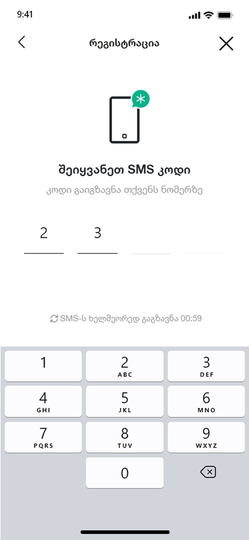
The number shown, a countdown, and a numeric pad already open.
The SMS screen states which number the code went to, which is the only question anybody has at that moment, and counts down to when a resend becomes available instead of leaving the option greyed out with no explanation.
The pad opens on arrival and the boxes advance on their own — six digits should be six taps and nothing else.
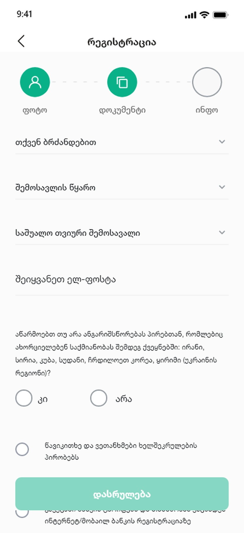
Split the compliance questions by who is answering
Individual, sole trader and company as segmented tabs.
Legal form, tax status and FATCA residency are three different conversations depending on which one you are. Putting them behind a segment means an individual never reads a question about a company’s registration certificate.
The questions themselves are asked as questions — are you a US tax resident, yes or no — rather than as the regulation they come from. The regulation is what the answer is for, not what the customer is here to understand.
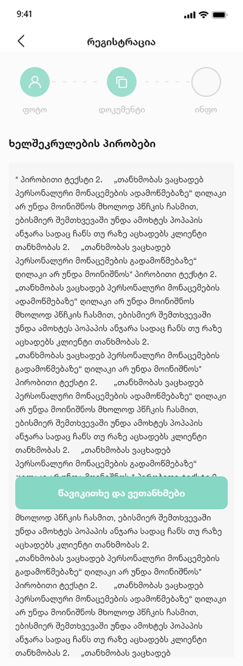
Consent shown in full, and scrollable
The whole text, with the agreement below it.
A consent that is summarised is not a consent. The full text is on the screen and the accept control sits after it, so agreement follows reading rather than replacing it.
The alternative — a checkbox next to a link — collects a tap and produces nothing anybody could defend later.
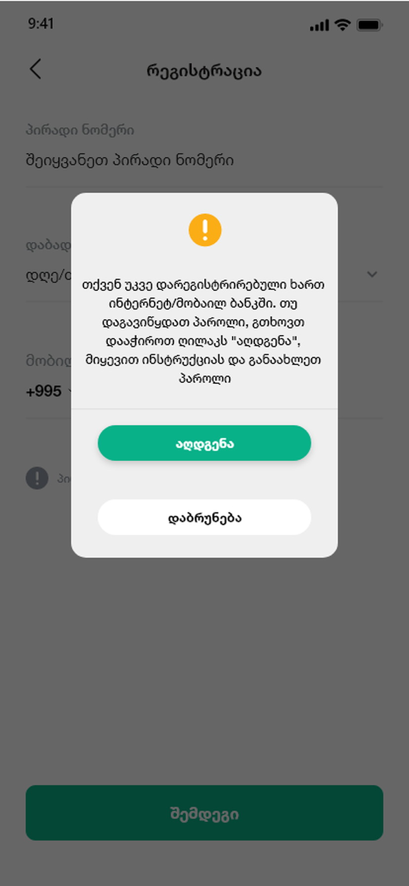
Already existing is not an error
Internet banking already active; in our records without an account.
Two of the most common outcomes are that the person is already known to the bank. Treating either as a failure sends an existing customer to a call centre to be told they are a customer.
Each gets a screen that names the situation and offers the action that resolves it — sign in, or continue and activate — so the branch is a fork rather than a dead end.
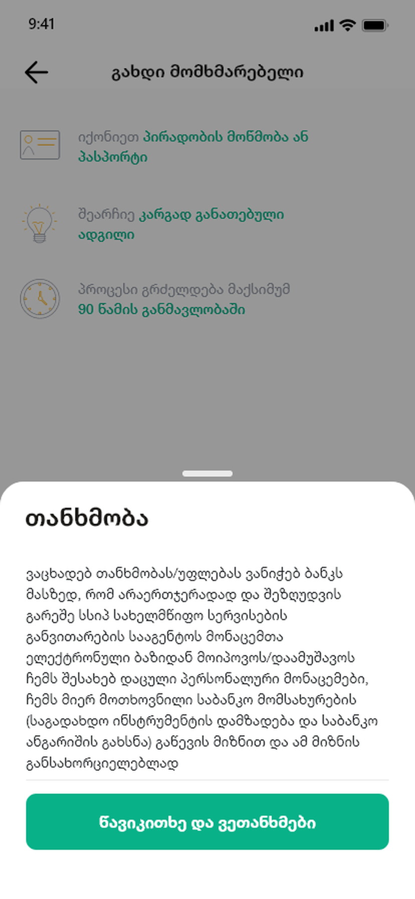
The registry can stop the process, and the screen says so
What came back, what it means, and who to talk to.
Some registry answers genuinely end the flow: a legal form the app cannot open an account for, or a record that does not exist. Pretending otherwise wastes the customer’s next ten minutes.
So the terminal screens state the finding plainly and route the person to the one channel that can help, which is the honest version of a dead end and the only one that does not generate a complaint.
An account opened from a phone, or a clear reason why not.
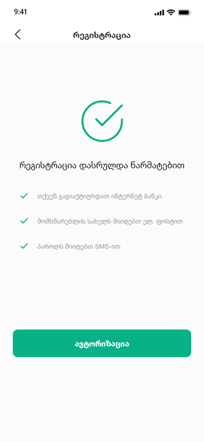
Registration takes three fields and an SMS for the straightforward case, and every other case ends on a screen that names the situation and offers a next step rather than an error code.
The success screen lists what actually happened — the account, the mobile banking access, the confirmation — because the last thing a new customer needs is to wonder whether it worked.
What I would keep from this one
Onboarding portfolios are full of happy paths. This project was almost entirely the other thing, and it taught me that the branch screens are where a bank either keeps a customer or hands them to a call centre.
The rule I took from it: an error state that only describes the system has not been designed. It has to describe the person’s situation and give them one thing to do.