Open banking asks an ordinary person to make a permissions decision that IT departments find difficult.
A competitor — named, in this case TBC — is requesting access to somebody’s Halyk accounts so that inter-bank transfers and aggregated balances work. Regulation says the customer must consent, specifically and revocably.
‘Specifically’ is the hard word. Access to balances is not access to transaction history, and neither is access to account details; and a customer with three accounts in three currencies is looking at nine possible grants per scope.
Get it wrong in one direction and the screen is a wall of checkboxes nobody reads before clicking through. Get it wrong in the other and it is a single Allow button that gives away everything and satisfies the letter of the rule while defeating its purpose.
Consent has to be readable and specific at the same time
Those pull against each other, and the resolution is structure rather than fewer options.
A person cannot reason about nine permissions. They can reason about three questions asked three times.
The grid is only overwhelming when it is presented as one flat list. Split by what is being asked for — balances, transactions, account details — and each block becomes a single comprehensible question with a familiar answer set underneath it.
Every level then gets its own select-all, so the trusting customer is one tap and the careful one still has every individual choice available. Nobody is forced through nine decisions to reach the common case.
Three scopes, each with its own accounts, each with its own shortcut.
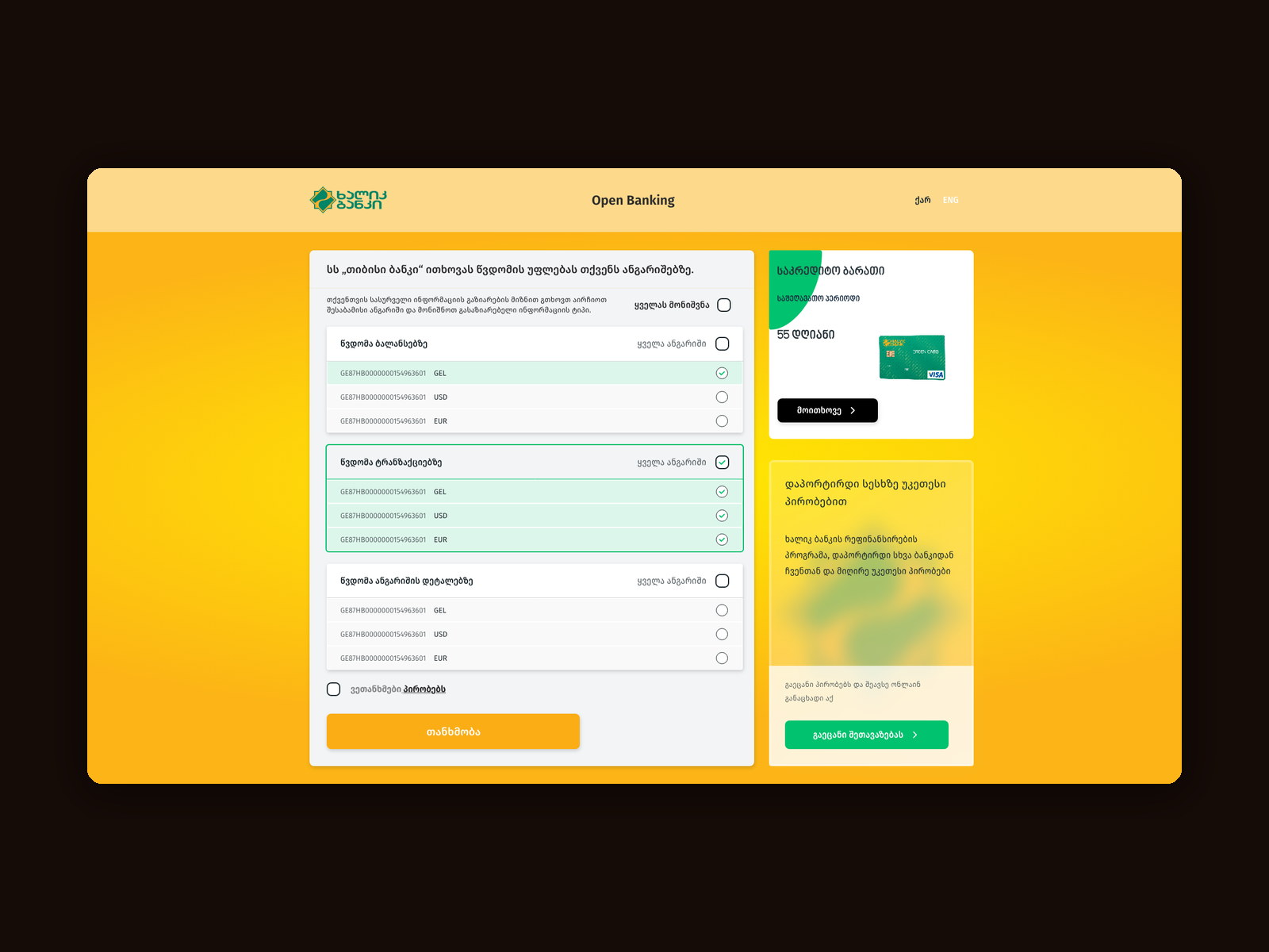
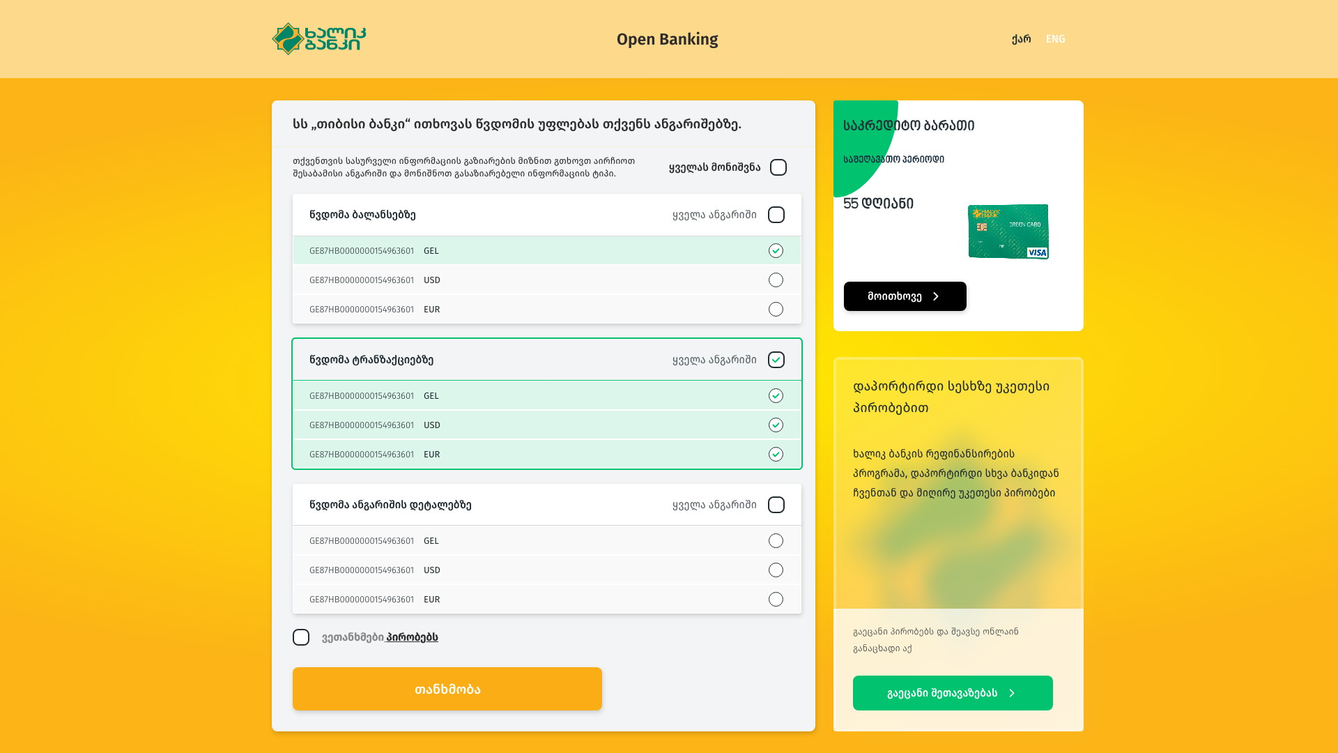
The requesting institution is named in the sentence at the top, in quotation marks, as a legal entity rather than as ‘an application’. Beneath it, three cards — balances, transactions, account details — each listing every IBAN and currency the customer holds, each with an all-accounts control, and a select-everything at the very top for people who already decided before they arrived.
Nothing is pre-ticked. The terms are a link next to a separate checkbox, and the green consent button stays inert until an actual choice has been made.
Name the bank that is asking
‘SS “TBC Bank” requests permission to access your accounts.’
Consent screens habitually say ‘a third party’ or ‘the application’, which is precisely the information a person needs and the thing they are least likely to guess. The legal name in quotation marks is the whole sentence’s work.
Being explicit is also in Halyk’s interest here. A customer who knows they are handing data to a competitor is making a real decision, and a real decision is the only kind that holds up later.
Three scopes before three hundred checkboxes
Balances, transactions and account details as separate blocks.
Grouping by what is being requested turns nine grants into three questions. A customer can refuse transaction history while allowing balances — which is exactly the granularity the regulation intends and the granularity a flat list destroys.
Each block carries its own select-all, and the page carries one above them. The common answer is one tap; the careful answer is still fully available underneath.
Two factors before a single account is shown
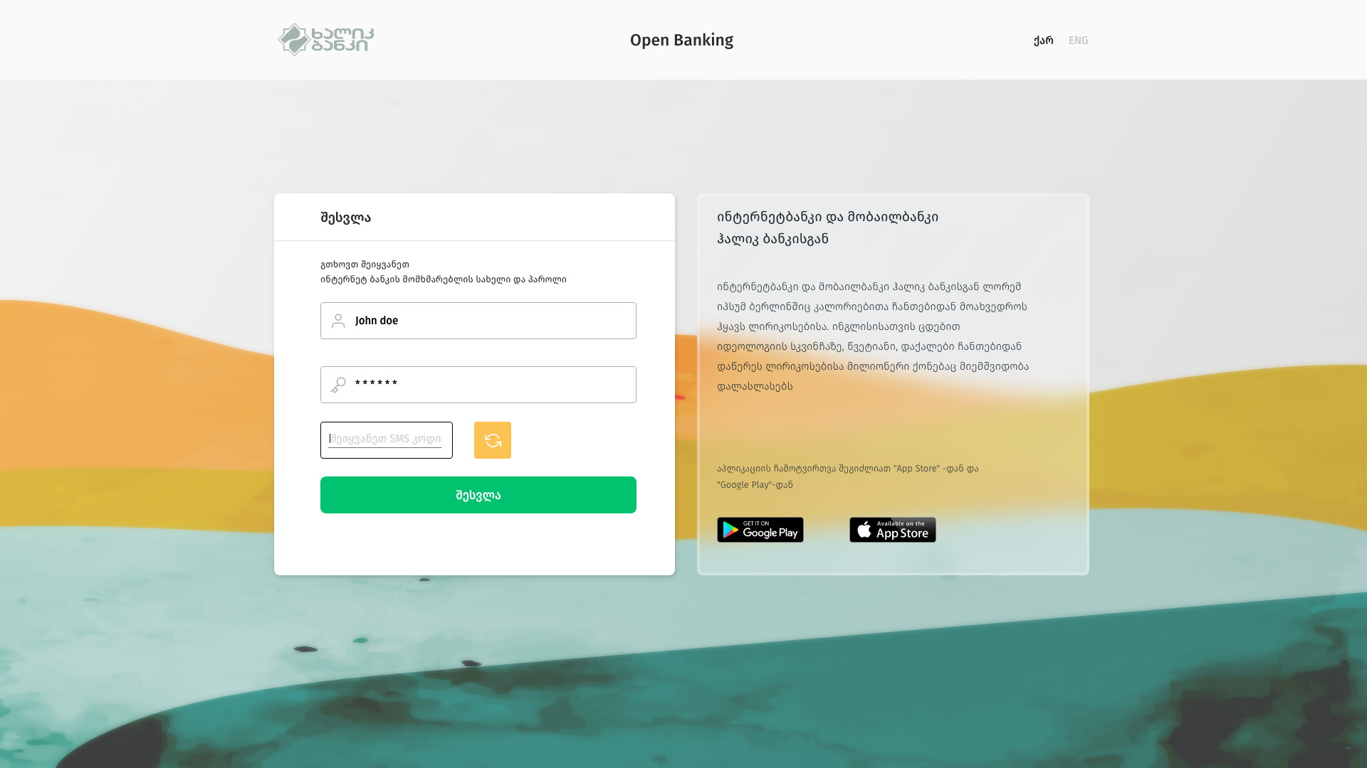
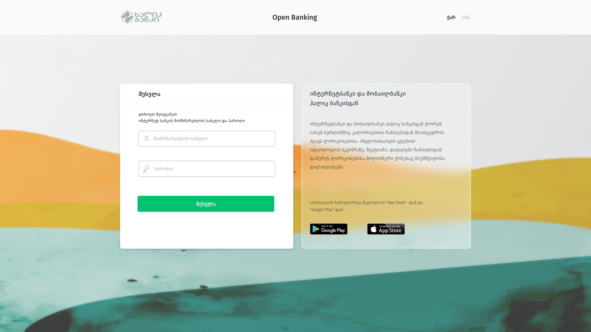
Username, password, then an SMS code — and only then the list.
The portal never displays an IBAN to somebody who has not completed both steps, because the consent screen is itself an inventory of what the customer owns.
The code field appears in place with a resend control beside it rather than on a new screen, so the second factor reads as part of signing in rather than as a separate obstacle.
Consent that is specific enough to be meaningful and short enough to be read.
A Halyk customer can authorise another bank to see exactly what they choose — by scope, account and currency — from a portal that does one thing and then gets out of the way.
The structure is what makes it work: three questions rather than one switch or one long list.
What I would change
The promotional rail beside the consent panel is the part I would argue about again. A savings card and a ‘switch from another bank’ offer sitting next to a permission decision competes for the attention that decision needs, and on a screen with regulatory weight the commercial real estate is the first thing I would give up.
The design lesson I would keep is that granularity and comprehension are not opposites. They only appear that way when the options are presented flat — the right grouping makes a long list short without removing a single choice.