The catalogue is enormous, the items are cheap, and nobody arrives wanting a specific one.
Miniso carries over ten thousand product names across ten categories — household goods, travel and digital accessories, sport, personal care, toys, seasonal ranges and gifts. A listing page in a single section runs to eleven hundred results across thirty-eight pages. Nobody reads that, and nobody arrives knowing which of them they want.
The economics make it harder. A basket of one twenty-lari item barely covers the delivery, so the site has to encourage several small additions — which is the opposite of the fast find-and-checkout flow most e-commerce is optimised for.
The range is also far wider than the price suggests. A thirteen-lari soft toy and a certified digital accessory sit in the same shop, and one product template has to serve a keyring and something with a specification sheet.
And a large share of the reason anybody visits is licensed: Disney, Barbie, Sanrio, Harry Potter, Toy Story, Minions, BT21, Coca-Cola and roughly ten more. Those are merchandising facts rather than categories, and no taxonomy will hold them.
Design the basket as hard as the catalogue
The first item is why somebody came. Everything after it is where the order value is made, so the cart deserves more design attention than it normally gets.
On a catalogue this size, the shop window matters more than the shelf.
Eleven hundred results cannot be browsed, so the way in cannot be the grid. Category tiles, a recommendation band, discounts, new arrivals and the licensed collaboration are the actual navigation — curated entrances into a catalogue nobody could otherwise face.
The corollary is that the cart is not the end of the journey. It is the last and best place to add a second item, which is why it carries a save-for-later shelf and a related-products carousel rather than just a total and a button.
Curated ways in, a filter rail that never moves, and a basket built for adding rather than finishing.
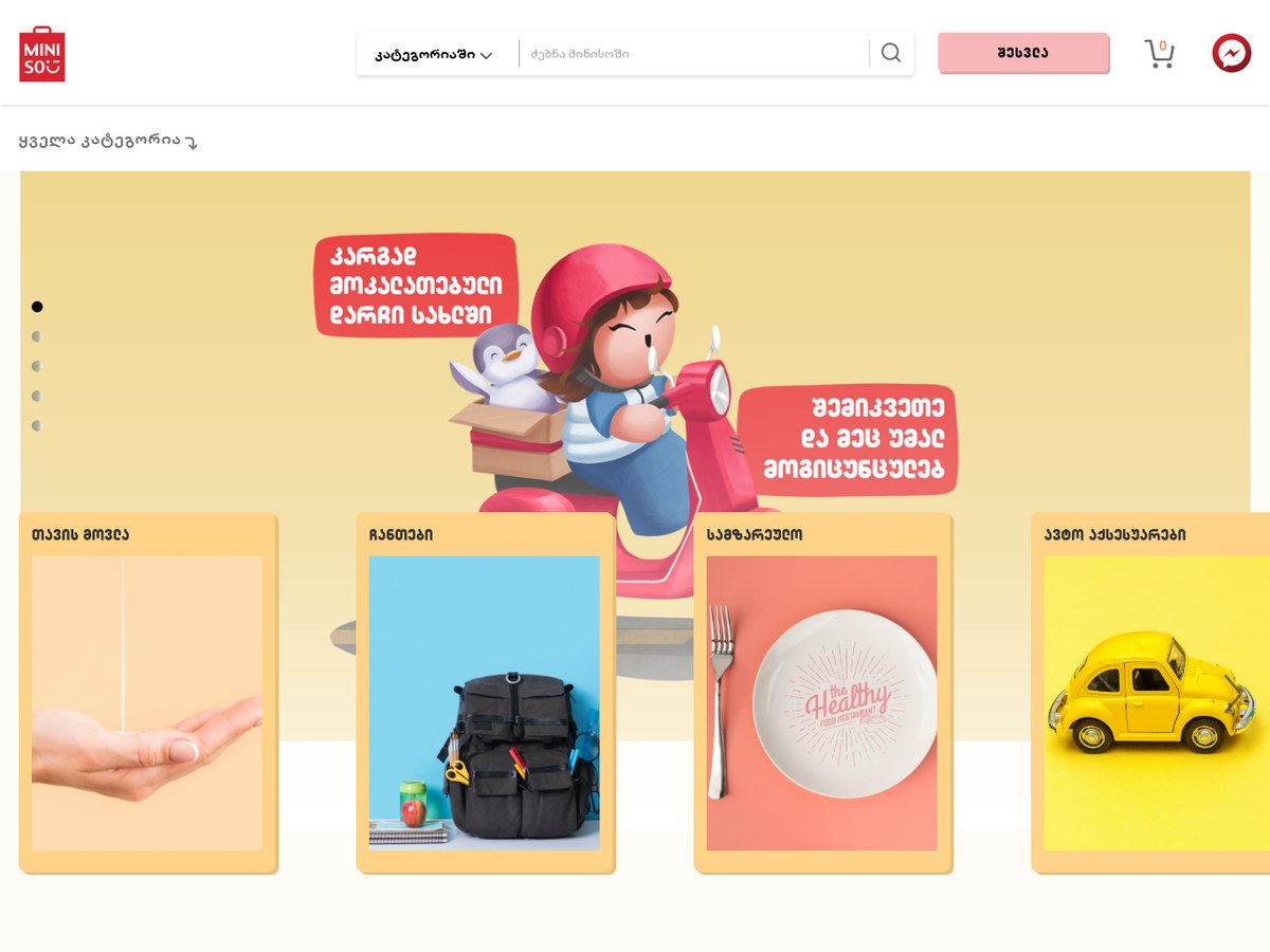
The home page is a sequence of entrances: a promotional banner with four category tiles laid over it, then discounts, an editorial recommendation band, new arrivals, the licensed collaboration and best-sellers. Each is a route rather than an advert.
Listing pages carry a left rail of collapsible category groups with checkboxes, a discount toggle and a price range, above a three-column grid with the result count stated. The product page changes depth by what is being sold, and the cart runs basket and order history as two tabs with a saved-items shelf underneath.
Category tiles break the banner, on purpose
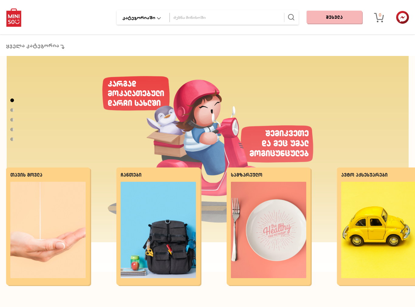
Four shortcut cards laid over the promotional hero.
A promotional banner takes the best position on the page and is the least useful thing on it. Laying the category tiles across its lower half puts real navigation in the first screen without giving up the campaign slot.
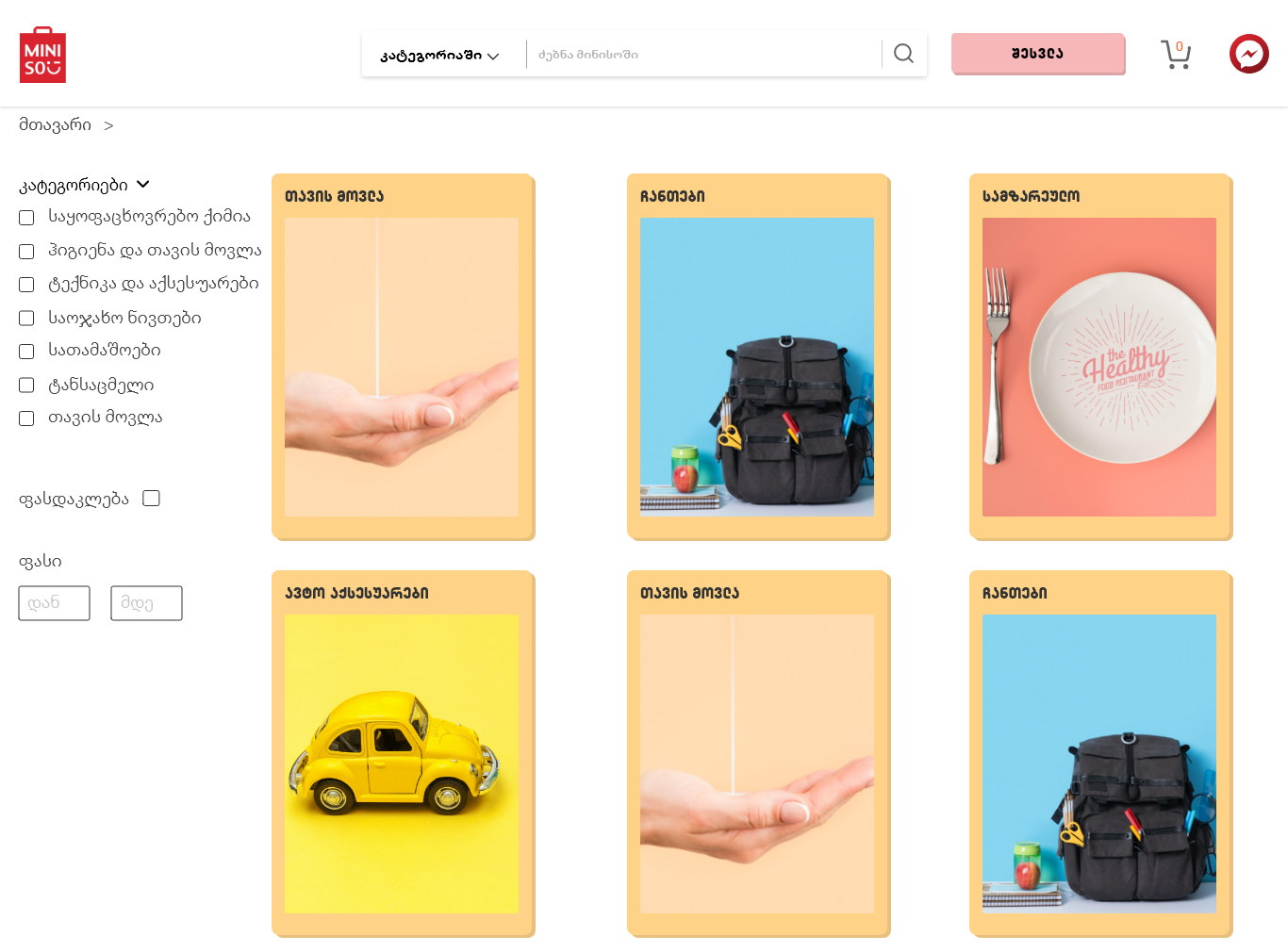
Each tile is a photograph of the product type on a flat colour ground — hand cream on pink, a backpack on blue, a plate on coral, a toy car on yellow. It reads as Miniso’s own merchandising rather than as a menu.
One editorial band, not a carousel of everything
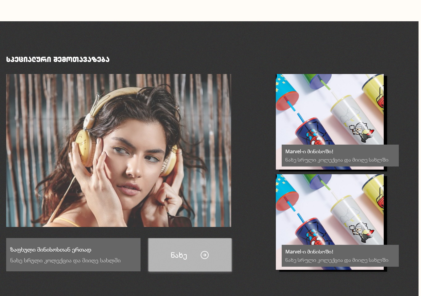
A large lifestyle photograph beside two stacked product cards, on near-black.
Between two rows of small product cards, a third row would have disappeared. Inverting to dark and giving one recommendation a full photograph makes the section read as a suggestion from the shop rather than as more inventory.
The two cards stacked beside it carry the actual products, so the photograph can do mood while the offer stays specific. One button, no pagination — a recommendation that needs browsing is not a recommendation.
Collaborations are a module, not a category
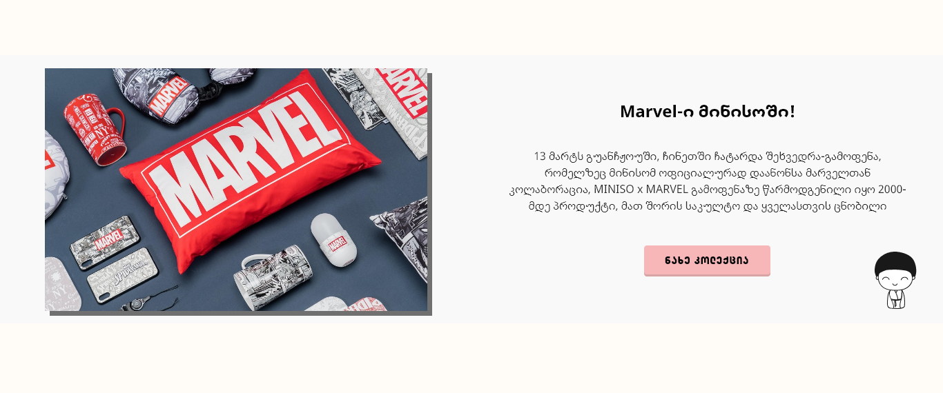
A licensed band that repeats on the home page and on listing pages.
Miniso runs seventeen licensed partnerships at once, and each one cuts straight across the tree — Marvel is a cushion, a mug, a phone case and a bag simultaneously. A collaboration can never be a node in a taxonomy built from product types.
So it is a recurring band instead, which can appear wherever traffic lands and be swapped for whichever partner is current. It gets editorial treatment — a full product photograph, a paragraph and one button — because at that moment the site is selling a collaboration rather than an item.
A category page that opens with pictures
Six banner tiles above the grid, and a discount badge that does not shout.
Landing in a section from search or a menu is the moment a shopper is least oriented. Six photographic tiles across the top say what is in here faster than a list of subcategory names, and they narrow the eleven hundred before a single filter is touched.
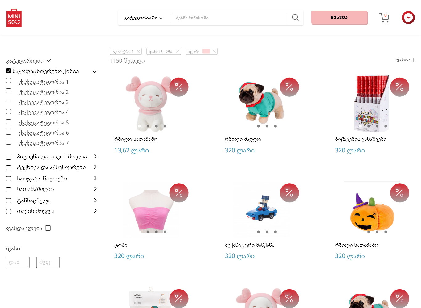
Almost everything on this platform is discounted at some point, so the badge is a small red disc at the corner of the card rather than a banner across it. Same size, same position on every card — the eye learns it once and can then scan for it.
Say how many results there are
‘1100 results’ above the grid, and page 38 in the pagination.
Stating the size of the result set is what turns filtering from optional into obviously necessary. A shopper who sees eleven hundred understands immediately that the rail on the left is the tool, not decoration.
The facet groups are collapsed by default with a chevron each, so the rail stays short enough to scan. On a general catalogue most shoppers do not know a category’s vocabulary, and a wall of open facets teaches them nothing.
One product template for a keyring or a phone
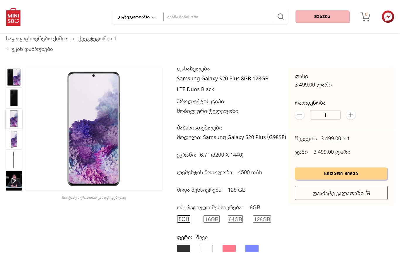
Thumbnail rail, large image, and a right column that grows or shrinks.
The same page has to sell a thirteen-lari plush and a certified electronic accessory. The frame is fixed — gallery left, decision column right — and only the contents of that column change: colour swatches and capacity chips appear when they exist and are simply absent when they do not.
Buy and save-for-later sit together under the price, one filled and one outlined. At this price point the hesitation is rarely about money, so the alternative to buying is not leaving, it is remembering.
Specifications are a table, not prose
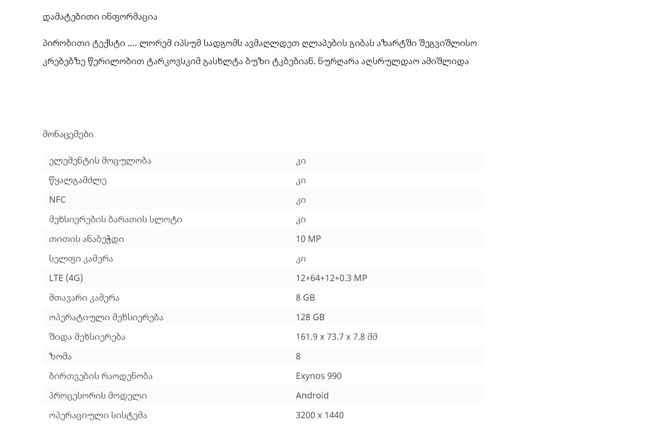
Zebra-striped rows, label left, value right — under the description.
Anything with a spec sheet is compared across tabs, and comparison needs a fixed row order. Whatever has been filled in renders identically for every product that has one.
The seller’s own writing goes above it, in the description. Separating the two means loose marketing copy cannot contaminate the part being compared.
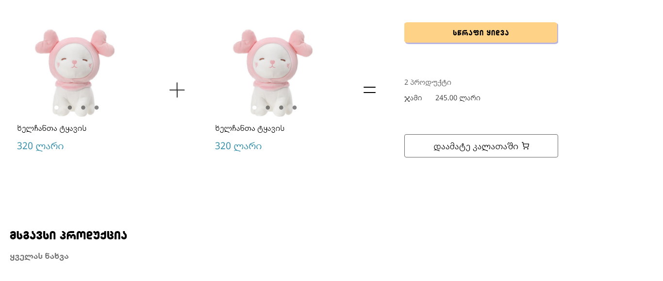
Bundles are shown as an equation
Product plus product equals a total, with buy and add-to-basket.
‘Also bought’ usually means a carousel nobody reads. Rendering it literally — two items, a plus, an equals, one total — makes the offer legible in a second, which is all the attention it will get.
Two commitments are offered because they are different intentions: buy this pair now, or add it and keep shopping. Collapsing them into one button loses whichever shopper it was not built for.
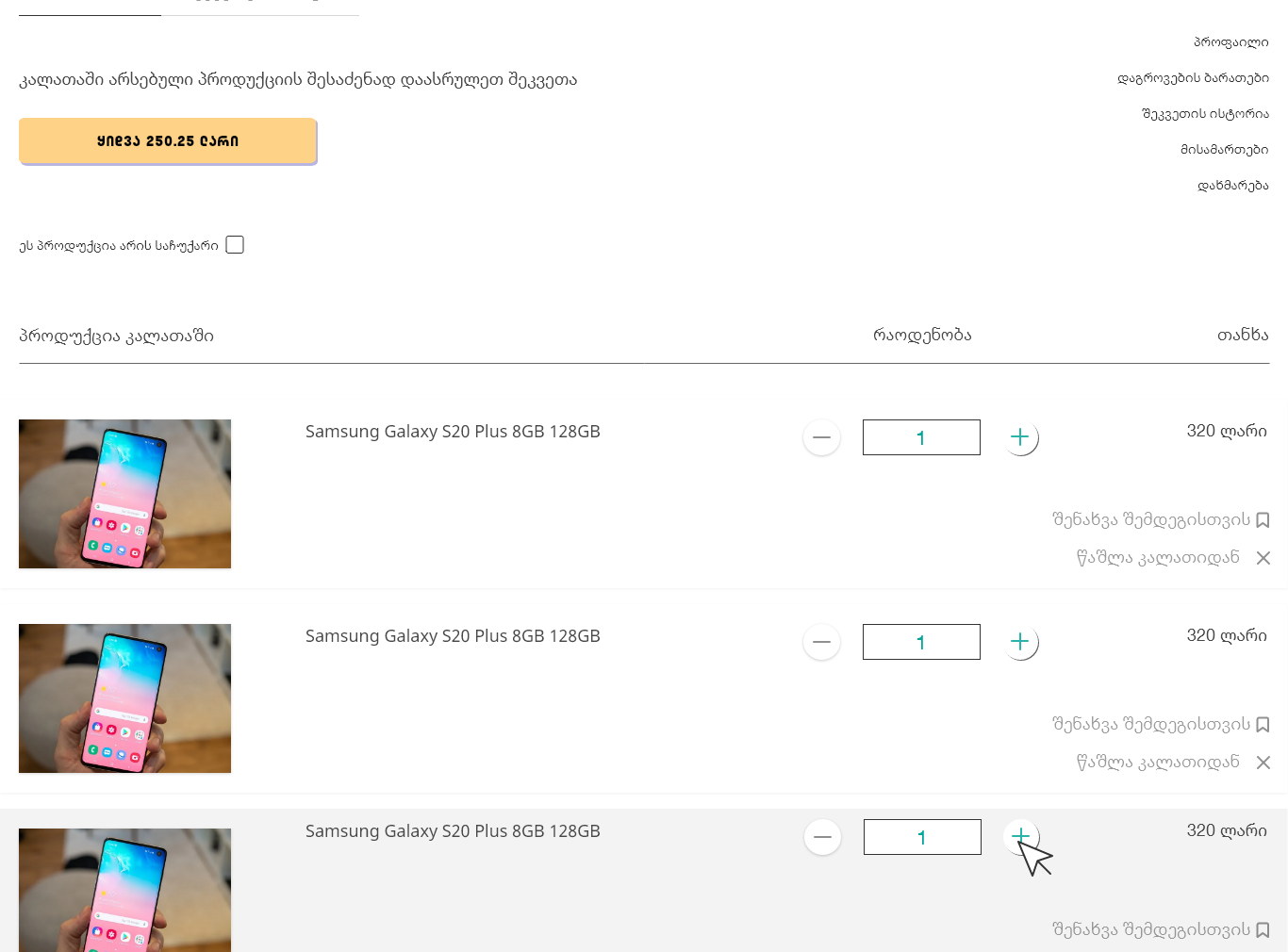
The basket is a shelf, not a receipt
Two tabs, a quantity stepper, and two actions on every row.
Basket and order history sit side by side, because ‘where is my order’ and ‘what did I buy last time’ are the same trip — and it keeps the account area almost empty, which for a shop selling twenty-lari items is the correct amount of account.
Quantities are a stepper rather than a field, and the control fills in the moment it is pressed. On a page listing five near-identical rows, a shopper otherwise cannot tell whether the click landed on the one they meant.
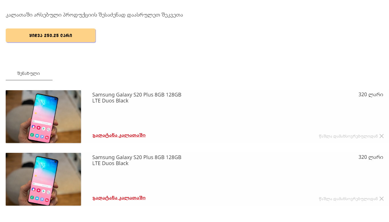
Saved items live under the basket
A shelf with ‘return to basket’, and similar products below it.
Every row offers save for later beside remove. Deleting something you were unsure about is how an order shrinks; moving it down a shelf keeps it in the session, one link from coming back.
The saved shelf sits directly beneath the basket rather than in an account page, with a related-products carousel under both. On a shop where the average item is twenty lari, this is the highest-intent surface in the product and the cheapest place to earn a second and third item.
A site that behaves like the shop it belongs to.
Curated entrances replace an unbrowsable grid, the filter rail is stated and short, the collaboration appears wherever the traffic does, one product template covers a plush toy and a spec sheet, and the basket is built to grow rather than to close.
Miniso had twenty-seven branches in Georgia by the time of this work, and the stores are cheerful and slightly silly — so the site ends in a yellow footer with the brand mascot sitting in the corner doing nothing functional at all. A grey utility footer would have closed every page in a different brand from the one the shopper had walked through.
What I would keep from this one
Spending the design effort on the basket rather than the product page is the decision I would repeat on any low-value, high-volume catalogue. The product page settles a purchase somebody had already decided on; the basket is where the order actually gets bigger.
Stating the result count is the smallest change with the largest effect. Eleven hundred is a number that makes a shopper reach for a filter, and hiding it just produces people scrolling page four of thirty-eight.