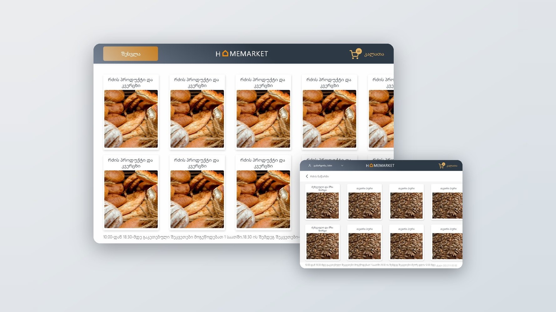
A tablet is not a big phone, and a kitchen is not a sofa.
The device sits in one place, is used standing up, is shared by a household and gets touched with hands that have just been doing something else. That rules out the interaction patterns most shopping apps rely on.
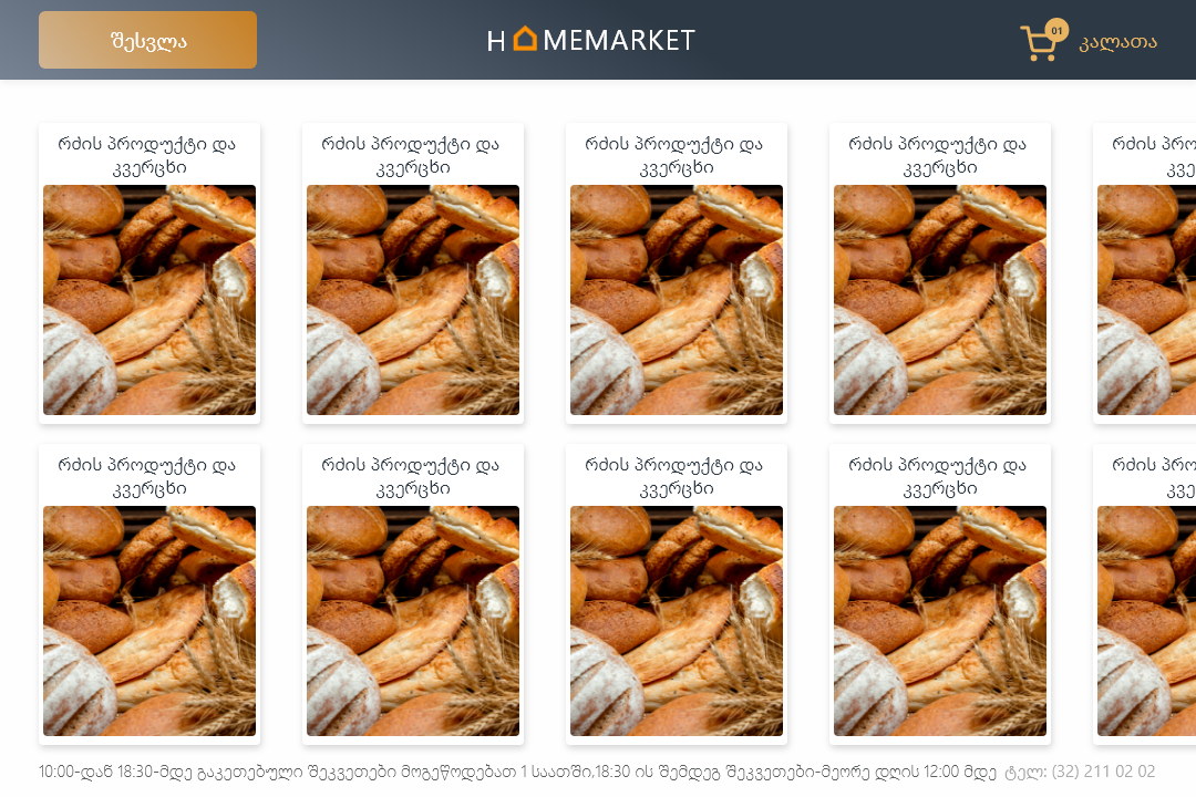
It is also the wrong shape for a phone layout stretched wide: a two-column grid at tablet size wastes the one advantage the device has, which is that the products can be shown large enough to actually see.
The buying pattern is different too. Nobody browses groceries for pleasure — it is a recurring, forgettable task where the same forty items come round every week.
Use the screen for the produce
The single thing a tablet does better than a phone is show you what the food looks like. Everything else follows from that.
Nobody wants to shop for groceries. They want last week’s order with three things changed.
Treating a grocery app as a discovery experience misreads the task. The fastest possible route to a repeat order is the feature, and browsing is the exception.
So reordering, wish lists and purchase history are primary rather than buried in an account section, and the beautiful large product imagery serves the items you have not bought before.
Reorder first, browse second, and everything big enough to tap without looking.
Stores are filtered by category, price and location, with products shown large — the tablet’s one real advantage. Previous purchases and saved lists sit at the top of the journey so a weekly shop is a review rather than a search.
Payment details are saved for a one-touch checkout, orders are tracked in real time, and a barcode scanner ties the app to the fridge — scan an item to check its expiry or to put it straight back on the list.
The repeat order is the front door
History and saved lists ahead of the catalogue.
The weekly shop is ninety per cent identical to last week’s. Making that the starting point turns a twenty-minute task into a two-minute one, which is the only reason somebody keeps using it.
Discovery still exists — it is just not what greets somebody who came to reorder milk.
Scan the fridge, not the catalogue
Barcode scanning for expiry dates and instant re-adds.
Tying the app to the physical kitchen is what a stationary tablet can do that a phone in a pocket cannot. Scanning something you already own to check a date or reorder it closes the loop between the cupboard and the basket.
It also gives the app a reason to be opened between shops, which is where most grocery apps lose the habit.
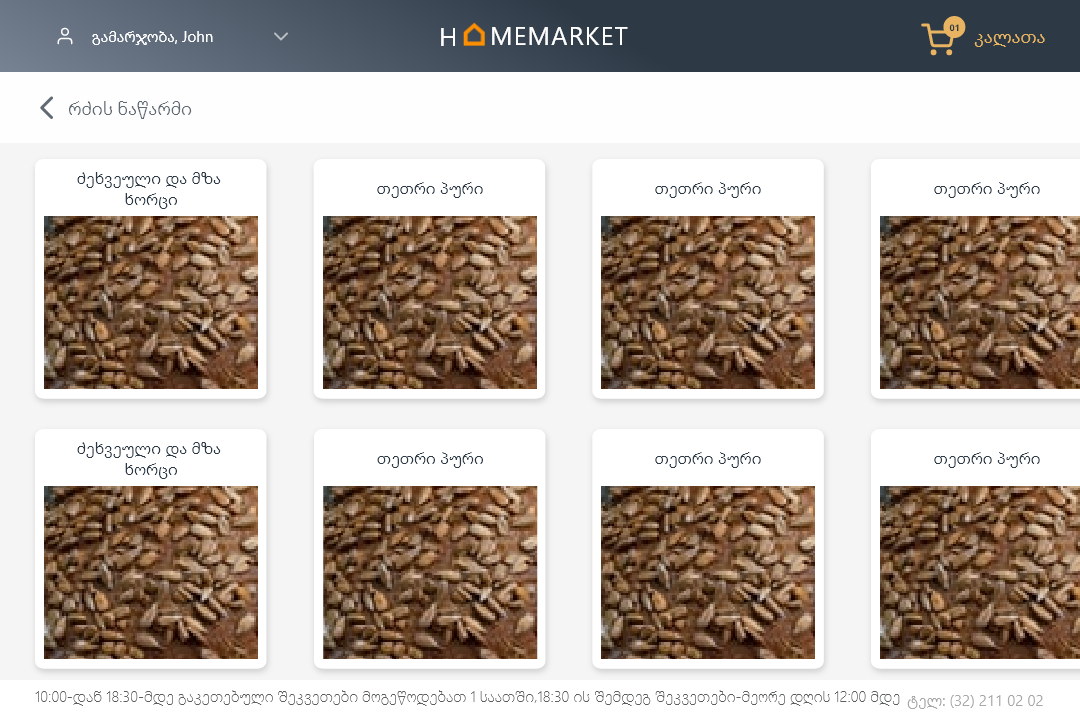
A shopping app that fits the room it lives in.
Large product imagery, one-touch reordering, saved payment and real-time tracking, with a barcode scanner connecting the app to what is actually in the fridge.
The layout uses the tablet's size for the products rather than for more columns of the same thing.
What I would keep from this one
Designing for a device that never moves is a genuinely different brief. Reach, posture and who else in the house might pick it up all change what belongs on the screen.
The habit question is the one I would keep asking: what makes somebody open this on a day they are not shopping?