Selling an occasion, not a product: Assorti
Confectionery e-commerce, where the thing in the basket is usually for somebody else.
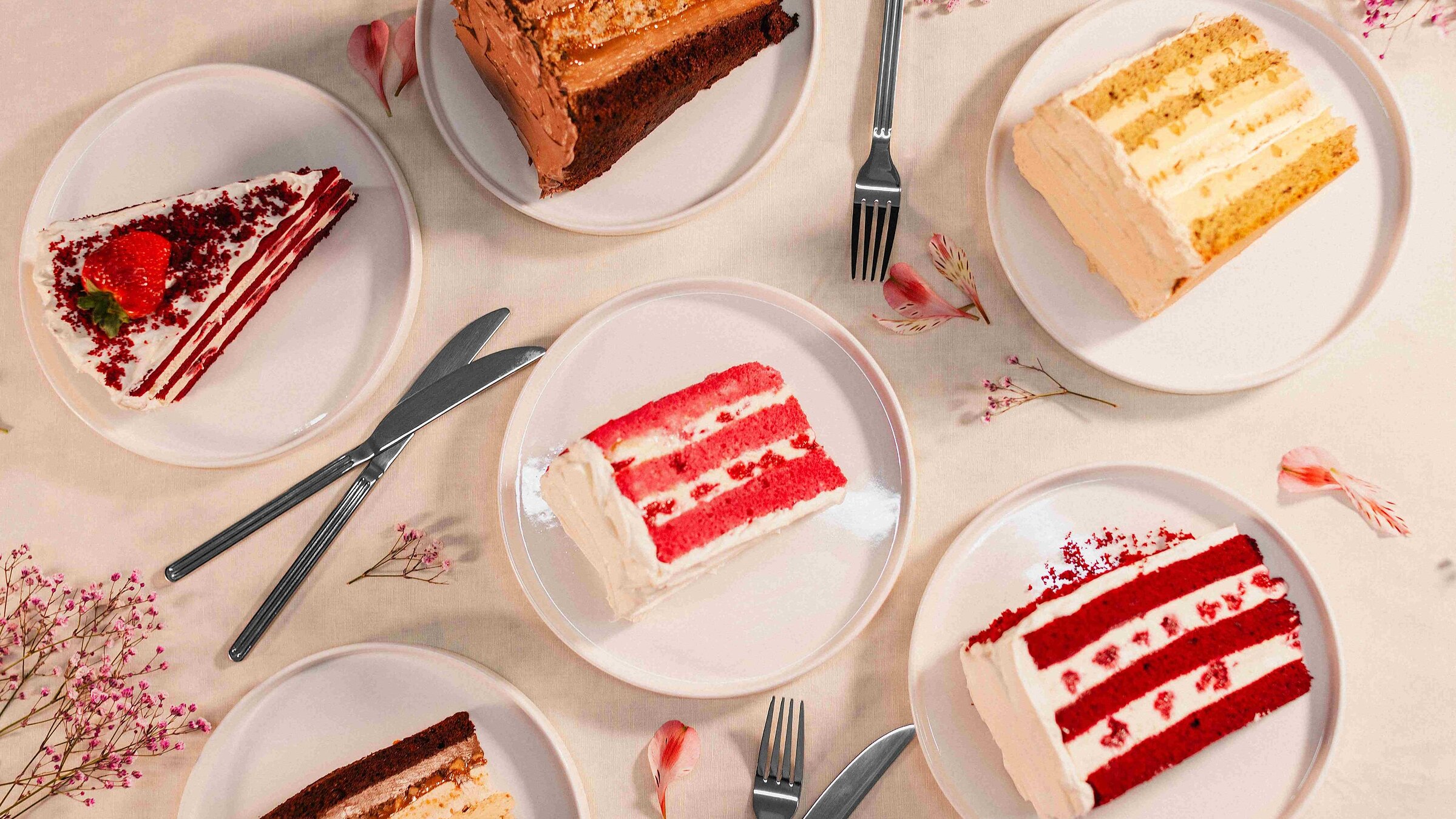
Nobody buys a cake the way they buy groceries.
A cake is bought a handful of times a year, almost always for an occasion, and almost always for someone else. There is no habit to lean on, no reorder pattern, no weekly rhythm — the shopper arrives with a date in mind and very little else.
That makes the usual e-commerce moves work against you. Filters and specification tables answer questions a birthday shopper is not asking. What they need is to see it, believe it will look like the photo, and know it can be there on Saturday.
The catalogue is also unusually wide for a bakery: whole cakes, single pastries, boxes, seasonal and fasting ranges, plus made-to-order designer cakes that are not really a product at all but a conversation.
Photography is the product page
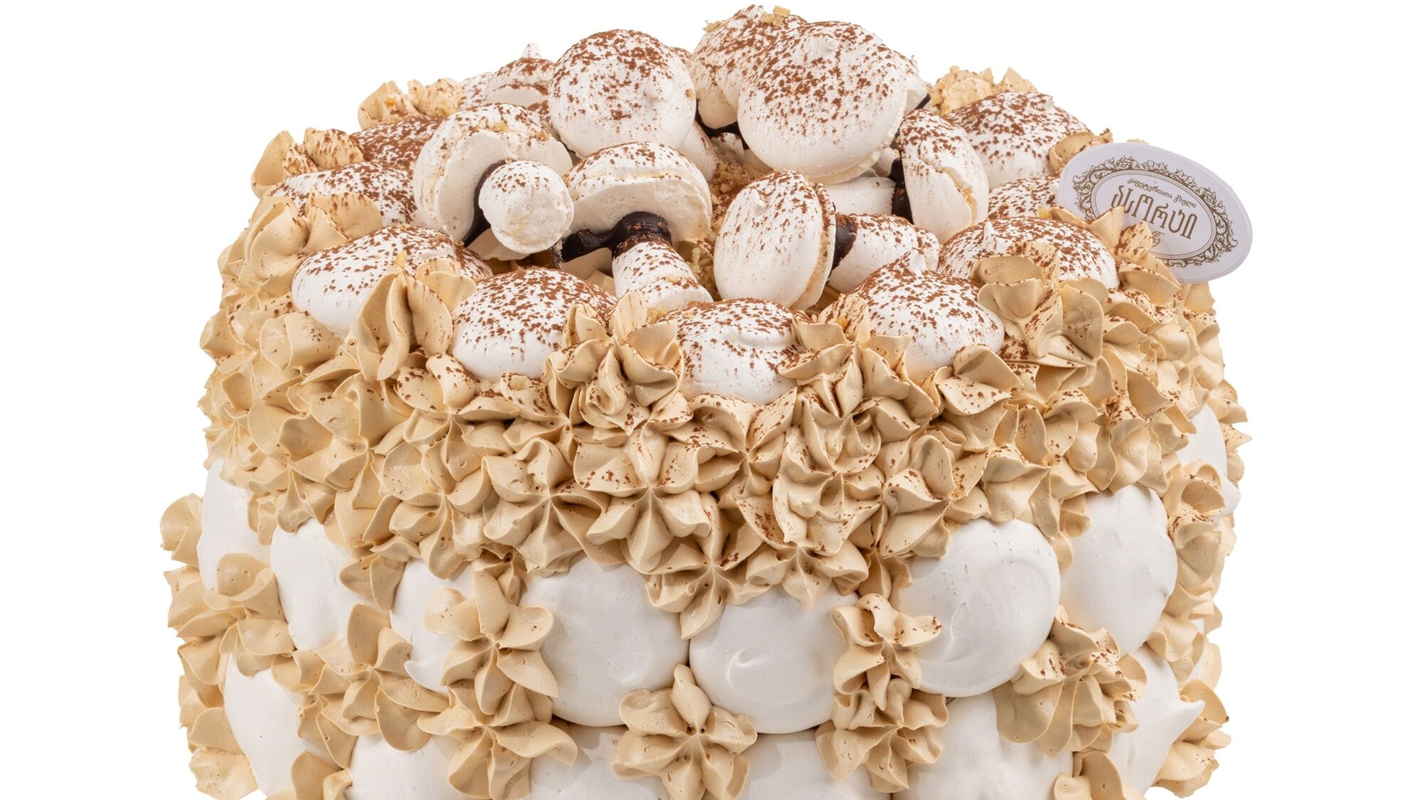
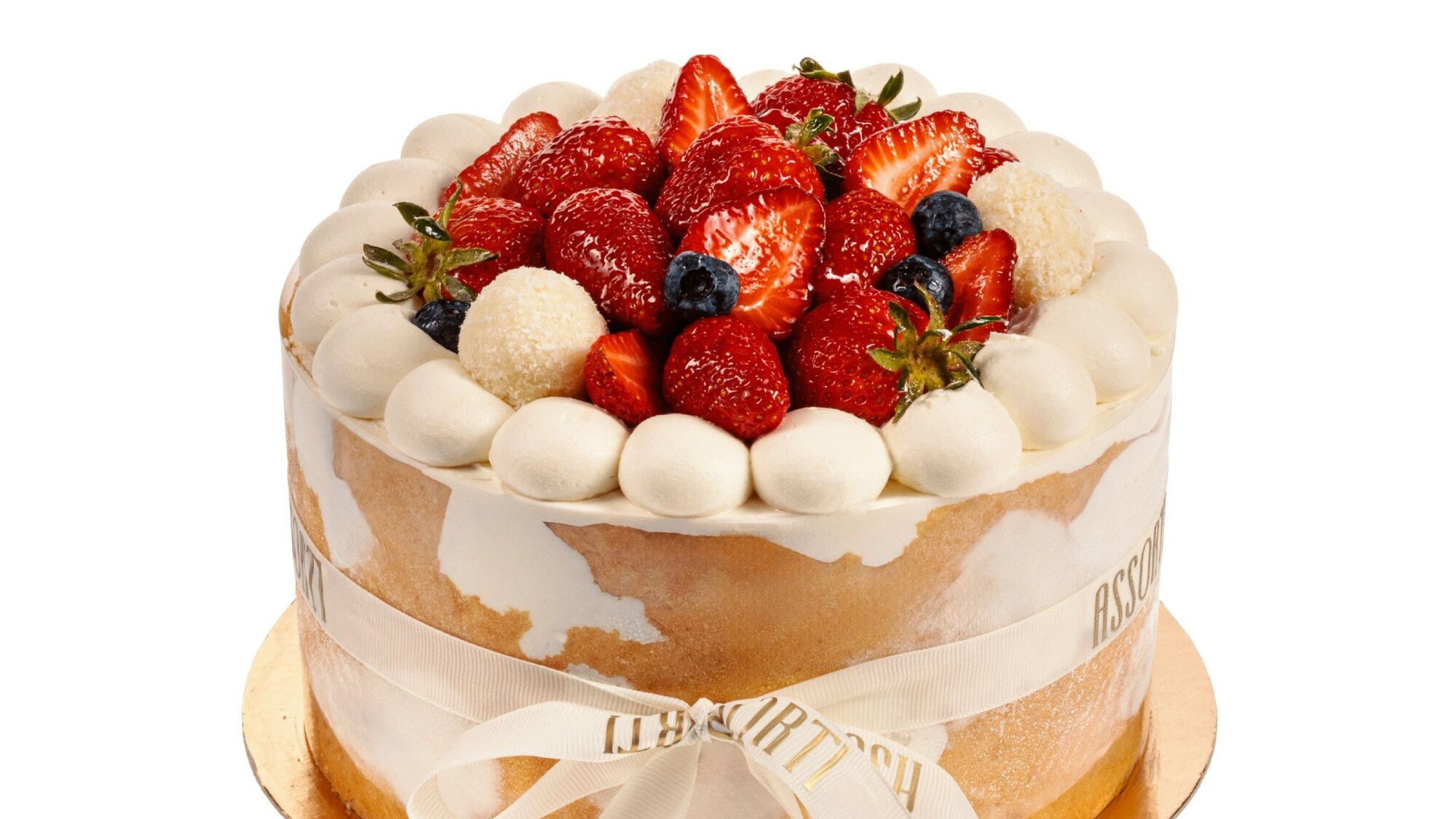
For a cake, the image is not decoration around the description — it is the description. Everything else on the page exists to support a decision the picture has already started.
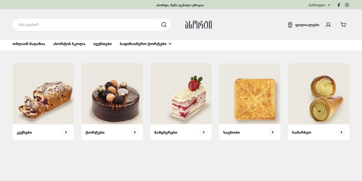
The catalogue is not a list of goods. It is a list of occasions.
Reframing it that way settled a lot of arguments. Whole cakes, single pastries and boxes are not three product types competing for the same grid — they are three different moments: a celebration, a treat for yourself, something to bring to other people.
Once the categories carried that meaning, browsing stopped needing filters. You pick the occasion and the range narrows itself.
A shop built to be looked at rather than searched.
Product imagery runs full width and uncropped on a near-neutral ground, so the cake is the only saturated thing on screen. The rest of the interface is deliberately quiet.
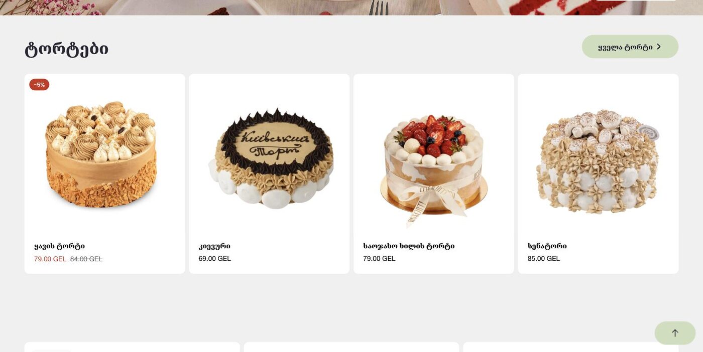
Price, discount and the add-to-basket control sit in a fixed relationship on every card, so the eye learns the pattern once and stops re-reading it.
Occasions, not filters
Categories that match how a purchase is actually decided.
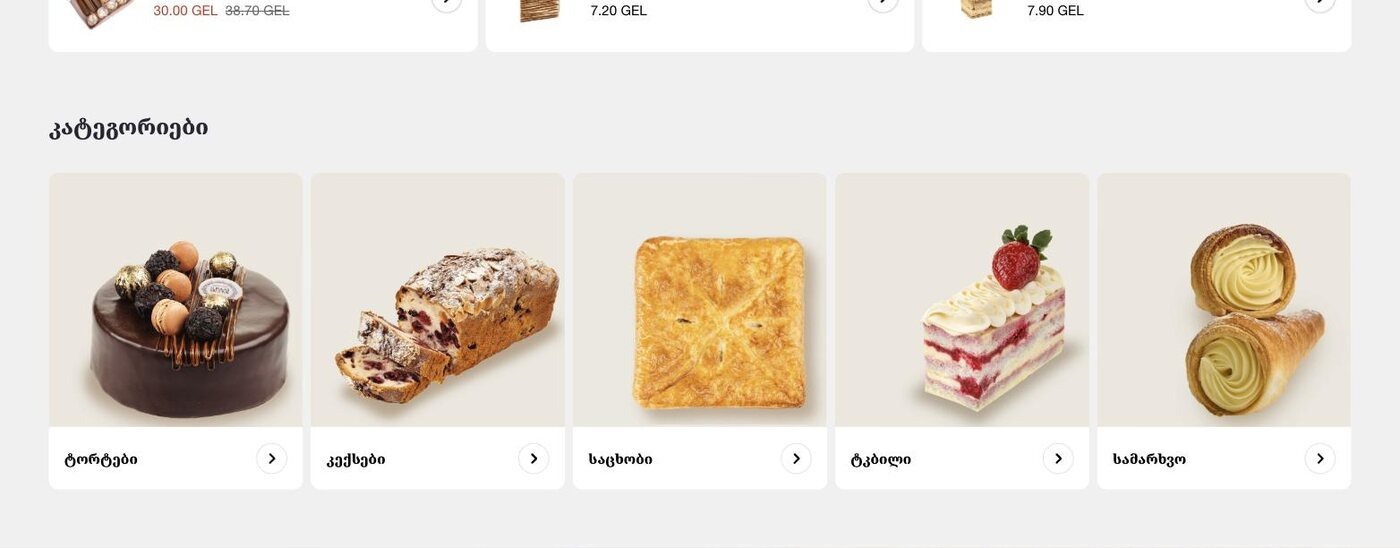
Cakes, pastries, baked goods, sweet and fasting ranges — the split follows the reason for buying, not an internal product taxonomy. It removes most of the need for filtering on a catalogue this size.
The photograph carries the page
One consistent treatment, no crops, no busy backgrounds.
Every item is shot on the same neutral ground at the same angle, which does two things: it makes the range look like one brand, and it lets a shopper compare two cakes without the photography being a variable.
Discounts that do not shout
A small badge and a struck-through price, nothing more.
Confectionery discounting is frequent, so it had to be legible without turning the grid into a sale board. The badge sits at the card corner and the old price stays visible but recessive.
Made-to-order treated as its own path
Designer cakes lead to a conversation, not a basket.
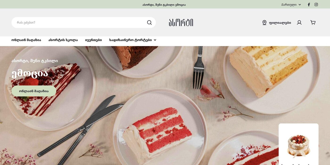
A custom cake has no fixed price or lead time, so forcing it through the same checkout would fail. It gets its own route through the navigation and ends in a brief rather than an order.
A storefront that behaves like a shop window.
Assorti runs at assorti.ge as the brand's online store, alongside the physical branches. Ordering, the confectionery school and events all live under one navigation.
The visual system has held as the range has grown — new products drop into the same treatment without a design pass.
What I would keep from this one
I started this project with the wrong model in my head — an efficient basket, fast quantity controls, reorder. All correct for groceries and all wrong here. Someone buying a birthday cake is not optimising; they are trying to feel confident about a gift.
The useful question was not 'how do we make this faster' but 'what would make you trust that it arrives looking like that'. Answering it turned out to be mostly photography discipline, which is not a screen you can draw in Figma.