The person making the decisions has never farmed, and the consequences land on somebody else’s land.
Villey gives a person in a city a virtual farm that corresponds to a real one in Africa. They choose what is planted, they are told what the crop needs, they authorise the work, and at harvest they decide whether the produce comes to them or is sold.
That is a strange amount of authority to hand to somebody with no agricultural knowledge, on another continent, in a different hemisphere’s season. Left to invent instructions, an owner will get it wrong — and the cost of getting it wrong is a real season on real land.
The pacing is brutal too. A potato takes months, and for most of that period nothing happens that a remote owner can act on. A product that only speaks at planting and harvest is a product nobody opens in between.
And there is a tone problem underneath all of it. Somebody is doing this work for real. Wrapping that in badges and points is one step from turning a farmer’s season into a game played by a stranger.
Let the farm ask, and let the owner answer
If the interface reports what the crop needs rather than offering a menu of things to do, an owner with no expertise can still make correct decisions — and the farm keeps its own authority.
The owner should never be inventing instructions. The farm should be asking, and the owner should be saying yes.
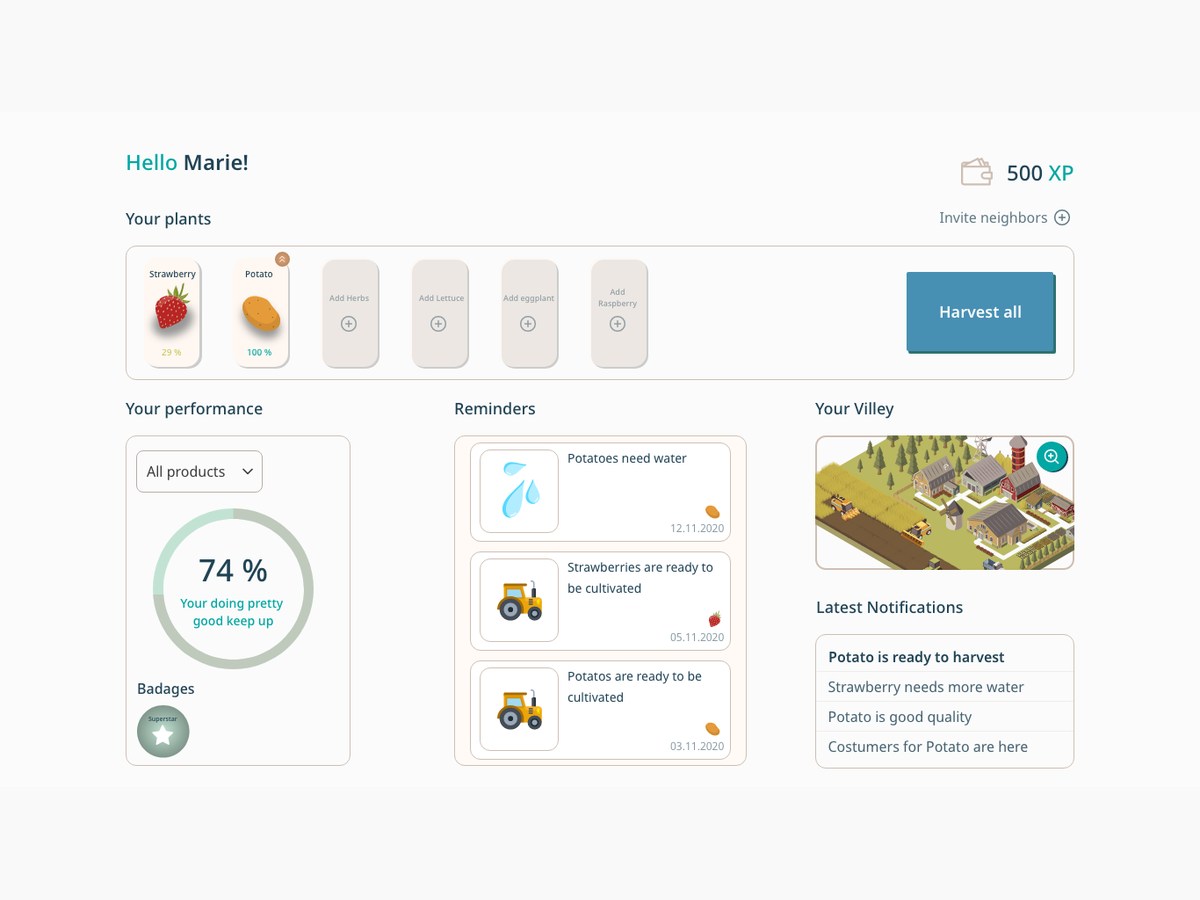
That inverted the usual dashboard model. There is no command palette, no list of agricultural actions to choose between — the reminders are written as statements of need, in plain language, dated: potatoes need water, strawberries are ready to be cultivated.
It puts the expertise where it actually lives, on the ground, and reduces the owner’s job to the one thing they are qualified to do: decide, and commit. It also solves the pacing problem, because the state of the farm is worth looking at even on a week when there is nothing to answer.
A shelf of plants, a farm you can look at, and two lists that behave differently.
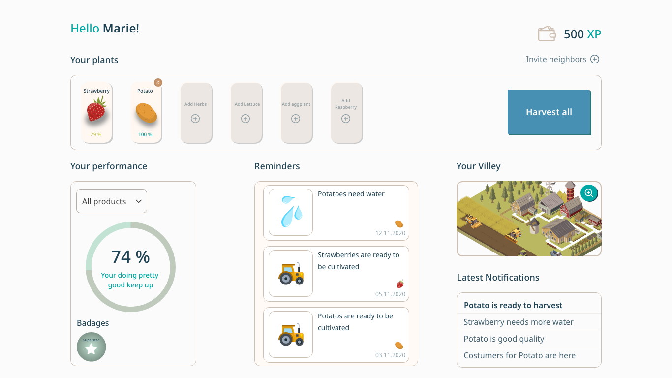
The signed-in home is one screen: the plants along the top with their growth percentage, stewardship and badges on the left, dated reminders in the middle, and a live picture of the farm with the notification log beneath it.
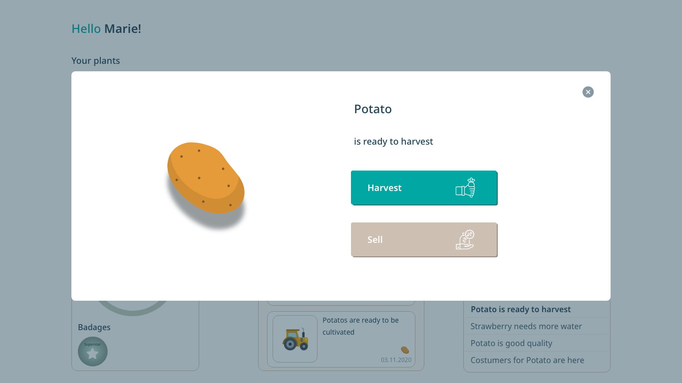
Ripeness interrupts — a plant at a hundred per cent opens a modal with the crop drawn large and exactly two things to do with it. Everything else is designed to be read rather than operated.
The home screen is a shelf of plants
Each with a growth percentage; empty slots named for what could go in them.
A plant card shows an illustration and a number — strawberry 29%, potato 100% — and that number is the whole reason to open the product on a quiet week. It moves slowly, which is exactly the right reward for something about growing.
The unused slots are labelled Add herbs, Add lettuce, Add raspberry rather than left blank, so the empty state is the catalogue. Harvest all sits at the end for the week when several come good at once.
Ripe means exactly two choices
Harvest or Sell, on a modal with the crop drawn large.
This is the moment the whole season has been building to and it is a real decision about real produce, so it gets a full interruption with one object on it: a potato, a sentence, and two buttons.
Offering Sell beside Harvest is what makes the model work at distance. Somebody who took on a crop in March may not want fifteen kilos shipped from another continent in September, and a plant they can convert is a plant they will plant again.
The farm is a picture, and the picture is the report
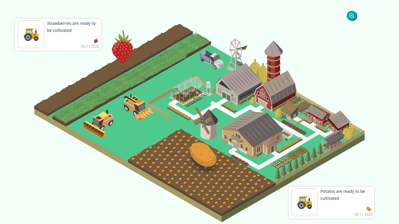
An isometric view of the real plot, opened from a thumbnail.
The owner will never visit, so the only honest way to say this is what your land looks like now is to draw it. Nothing in the scene is scenery — rows are dense while a crop is standing and cut to stubble afterwards, and the ground shifts from green to khaki as the season turns.
A chart would have been faster to build and would have told a non-farmer nothing. A field is a thing people already know how to read, and the whole-image colour change is a status signal you can register from across a room.
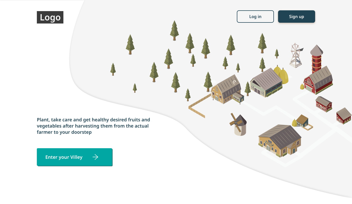
The proposition is one sentence
‘Plant, take care and get healthy fruits and vegetables from the actual farmer to your doorstep.’
A model this unusual cannot be explained by a headline of three words. The landing page spends a full sentence naming all four steps in order, because a visitor who guesses wrong — that this is a delivery box, or a farming game — is lost either way.
Enter your Villey as the call to action does the rest. It implies a place that already exists and is yours, which is a more accurate description of the product than Sign up.
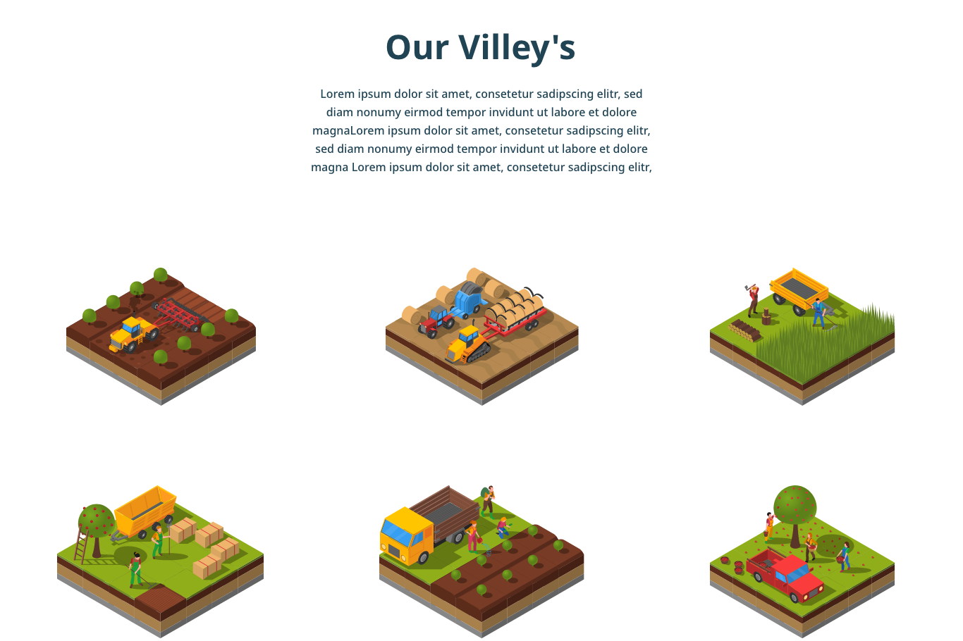
Show the labour, and put people in it
Six isometric tiles of actual farm work.
Ploughing, baling, cutting, loading, packing, picking — with a person in every single one. The alternative was photography of vegetables in a basket, which sells a mood and conceals the only fact that matters: somebody is doing this on your behalf.
On a product where the owner is remote and the work is not, hiding the workers would have been the easy and the wrong decision. The illustration style is the same one used for the farm view, so the marketing page and the product are visibly the same thing.
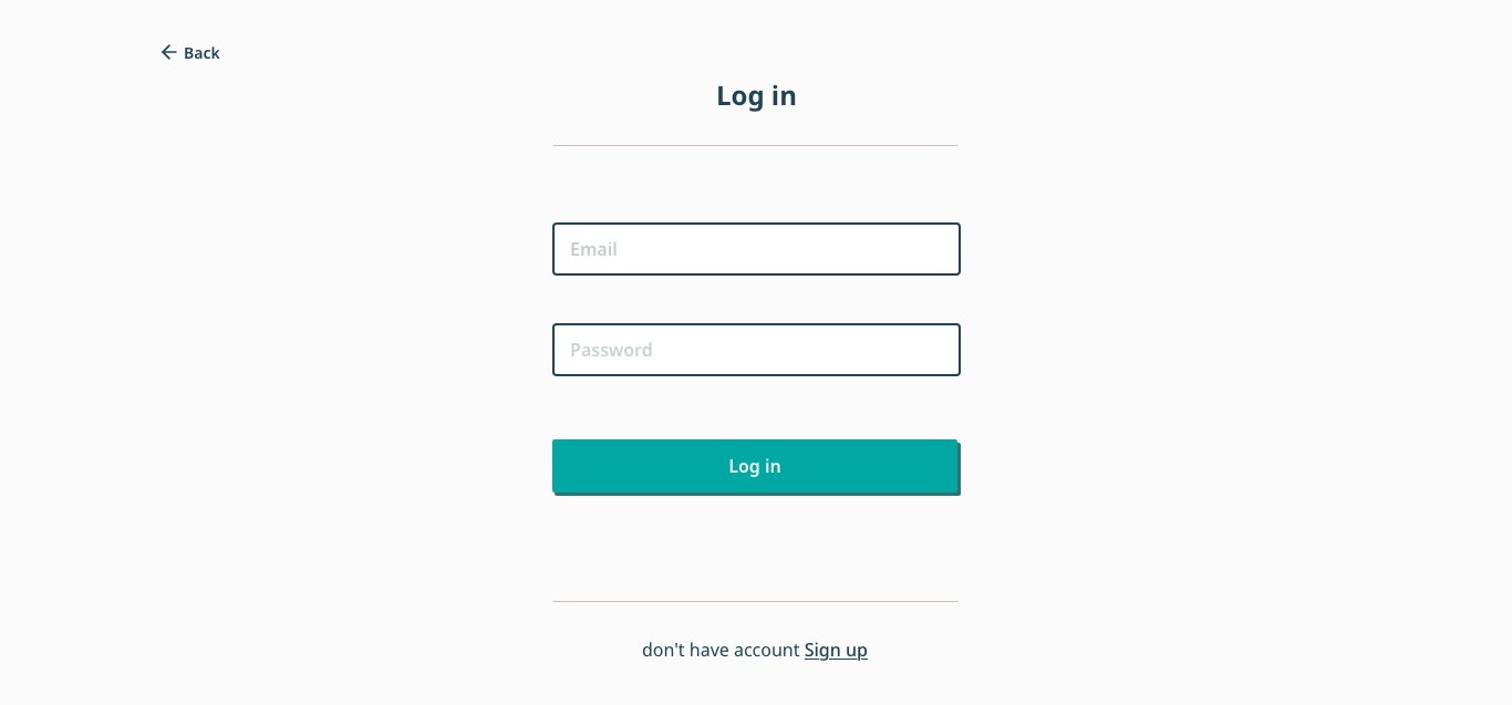
Two auth screens that are obviously one screen
Log in is sign-up with the fields removed.
Same centred column, same rules top and bottom, same teal button, same quiet Back. Sign-up adds a name, a password confirmation and a Google shortcut; nothing else moves.
The cross-link sits under the rule on both, so somebody who landed on the wrong one is one click from the right one rather than back at the navigation.
The farm asks; the owner answers
Dated cards you act on, and a plain log you scan.
A reminder is a request with a date on it — potatoes need water, 12.11.2020 — and gets a card with an illustration of the task, because something is being asked of you. A notification is a fact — potato is good quality, customers for potato are here — and gets a single line.
Merging them would have buried the three things that need a decision under everything that merely happened. Splitting them also draws the line the whole product depends on: what the farm needs from you, and what the farm is telling you.
Score the stewardship, not the yield
A ring at 74%, a badge, and a line of encouragement.
The number rates how well the owner has kept up with what the farm asked — not how much was produced. The yield belongs to the people working the land, and turning their output into a stranger’s personal score would be dishonest about who did the work.
It is the lightest possible gamification on purpose: one ring, one badge, an XP figure and an invitation to bring in neighbours. Anything more would have made a real season on real land look like a game about one, which is the failure mode this product has to stay furthest from.
A season directed from a desk, with the expertise left where it belongs.
Villey came out of Garage48 as a full flow: a landing page that explains an unfamiliar model in one sentence, sign-up, a dashboard built for the long middle of the season, a drawn farm that reports its own state, and a harvest that ends in a real decision.
The structural bet — that the farm should ask and the owner should only answer — is what let somebody with no agricultural knowledge hold genuine authority without doing damage with it.
What I would keep, and what I would want to fix
Designing for the empty weeks rather than the eventful ones is the lesson I would take anywhere with a long cycle in it. The exciting screen mostly designs itself; the product lives or dies in the period where nothing is happening.
The part I would push on is the other end of the relationship. Every screen here is built for the owner, and the farmer appears only as work being illustrated. A real version needs a surface where the people on the ground can say something back — raise a problem, refuse an instruction, show what actually happened — otherwise the product is a very well-designed one-way mirror.