Two people need this to do opposite things, and one of them wants it to be over.
The instructor needs enough about a person’s life to write a real plan rather than a template with a name on it: what they are training for, what they have access to, who they are.
The person answering arrived to get in shape, not to fill in a form. Every additional question is a chance to close the tab, and this one is reached from an advert rather than from an account they have already invested in.
It is also, plainly, a lead capture. The business needs a name and an email at the end of it. Most quizzes of this kind hide that until the last screen and then spring it after the work has been done, which is exactly the moment it feels like a trick.
Do the consultation first, ask last, and say what the email buys
If the quiz genuinely narrows down a plan before it asks for anything, the email field at the end reads as the next step rather than as the toll.
Four questions is not a shortened questionnaire. It is the whole design decision.
Gender, age, primary goal, training environment. That is the minimum an instructor needs to start writing, and everything beyond it was cut because it can be asked later by a human who is already in the conversation.
Once the count was fixed at four, the rest of the work stopped being about pacing a long form and became about making four screens feel like something worth doing — which is a photography and copy problem more than a layout one.
A quiz that looks like the brand’s advertising, not like its database.
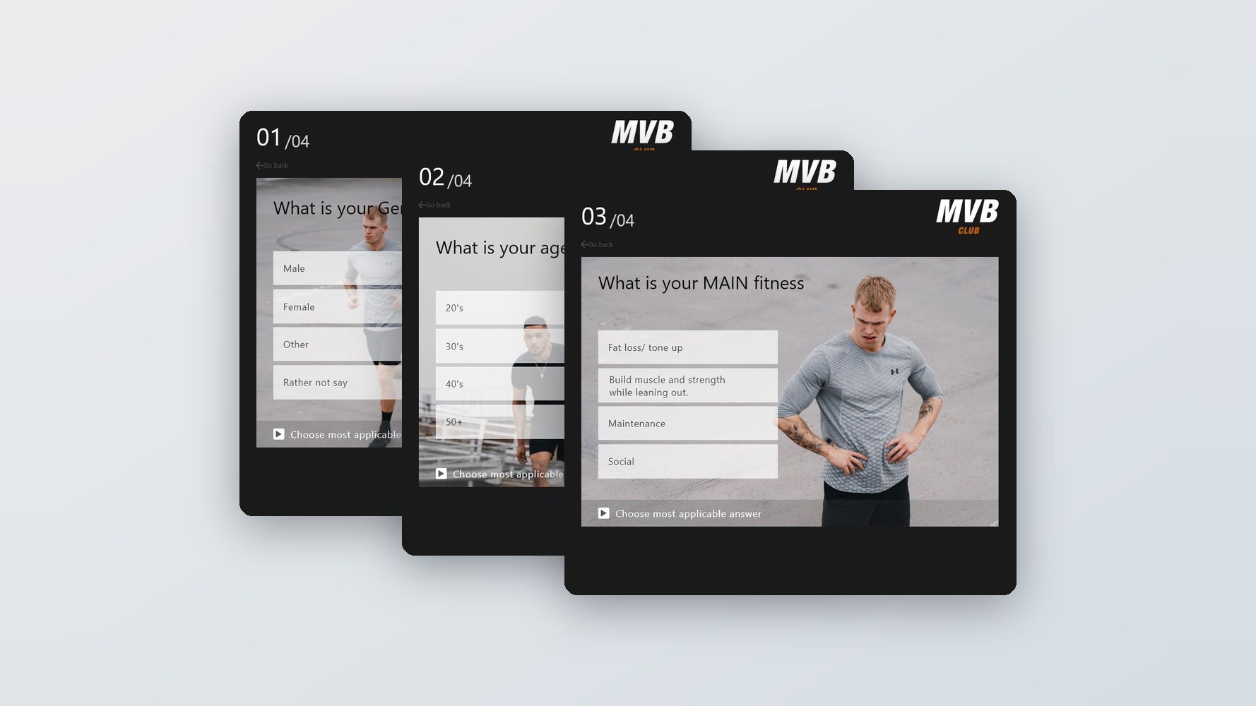
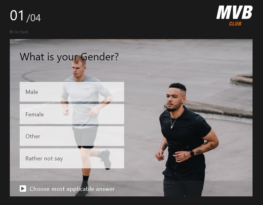
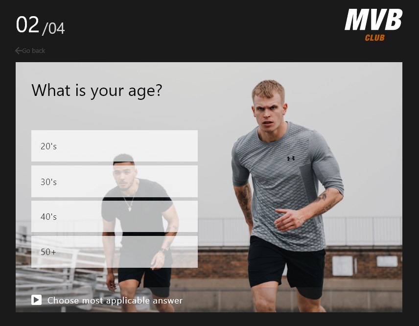
Every question is a full-bleed photograph of somebody training, with the answers as translucent bars stacked over the left third. The counter sits top-left in large type, the brand mark top-right, and a footer bar restates the instruction on every screen.
The sequence runs intro, a held beat, four questions, then the result screen — where the plan is described, the name and email are asked for, and what happens next is stated in four words.
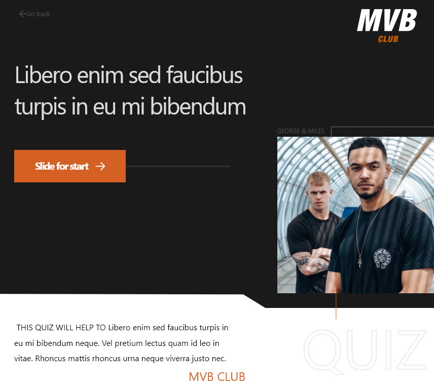
Start is a slider, not a button
‘Slide for start’ on a track, over the trainers’ own photograph.
A button is pressed by accident; a slider is a small deliberate act, and it sets the register for what follows — this is a thing you are doing rather than a page you are on.
The trainers are named on the intro image. The quiz is answered more honestly when it is obvious that specific people will read it, so their faces appear before the first question rather than in an About section nobody reaches.
A held beat before the first question
A full-screen ‘Get Ready’ on black, then straight into 01.
Two words on an empty screen do more for pacing than any transition. It separates the marketing page from the questions, so the first question does not arrive while somebody is still reading a headline.
It also borrows the language of the gym rather than the language of software, which is the register the whole product is trying to hold.

One question per screen, on a photograph
Answers as translucent bars over the left third.
A form shown all at once is judged before it is started. Dealt one at a time, each question is judged on its own — and at four questions the whole thing is over before anybody decides it is long.
Putting the answers on a photograph rather than a white card keeps the quiz inside the brand’s advertising rather than dropping into an anonymous form. The bars are translucent so the image survives underneath, which is what makes the screen look like a campaign frame.
The counter is the largest thing on the page
‘01’ large, ‘/04’ small beside it.
The denominator is the reassurance and it is visible from the first screen: this is four questions, and you are on the first. Making the number bigger than the question is the opposite of the usual hierarchy and it is deliberate.
‘Go back’ sits under it, quiet and always present. A quiz that cannot be corrected is a quiz people abandon rather than risk answering wrongly.
Every question changes the plan
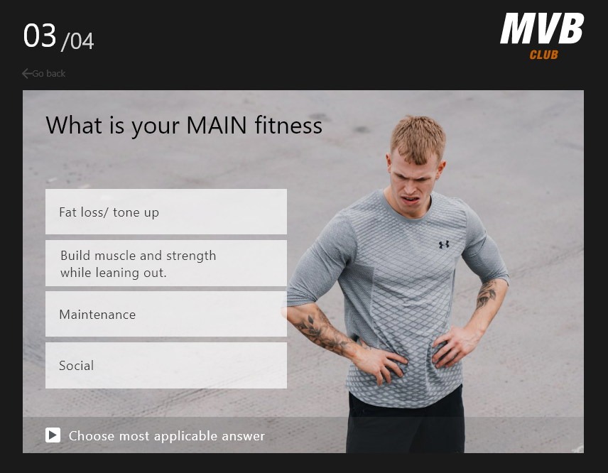
Goal, and then the equipment you actually have.
The test applied to each question was what changes in the output if it is left blank. Fat loss and building strength are different programmes; a CrossFit box and ‘travel a lot so always have limited equipment’ are different programmes again.
The answers are written as sentences people say about themselves rather than as categories. ‘Build muscle and strength while leaning out’ is how somebody describes their goal out loud, and recognising yourself in an option is what makes the answer accurate.
The reassurance goes on the last question
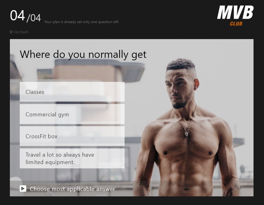
‘Your plan is already set, only one question left.’
Drop-off clusters just before the end, when the effort is spent and the reward is still not visible. A line of copy at exactly that point is cheaper than any progress animation and does more.
It is also true, which matters. By question four the instructor has enough to start, and saying so converts the last question from an obstacle into a formality.
The gate is at the end, and it says what it is
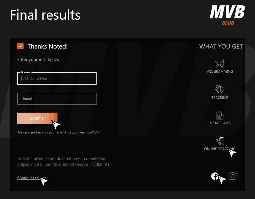
Name, email, and ‘what you get’ listed beside the field.
Asking for contact details after the work has been done is only fair if the person can see what they are exchanging them for. Programming, tracking, meal plans and online coaching sit next to the form as four plain icons, so the trade is legible at a glance.
‘We can get back to you regarding your results’ promises a person rather than an autoresponder, and a quiet ‘Continues to web’ gives anybody who does not want to hand over an address a way out that is not the browser back button.
Enough to write a plan, in four questions and a minute.
Instructors receive the goal, the constraint and the basics they need to write something specific; the person answering gets a stated promise and a human follow-up rather than a confirmation email.
Because the quiz is built from the brand’s own photography rather than from form components, it can run as a landing page from an advert without looking like it belongs to a different product.
What I would keep from this one
The useful discipline on any onboarding questionnaire is to ask, for every question, what changes in the output if it is left blank. Four survived that test here, and the temptation to add a fifth came back on every review.
The other one is about honesty in a funnel. A quiz that captures an email is not a problem; a quiz that pretends it is not capturing an email is. Putting the list of what you get next to the field it is asked for costs nothing and is the difference between a trade and a trap.