The product is two coaches, and the competition costs nine pounds a month.
MVB Club is George and Miles — thirteen years between them — selling personal online coaching: a workout and meal plan written for you, direct contact with the coaches, a training app and a video library.
Everything in that list except the last two words is also offered by a fitness app for a fraction of the price. The service is expensive, recurring, and asks a stranger to hand over their body composition and their diet to somebody they have never met.
So the site is not selling features. It is selling the belief that a specific person will read what you send them and write back — which is the one thing an app cannot do, and the hardest thing to make credible on a landing page.
It also had to be one page. This is a two-person business; a site with twelve routes through it is a site nobody maintains.
Put the coaches in front of the offer
If the visitor meets George and Miles before they meet the price list, every claim afterwards has somebody attached to it.
An app can write you a programme. It cannot be somebody who knows your name.
That is the entire commercial argument, and it decided the order of the page. The coaches are named and photographed in the second section, before anything is offered, and the promise underneath the offer is written in the first person plural: we personally coach you all the way.
It is repeated verbatim at the bottom of the page. On a single-scroll site the same sentence in two places is not redundancy — it is the argument bracketing everything in between.
One scroll: welcome, the coaches, what you get, proof, what is included, apply.
Each section is announced by its own name set huge and hollow behind the real heading — ABOUT, STORIES, PLANS, CONTACT — so a page with no navigation still has landmarks you can scroll to and recognise.
The sections are separated by a diagonal notch rather than a straight edge, and threaded together by a thin orange rule that runs down the centre between them. Photography is the client’s own, desaturated, with orange and white doing all the signalling.
A welcome, not a pitch
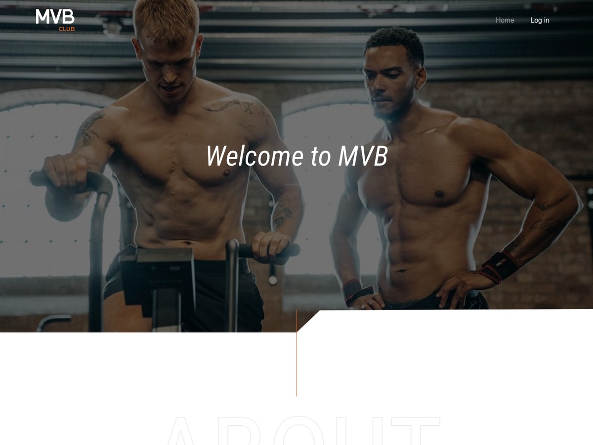
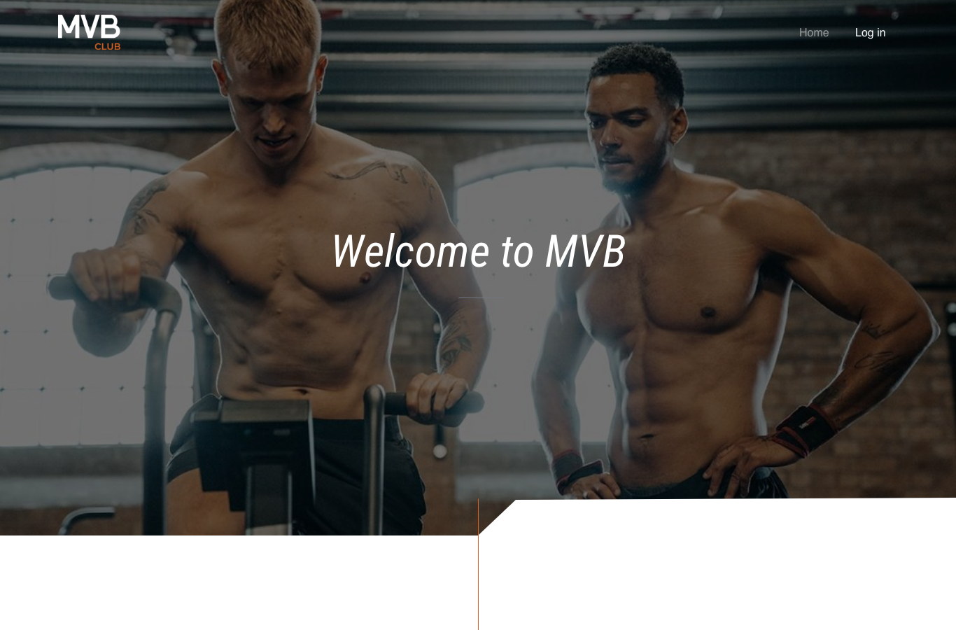
‘Welcome to MVB’ over a photograph, and nothing else.
The hero makes no claim and lists no benefit. On a service sold on relationship, the first screen is an introduction — the argument starts one scroll later, once there are faces attached to it.
The band ends in a diagonal notch rather than a horizontal edge. It is the page’s one structural mannerism, repeated at every section boundary, and it does the job a grid usually does on a site with no columns to speak of.
Name the two people and count the years
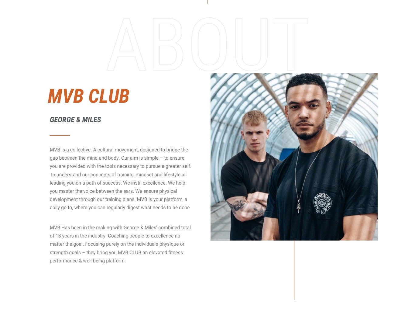
‘George & Miles’, a photograph of them, thirteen years.
A number is what turns a claim into a fact. ‘Thirteen years in the industry’ is the most persuasive sentence on the page and it sits in the second section rather than in a footer.
The photograph is them, not a stock athlete. Everywhere else on the site the imagery is anonymous training footage; here it is deliberately the two people you would be paying, looking at the camera.
Four pillars, and the promise underneath the heading
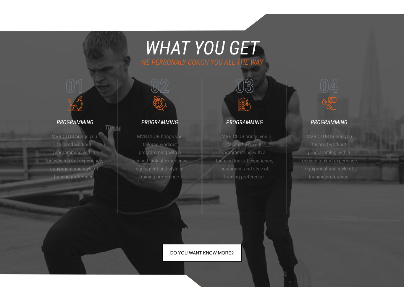
Programming, tracking, meal plans, coaching — numbered 01 to 04.
The offer is four things, so it is shown as four columns with hollow numerals and a line icon each, over a full-bleed training photograph turned down to grey. Rendering it as a list would have made a coaching service look like a pricing table.
‘We personally coach you all the way’ sits directly under the section title in orange, so the differentiator is read before the features rather than after them. The same four pillars reappear on the quiz result screen, with the same icons — one offer, told identically wherever somebody meets it.
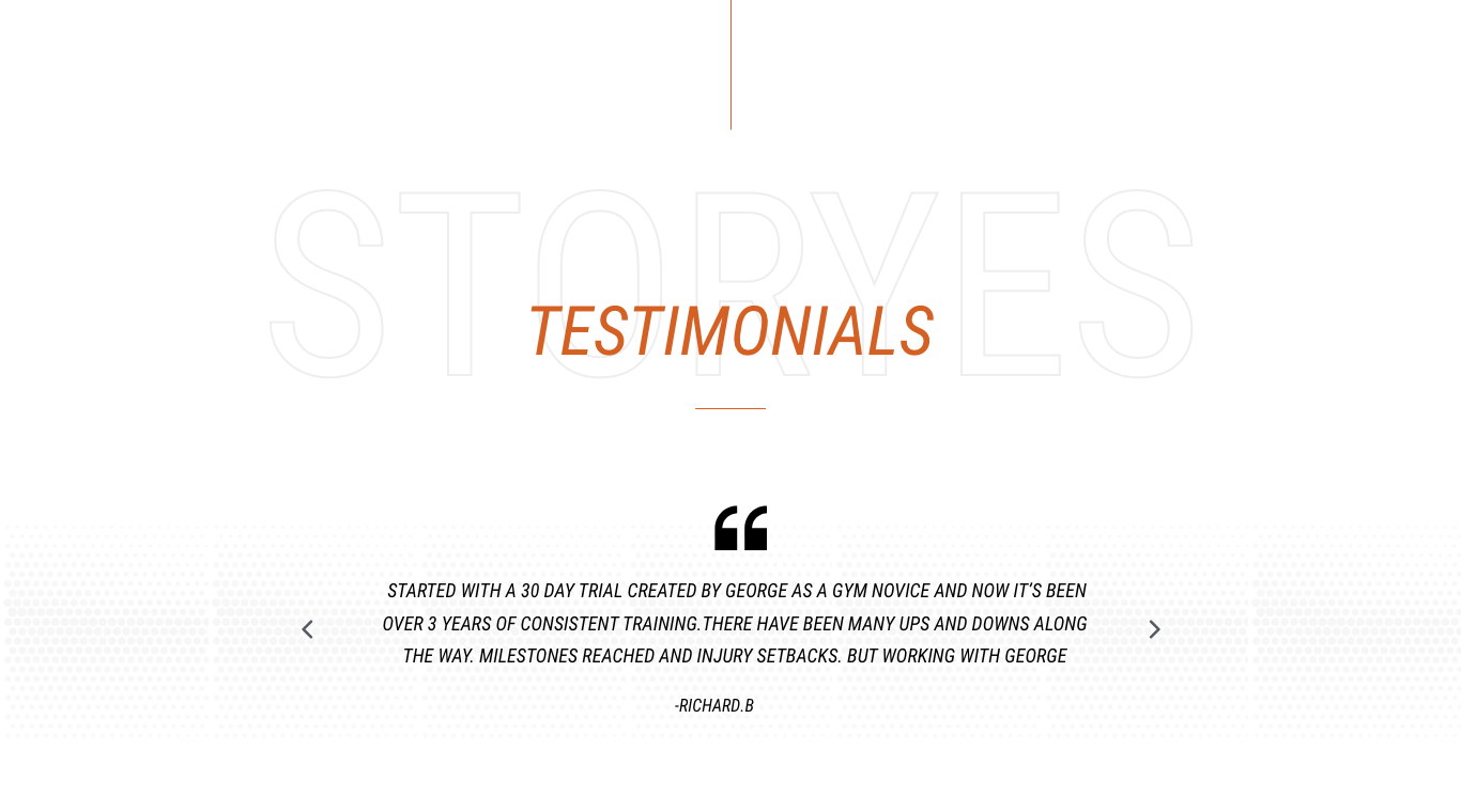
One long testimonial, not a wall of stars
A single client, in his own words, with arrows to the next.
Richard’s quote is four lines long and mentions injury setbacks and ups and downs. A curated five-star wall reads as marketing; a testimonial that admits the process was hard reads as a person.
It occupies its own section with nothing competing for attention, because on a high-trust purchase the proof is not a supporting element — it is a step in the argument.
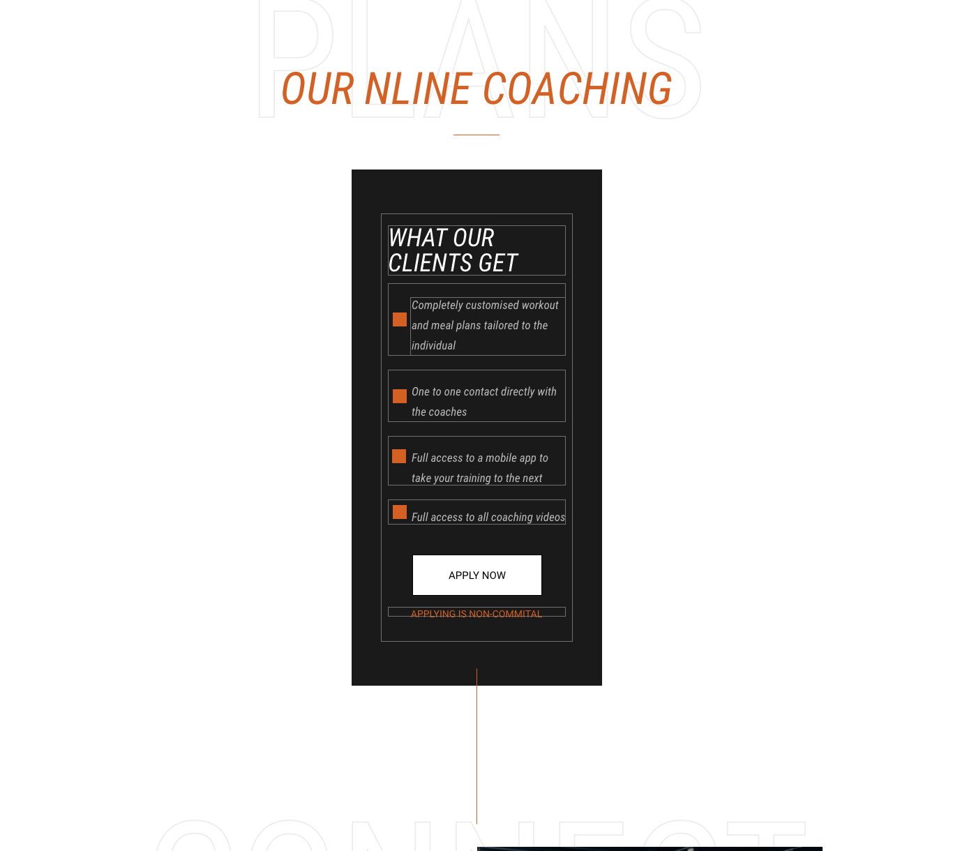
The ask is an application, and it costs nothing
A ticked list of what is included, APPLY NOW, and ‘applying is non-committal’.
The four inclusions are set as literal ticked rows on a dark card so the offer can be read in five seconds without a price anywhere near it. Naming a figure at this point invites a comparison with a nine-pound app, and that is the wrong conversation.
The line under the button is the most important copy in the section. On a service this expensive the barrier is not doubt about quality, it is fear of being sold to — and ‘applying is non-committal’ removes that for the cost of three words.
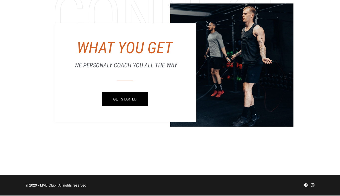
Close by repeating the promise and changing the verb
The same headline again, and ‘Get started’ instead of ‘Apply now’.
Somebody who has scrolled the whole page has read the argument and is ready for a different word. ‘Get started’ addresses a decision already made; ‘Apply now’ addresses one still being considered.
Repeating the headline verbatim closes the bracket opened four sections earlier. The visitor leaves having been told the same thing twice, which on a page with no navigation is how a message survives the scroll.
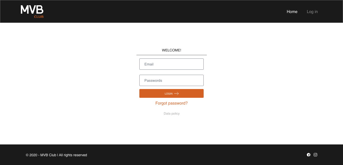
The members’ area wears the same clothes
The marketing header and footer, around a four-element login.
Clients arrive at the login from an advert, an email or the site itself, and it is the first thing they see after paying. Handing it to a default framework would have made the product feel like a different company from the one that sold it.
The form itself is deliberately plain — two fields, one orange button, a way back in if the password is gone, and the data policy in reach. There is nothing to design here except restraint.
A one-page argument that ends in an application.
The site introduces the coaches, states the four things a client receives, proves it with one long testimonial and asks for an application that costs nothing to send — in a single scroll a two-person business can maintain.
The visual system — orange on near-black, hollow landmark type, diagonal section cuts and the client’s own photography — carries from the marketing page through the onboarding quiz to the members’ login without a seam.
What I would keep, and what the device cost
Leading with the people rather than the offer is the decision I would repeat on anything sold by a small team. The features are matched by every competitor; the names are not.
The hollow section labels are the part I would handle differently. Setting a word at two hundred pixels behind every heading is a strong device and a completely unforgiving one — a typo that would pass unnoticed in body copy becomes the largest object on the screen. If the type is going to be that big, the words have to be locked before the layout is.